Each year, students enrolled in the animation course at Cégep du Vieux Montréal produce incredible work for their end of year thesis films. Considered to be among the best animation courses in the world, Toon Boom Animation was fortunate to feature selected projects from the course and hear directly from the talented students behind them.
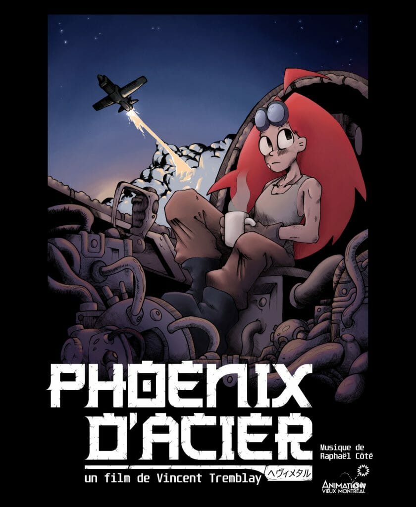
Phoenix d’acier (steel phoenix) is a short film by Vincent Tremblay that takes viewers out of this world with its retro style and science fiction setting. Following main character, Aby, as she attempts to navigate home from a deserted planet, we see Vincent’s skill at vehicular and mechanical design in the form of spaceships, war machines and wreckages. Animated using Harmony, Vincent makes smart use of cel-shading, and employs a minimalist approach to visual effects, to achieve a pleasingly retro-futuristic visual aesthetic.
We interviewed Vincent to learn more about his approach and the techniques he used to bring Phoenix D’acier home. He shares how he combined classic animation techniques to create his interplanetary world and eye-catching space travel sequences, and incorporated his background art as a key device in his storytelling. Vincent reveals the myriad of inspirations behind his style — some of which may be familiar to fans of 90s anime — as well as sharing his thoughts from his time at Cégep du Vieux Montréal.
Please introduce your short, Phoenix d’acier, and its characters…
Vincent: Phoenix D’acier (Steel Phoenix) is the story of Aby and her quest to escape a deserted planet in a makeshift spaceship. The planet is a shipyard covered in the overgrown remnants of some ancient war. Aby uses the parts she can salvage from the wreckages of old planes and tanks to build her own ship and fly away. To be honest, the short was mostly an excuse to draw machines and satisfy my inner mechanical designer. I wanted to animate a plane and everything came from there.
How did you come up with and approach the design of the main character and vehicle?
Vincent: I wanted everything to look like it belonged to the same universe and had a consistent aesthetic. Therefore, I designed everything to be a mix between futuristic sci-fi and retro military stuff reminiscent of World War 2. I also made sure that everything seemed worn down and old. For the design of Aby, I mostly went for a retro pilot look, but also made sure she seemed a bit rough around the edges. That’s why she’s wearing her traditional leather pilot jacket and her goggles. Her boots, old pants and big gloves also served to reinforce this run down aesthetic. Finally, her hairs were mostly there to give her an interesting silhouette and create some fun follow through as she moved.
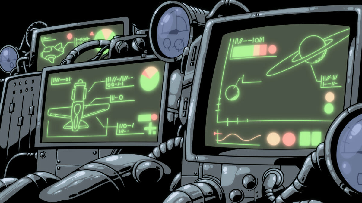
The spaceships were designed in a similar fashion. I wanted the big one to look more like an old fighter plane, but still gave it some sci-fi attributes. One of them being the engine itself that doesn’t look at all like what you would expect on an old plane. The most apparent anachronism is the cockpit itself. It’s filled to the brim with all kinds of weird futuristic components and screens, but even then I kept a certain retro look. The screens are like those old green computers and the rest is mostly cable and analog gauges. Finally, I made sure that everything looked like it was haphazardly put together. The smaller ship, being made for space travel, looked much more sci-fi. Its shape is slicker and more organic, but it still feels old and made with what was on hand. Overall, I mostly used pictures of real planes and pilots as references and transcribed it to my futuristic apocalyptic setting.
How did you approach the background art for the world Phoenix d’acier is set in?
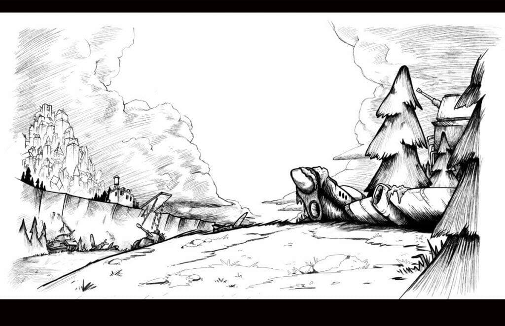
Vincent: There were two approaches used for the backgrounds in my short. The first was used for the landscapes, and looked more like an old painting and made a heavy use of cross hatching. I wanted to artstyle itself to look retro and rough, so most of the details came from the heavy line art and cross hatching. The colors mostly served to create the mood. I wanted the atmosphere to be quite cold and silent, so the backgrounds were mostly made with hues of desaturated blues and greens. On the other hand, the planet in the sky was coloured in a brownish orange. It’s still quite desaturated so it’s not too jarring amongst the rest, but it gave a warmer and more welcoming feel to Aby’s destination.
The landscapes were also instrumental to telling the story, with the remnants of the war being littered everywhere. amongst trees and nature, you could see old tanks, artillery pieces and planes being left to rust. In the distance, there was an old abandoned city. Its giant skyscrapers were mounted with cannons pointed at the sky, like the city itself was merged with some weird war machine. The second approach was used for the ship’s interior and other mechanical things. Contrary to the exteriors which looked like paintings, the interiors used a cel-shading look with only a few colors and hard black shadows.
These backgrounds were quite tricky because there were so many intricate details that had to be individually drawn. every gauges, wires, gears and other mechanical parts had to be painstakingly drawn and shaded. Besides, the black shadow was an additional challenge since it can easily lead to a loss of detail. I needed to carefully tread a thin line between putting too much black and losing the whole image, and not putting enough which made the images look flat. In the end, the cel-shading look may seem easier, but it requires much more intentionality in every minute detail which demands lot’s of time and effort. All in all, the mechanical part took a huge amount of the time I had for the creation of the film. Still, it was one of my favourite parts since it allowed me to go full mechanical designer.

What software did you use on this short?
Vincent: The animation was made using Toon Boom Harmony. The backgrounds were made using a mix of Photoshop and Clip Studio Paint. Finally, the editing was made using Premiere.
Were there any software tools or techniques that proved helpful on this project?
Vincent: I’d say that from a technical standpoint, my short is relatively simple. The art direction truly did most of the heavy lifting in bringing my vision to life in a professional and memorable manner. Thanks to techniques such as cel-shading and the minimal use of digital effect my short gained a unique aesthetic that made me stand out amongst my peers. Ironically, holding back on most effects gave it a much more unique feel than if I just used everything that I could have used.

What effects did you use to create the atmospheric and space flight sequences?
Vincent: In the shots were Aby’s piloting, the sky is a long background that loops around like in old cartoons. By using many elements which passed by at different speeds, I could create an element of depth and speed. Most of these shots were arranged in a similar fashion. At first, there were clouds which I drew to look blurry. Those were the fastest element and would cross the screen in only a few frames. Then, there was the atmosphere itself that moved at a slower pace. Finally, there were the stars which barely moved at all.
At that point, the only thing missing were a few slight shakes and a multiplane effect for the interior of the cockpit, it truly sold the speed and force of the spaceship. The whole effect was quite simple, but finding the right look was quite difficult at first, especially finding a way for the clouds to look right when blurred. At first, I tried using a simple blur effect from Harmony on regular clouds, but the effect looked too digital and out of place with the overall art direction. I ended up drawing them already blurred in photoshop by giving them a brush strokes look. I then used the same process to create the foggy effect of the atmosphere.
The other shots where you can see the ship from the exterior were not so different. In those cases, I drew the sky like a regular background and used a multiplane camera to create depth. The most challenging part was animating the spaceship themselves since vehicles are always hard to keep on model. This was especially true for the shot where the camera makes a 180 degree turn to follow the spaceship as it flies by. The constant change in perspective and the weird contorted background proved to be some of the biggest challenges I’ve faced during the production. Once the animations were done, I only had to animate the glowing fiery trails and that was mostly it.
I animated those as you would animate everything else and used some blur and color scales to create the glowing effect. The last interesting shot was the one where the camera seemed to be bolted to the side of the spaceship. For this one, I moved the Background and kept the ship still in the frame. To truly sell the effect, I created shadow shifting on the spaceship as it turned. It was created the same way you would make a cutout rig. I could change the shape of the shadow by using deformers to match the movement and give the impression that the light source was moving relatively to the ship itself. It’s funny because it is not an important shot in the grand scheme of things, but it’s one of my personal favourites in the whole short and many people told me that it was the same for them.

Do you have any advice for animating to music, like we can hear in the short’s soundtrack?
Vincent: I think the key is communication. First, I gave my compositor lots of references to clearly show what I was looking for. Secondly, I was constantly keeping him up to date with my progress throughout the production to make sure we were always on the same page. I asked him for lots of little changes, but also took in consideration his ideas. The exchanges truly went both ways. Even then, once the music was done, I ended up tweaking the timing of the animation for the key moment to truly follow the music.
I chose to focus on four main moments where the music needed to perfectly sync and worked the timing around those. First, I wanted the bass to kick in right after Aby got electrocuted. Then I wanted the music to pick up speed as the engine started. After that, The explosion needed to perfectly cut the music. Finally, I wanted the little ship to make its loop alongside the final notes of the song. By focusing on only those moments, I could make sure the important parts would hit properly without being overwhelmed by trying to sync absolutely everything.
Are there any key inspirations behind Phoenix d’acier that you can share?
Vincent: Honestly, it was a melting pot of everything I like. I truly love the old aesthetic from retro stuff and wanted to recreate a similar feel. I didn’t want my shorts to look too modern and digital, and that meant I had to restrain myself. That’s why I made heavy use of techniques such as cel-shading, cross hatching and used the minimum amount of digital effect. That’s also why I decided to animate the spaceship by hand. In fact, most of what’s seen on screen was animated by hand. Of course those restraints did put some limits to what I could do, but working around them in a creative way also allowed me to create a unique and particular art style that truly defined my film.
There’s also a certain purity to the drawing that’s lost if you hide it under too many effects. With that in mind, you won’t be surprised to learn that one of the main inspirations was old sci-fi and cyberpunk anime such as Royal Space Force, Akira, Bubblegum Crisis, Neo Tokyo, Cowboy Bebop and Redline. Of course, there’s also a lot of influence taken from Miyazaki’s movies, especially Nausicaä. There was also a lot of influence from old fantasy and sci-fi comics, like those from the heavy metal magazine, or from artists such as Philippe Druillet, Bernie Wrightson, Juan Giménez and Tsutomu Nihei. The character design was much more modern compared to the rest. It was inspired a lot by the art of Guillaume Singelin, but also other modern cartoons like Hilda, and of course a dash of anime like Last Exile. Music was also important throughout the productions, mostly 80s rock and metal such as Judas Priest, WASP or Blue Öyster Cult.
What has it been like studying at Cegep du Vieux Montreal?
Vincent: I can’t complain about much. Comparing what I could do three years ago versus what I can do now, I can clearly see a massive progress that I would never have achieved on my own. The teachers were always there for us and the cohort was amazing.
Any advice for other aspiring animators and students?
Vincent: I don’t have much to say, but there’s one thing for which I wasn’t ready. Get ready to get your pride put in its place. Now it’s the real deal and that’s part of the process.
- Want to see more from Vincent Tremblay? You can follow Vincent on Instagram.
- Interested in using Harmony for your thesis film? Students can qualify for up to 84% off Toon Boom Animation’s software.


