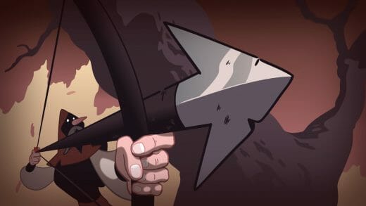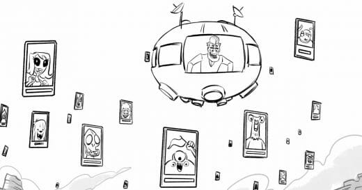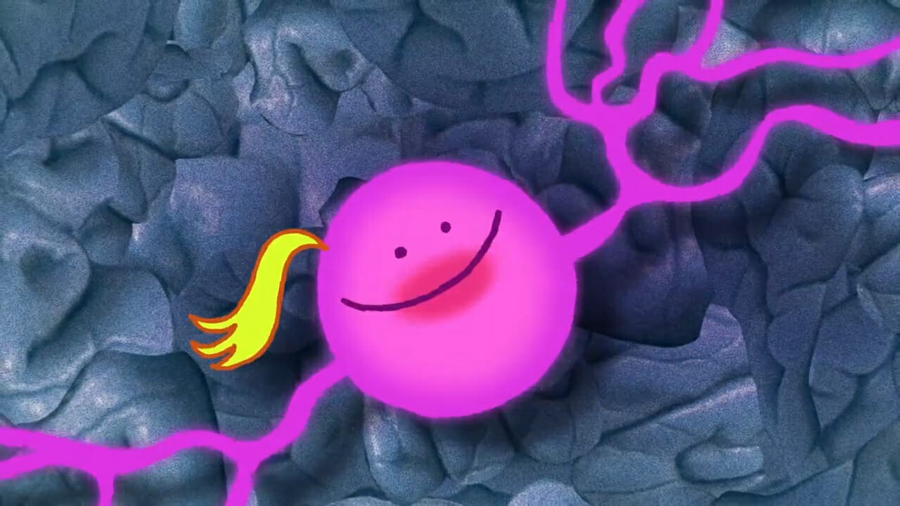
In Don’t Think About Her, John spirals into despair when he can’t stop thinking about his ex-girlfriend. It begins like it does for many… He checks her Facebook profile where he sees that she’s seemingly living her best life, while he continues to long for her. Consumed by his obsession with her, the film follows John as he confronts his own brain to overcome the pain.
Don’t Think About Her is Liza Desyatkova‘s student film, made using Toon Boom Harmony and Storyboard Pro. We caught up with Liza to learn more about the process behind the film, from what inspired the story to how she incorporated mixed media as part of the film’s aesthetic. Liza also shares details about her experience of making a student film.
Can you tell us about your journey into animation?
Liza: I’ve been immersed in the arts for as long as I can remember. I grew up painting, sculpting, sketching and working on a lot of small projects. I ended up going into animation because I liked the fact that learning animation involves so many different skills. You have to learn how to draw backgrounds, you have to know movement, and you have to learn to draw people and emotion. Most importantly, you learn how to tell stories, and that’s what I wanted to challenge myself with.
I went into the animation program at Sheridan College. I got to explore my own art style, experiment, and play with doing animation in irregular ways. By the end of the program, I’d accepted that I just like to make weird things! When I was in my second year at Sheridan, I got an early internship as a 2D rigging artist, and then every summer after that I was able to work for a studio. Now that I’ve graduated, I’m working in Vancouver as a technical director of a studio.
You made Don’t Think About Her as your student film. Can you share a little bit about your approach to the film?
Liza: Sheridan dedicates the entire last year to making a thesis film. It was daunting for me, because it was a chance to finally show what I can do as a filmmaker and artist. And that came with a lot of expectations for myself. Ultimately, I allowed myself to just have fun with the film; and worried less about what others might think. As long as I enjoyed the process, success would come naturally. And that’s how I ended up making Don’t Think About Her.
What inspired the idea behind Don’t Think About Her, and how did you develop that idea?
Liza: When I first started working on the film, I had decided that it was going to be about the brain. I was reading a lot of books about neuroscience at the time, and I especially liked the aesthetic of neurons and electricity representing our thought patterns. And I figured this would be a witty idea to turn into a film, but soon discovered it was way harder than I thought it would be.
I developed many ideas, and they oscillated between being slapstick humour and intimately serious. I worked through seven sketchbooks, neurotically writing down a new story concept everyday. All of the main ideas that I wanted to express kept showing through the framework, creating common themes between each new story I’d develop. I call this the ‘feverish indecision’ technique.
Liza’s concept art:
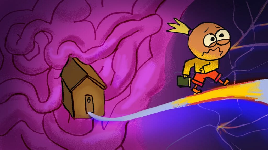
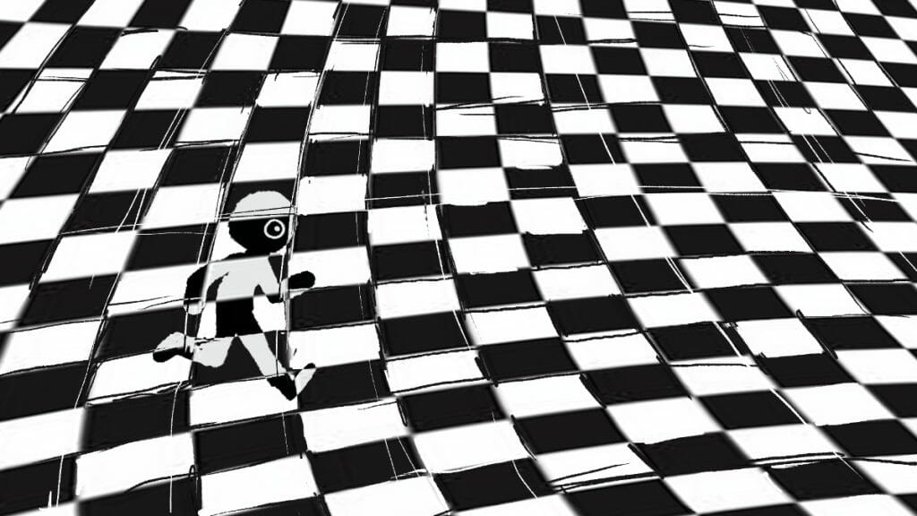
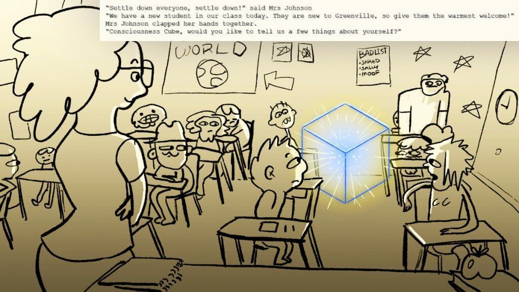
Liza: It’s fun to look at the old drawings and seeing how they had more potential than I realized. In the end any of the ideas could have worked, it’s just a matter of taking something and committing to it.
In the end, I developed a character who wanted something that they couldn’t have. At first his arch was extremely slapstick and surreal, but them I managed to ground him by basing his story off of my own experiences. I had one image of him looking at his ex on Facebook, and that’s when I had the idea to focus on that, the dynamic of his pain but also his obsession with his ex.
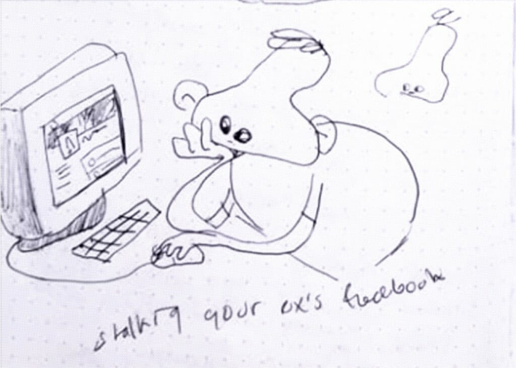
Liza: Since sharing the finished film, I’ve been surprised by how many people relate to it. I honestly thought people would think Don’t Think About Her was weird. And even that I’m weird to have come up with it. But instead, people are telling me that they have felt that experience of thinking about their ex. Knowing this dirty secret about everyone who relates to my work is part of the satisfaction.
Could you talk a bit about how you used the film’s aesthetics and sound design to communicate the story?
Liza: I didn’t want to include dialogue in the film; as a challenge to drive the story with visuals. I also knew that including dialogue would add extra work and, potentially, length to the film. So I figured I would approach it without, taking on the challenge of telling the story through image and sound design.
I really like communicating ideas and a story through funny symbolism. For example, the brain growing bigger and the head expanding is visually surreal, but obviously a metaphor for the main character’s head being filled with invasive thoughts. I really enjoy playing around with drawing and going against what something would look like or how it would behave in the actual physical world.
For the film’s sound, I hired Iva Delic (music) and Deanna Marano (sound design). Aside from telling them about the kind of feel I was looking for at some points in the film, I let them do their own thing with the sound. I wanted to give them space to interpret the film in their own way. I really enjoyed letting go of the control when it came to sound design, and it made the film feel a bit more like a collective project.
Can you share the production process behind the film? How did you approached production, who was on the team, and what was the timeline?
Liza: I started the process with ideating, just by drawing in a sketchbook. I’m a scribbler and writer so I can get through a sketchbook pretty fast. I ended up going through seven of them in total! This was one of my favourite parts, just filling pages and pages of loose half-baked ideas.
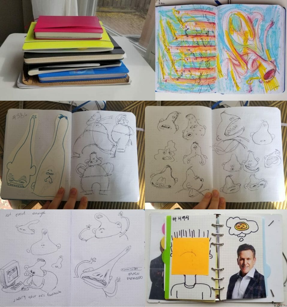
We would get a lot of junk mail in our house, and as a joke I would cut them out the stock photo people and put them in my sketchbook as if it were an idea for a film. Funny enough that ended up coming through into the film!
The first few months were spent ideating, until finally I was ready to work on animatics. The first animatic I did for Don’t Think About Her didn’t end up being all that different from the final film. Once I had that first animatic done, the idea was there.
Next, I worked on backgrounds. The backgrounds in Don’t Think About Her are mixed media. Some are drawn, others use photography and videography. For example, I found some old office photos and used them to put together the film’s office scene. In other scenes, I used my own pictures, even taking pictures of things around my own house. And I actually made the heart icon out of Play-Doh. I loved finding stuff around my own environment that I could use in the film.
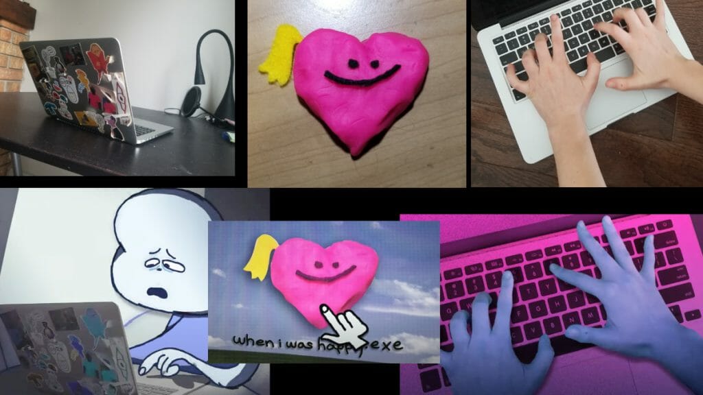
Since the animatic wasn’t planned out in total detail, I was able to experiment a bit and make things up as I went. I think it’s important to leave empty spaces in your animatic because that means you have space throughout the process to explore any new ideas that come up. If you plan everything out in tons of detail, you’re doing all the hard work right at the start!
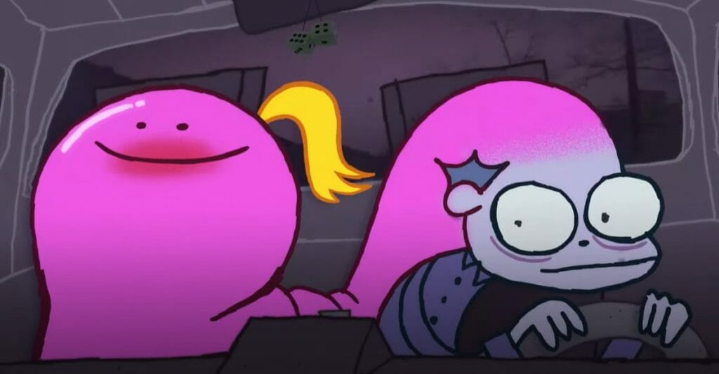
Once I finished layouts, I got to the animation stage. I did different tests for what I wanted the animation to look like. For example, I did the same shot of him driving in a car 3 or 4 times, every time with a different line or different face design. I hadn’t planned out his character that much so in animating him I played around to make sure I got it right.
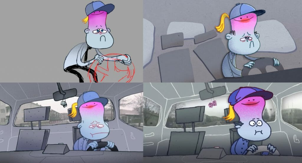
The animation is mostly hand drawn. But there were some points where I added rigging just to speed up the process. Once the animation was done, I finished up with compositing. I also had my friend Jacob Tobin draw some crazy explosion FX for the climax. In total, it took about 8 months to make the film.
The film’s mixed media makes for a really fun aesthetic. How did you land on the idea to incorporate other media into the animation?
Liza: I had used mixed media in other projects of mine, but it wasn’t ever my core style. The idea to use it in Don’t Think About Her came to me first because it’s a shortcut. Including mixed media meant there was less that I would have to draw. But I also thought it would contrast well with my drawing style, which tends to be very scribbly and childlike. I thought combining the mixed media with my drawings would create an interesting look.
Someone who helped me out was Noam Sussman, who is a really talented filmmaker. He thought the mixed media look was cool and he encouraged me to do it more… So I ended up completely filling the film with it! But truly, him telling me that was important because I’d actually been struggling with the style of the film. I had thought that the mixed media was chaotic, and so I needed that assurance from Noam. Once I was validated that the mixed media worked, I really flourished.
What was a challenge that you faced in making the film, and how did you overcome it?
Liza: Managing your own emotions and mental health while making a film is hard. You can find yourself in a bit of an echo chamber during the process, especially if it’s just you working on it. You’re with it so much that sometimes it’s hard to tell if what you’re making is any good, or even if it makes sense. I felt anxious sometimes that Don’t Think About Her wouldn’t land with people, because what I find funny might not be funny to a random viewer.
It was a challenge to deal with the ups and downs of emotions throughout the process. One minute I would feel great about the film, and then a minute later I’d be second guessing it. I learned that you have to grow with your film and learn to trust it, and trust yourself.
I know you experiment with new styles and techniques in animation. Can you share a bit more about that?
Liza: I got really into playing around with Toon Boom Harmony because the software allows me to experiment with different styles and looks. There’s the very classic animation styles, like cartoons, but with Harmony I can experiment with styles that have texture, or that look painted.
Once you become really comfortable using Harmony you can freestyle what you’re doing on the go. The fun stuff is when you’re working on a small animation and you figure out a solution for making the process go faster on the spot. Once you know the tools in Harmony really well, the focus becomes less on the tools themselves, and more on how you can leverage them together to achieve what you’re imagining.
I actually created a community on Discord that’s focused on technical scripting in Toon Boom Harmony. People who program inside Harmony and create their own tools use the community as a space to chat and share their ideas. I guess people really like the community because tons have joined it!
Do you have any new or upcoming projects you’d like to tell us about?
Liza: Right now I’m just developing myself as an artist, creating things in my sketchbook, experimenting with new materials like clay and paint, seeing how I can tell stories outside the classic “film” format. Follow me to find out what the heck I’m up to!
On a final note, as a silly experiment, I counted how many thoughts it would take to finish my film. Every idea I wrote down, I counted.
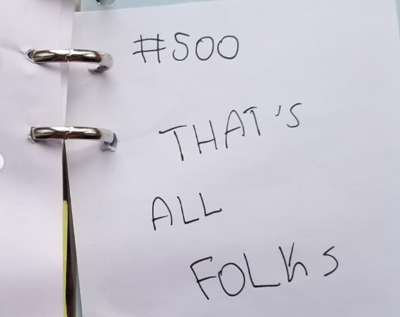
- Can’t stop thinking about this film? Be sure to also follow Liza on Instagram and Twitter.
- Interested in using Harmony or Storyboard Pro for your thesis film? Learn how you can save up to 84% on Toon Boom Animation’s software through student licenses.
- Don’t Think About Her was featured in Toon Boom Animation’s 2022 Education Showreel.


