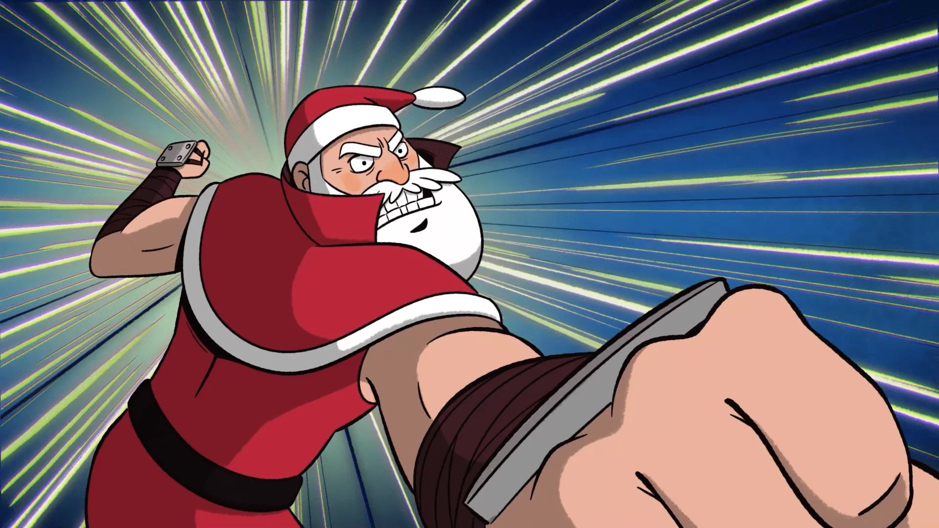
Tonic DNA is a Montreal-based animation studios that focuses on feature films, short films, and advertisements. They’ve worked with Disney, Warner Bros. and Netflix, and have made commercials for a wide range of notable companies. The studio’s most recently-released project was their 2023 holiday short, where Santa Claus comes down the chimney into a cozy home, ready to deliver presents and eat the cookies left out for him, when he’s confronted by a team of ninjas.
The intruders are hellbent on crushing Santa’s cookies before he can eat them. They don’t expect Santa to rip off his signature red coat, revealing rippling abs. What follows is a hilariously low-stakes martial arts sequence with fun anime influences.
Toon Boom Animation was able to get a hold of Philip Anderson (project director), Geneviève Létourneau (assistant director) and Simon Pope (animation supervisor) to discuss their new addition to Tonic DNA’s holiday tradition.
What was your role on this project?
Geneviève: I was assistant director for Philip Anderson. Philip is the brain of this operation and did some visual development regarding the 2D FX during pre-production.
Philip: I am the director of the Christmas project and came up with the idea. I storyboarded and edited the short. With an animated short like this, people may think I also did everything by making all the artwork. However there was a team of supervisors and artists who produce the backgrounds, animation, clean-up, FX and compositing.
Simon: I was animation supervisor on the Christmas project, taking Phil’s concept and channelling it through to the animators to bring it to life.
What did the planning stage of this project look like?
Philip: We knew the deadline had to be before Christmas so we couldn’t take our time on this. The project began in September with a brief from Jay Caplan, the creative strategist at Tonic. From there I came up with about five ideas which were pitched to the bosses. One was picked, I storyboarded it and it was rejected. We then went with another idea which became the final film.
The planning evolved as the story developed: shots added, shots taken out, timing changes. Production was constantly juggling the schedule as the story developed.
Once the rough idea was approved, we went straight to character designs. I started storyboarding even though final character designs were not final; there was enough in the preliminary designs to start. When the first pass of the storyboard was complete, Julie Poupart planned the art direction.
Even though there were still issues with the story, we picked shots that we knew were not going to change and rushed them into layout and animation. From there the usual pipeline followed of clean-up, colour, FX and compositing.
Geneviève: We have great managers and coordinators helping us run a short but intense project. It was essential to carefully plan this ambitious project, as the goal was to deliver it online before the holidays with a small team. Many of us wore many hats, but multitasking made sense with a multi-talented team.
Simon: I think as a group with different backgrounds, styles and experiences, it really helped to get a well-rounded piece together. As the main concept was solid, it was about getting the right energy and feel in the storyboards.
As with any production, there was plenty of adding and trimming in this phase, to make sure the rhythm and pacing felt natural for the story. It’s always important to make sure the jokes and action are clear. So a lot of massaging and finesse goes into the boarding phase.
What was the production process like? How would you describe your part in it?
Geneviève: It started at the storyboard animatic stage. Philip provided the team with the story, the beats of the action, the concept. From there I worked alongside other designers to make the visuals coincide with the stylistic vision our director had.
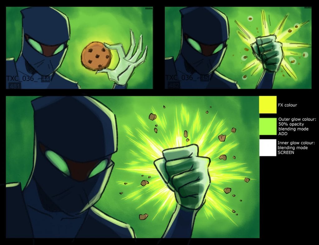
We wanted the effects to match the type of ambiance, that we think an epic ninja fight would need, to make it as dynamic as possible. While Philip and I were finishing the last modifications of the story, Julie Poupart did our colour script.
From there Josiane Fortin took the lead on set designs and background painting. Once the character designs and FX concepts were done, animation was already in full swing. It went really fast. Almost everything was moving in parallel at some point. Communication was key.
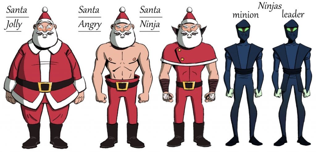
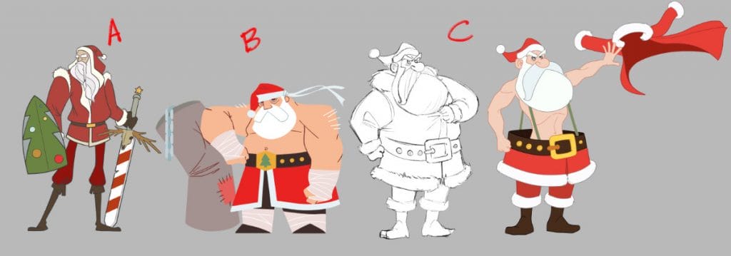
Simon: Once the concept was nailed and the storyboarding was coming together nicely, we opened the floor for artists to come up with character designs. It was fun to see such a wide range and variety in the artists’ approaches to the characters.
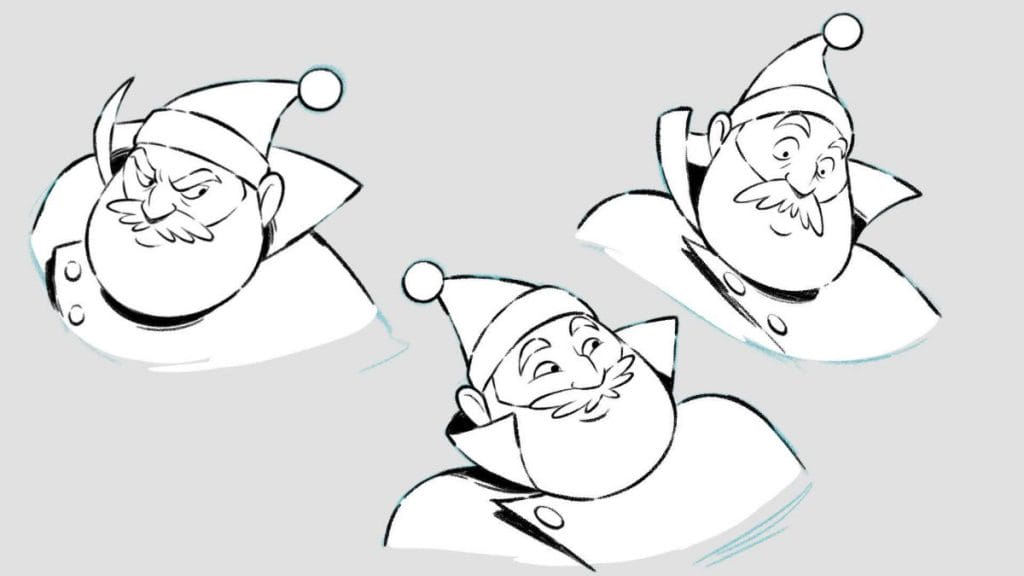
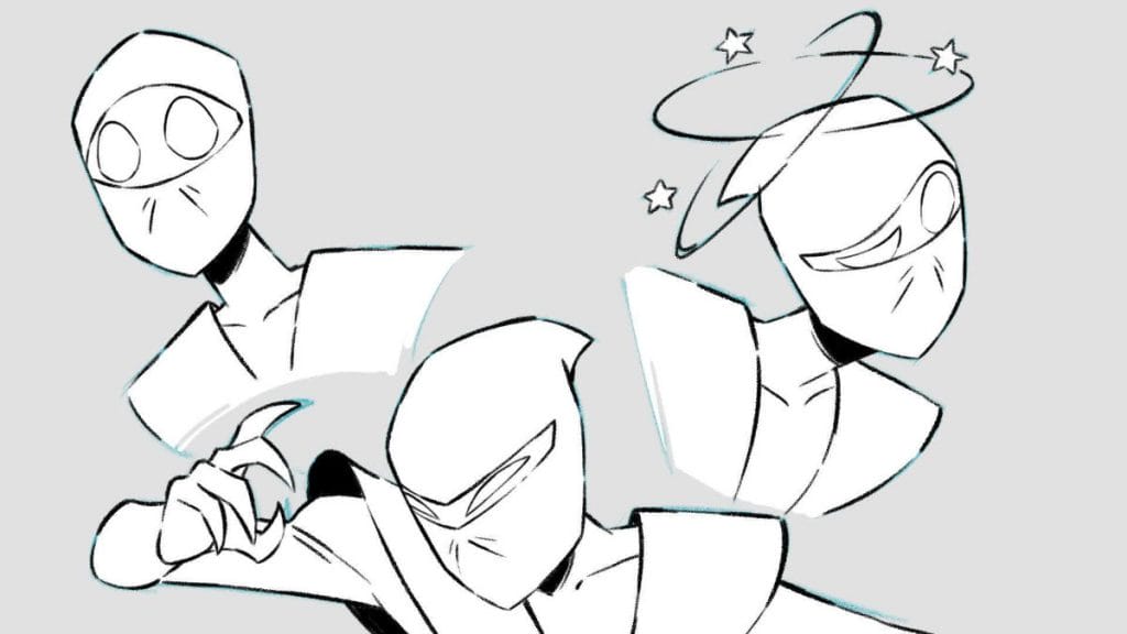
Phil funnelled them down to the look that worked best for the piece. I’d chime in to make sure it’s workable to animate. With the story, we wanted to have some fun with the characters’ posing and expressions. So we needed to make sure we had designs fitting that.
Once a shot got the go-ahead from the boards, we would do a rough animation pass. I’d give my feedback and any notes or drawovers for the animator to make tweaks. Sometimes we would revisit the main pose to improve hook-ups between shots in order to get the flow clearer. I would also share those with Phil, to make sure we’re all aligned with the timing, energy and acting of each shot.
Following that, we’d do a tiedown pass of the scene to put it more on model, getting the volumes and expressions on point for clean-up to build from.
Philip: The production process was the same as other commercials or shows in which we followed the same animation pipeline. However, there is always some chaos, good or bad, as things progress. For me, it was trying to make a fun story.
Along with Jay Caplan, [head of production] Laura Montero Plata, [assistant director] Geneviève Létourneau and [production manager] Juliana Vasquez, we would meet and go over the story to see what can be done to improve the film. They were always pushing me in a good direction.
Take a behind the scenes look at how our 2023 Holiday card came together via our @Behance page.https://t.co/9K6SfD1cn4
— TONIC DNA (@TONICDNA) December 14, 2023
Jetez un coup d'œil à la création de notre carte de Noël 2023 sur notre page Behance. pic.twitter.com/sIUpmD2Bpj
What was the inspiration to create a Christmas-themed martial arts short?
Geneviève: It’s been a tradition at Tonic for years to create short stories wishing happy holidays to their clients and viewers, like a holiday animated card.
Philip: The brief for this Christmas card was to have action and fun, no mention of martial arts. I came up with about five ideas with the first one being Santa fighting ninjas. Action and martial arts go together and the idea seemed like it would be fun to work on.
The second idea, which became the first pitch to the bosses, was about Santa fighting a monster. I even did a rough storyboard which was rejected, so it went back to the ninja theme.
What techniques and programs did you use to make this film?
Geneviève: The designs and storyboards were done in Photoshop and the whole film was traditionally animated using Toon Boom Harmony. The edit of the animatic was primarily done in Premiere Pro, except the storyboards and animatic corrections parts I helped with, which were done with Harmony.
I’m more used to the interface and my drawing tools are all readily available in one place. Plus I could already play with the timing as I drew new board panels. The renders were then placed in Premiere Pro with the rest of the montage.
The effects and compositing were also all done in Harmony. No outside post-prod was required for the film.
Philip: The plan was to keep this as traditional or 2D as possible. I did not want things to look digital or puppet.
Simon: Despite the short turnaround, it was boarded in such a way that there were some powerful still shots that required limited movement which was compensated with strong, powerful posing.
Those shots opened up some time for us to have fun with more fleshed out, fully animated shots. There’s a real balance in bang for the buck in this short that went a long way to make the short turnaround more manageable.
How is creating a comedic action sequence different from creating more “serious” action sequences? Or does the comedy perhaps come from depicting a silly scenario in a serious way?
Philip: This is a Christmas film so I did not want the story to be too serious. We want kids to enjoy this. I also wanted to trick the audience into thinking this a nice Christmas film. In the way it begins before introducing the ninjas.
When Santa is fighting the ninjas, we are trying to make it look exciting and dramatic. The idea of Santa fighting ninjas is silly which alone is comedy enough. The comedy is then pushed more by how Santa is drawn.
A perfect example is when Santa rips off his jacket. The idea came from [character designer] David Goldstyn, who did a drawing of Santa taking off his jacket showing a lean body. From there my idea was a long shot Santa doing the action.
Geneviève changed the set up to what we see in the movie. [Animation supervisor] Simon Pope did the amazing drawing of Santa with all the muscles that the animator followed.
Geneviève: If the protagonist wasn’t a jolly Santa, the laughs would have been quieter for sure. The fact that the main character is Santa and that he’s doing his usual gift run in someone’s home influences all of the rest of the story. And why what happens next is happening.
The humour aspect was automatic. It’s so absurd that ninjas are trying to provoke Santa by destroying his cookies, that we had to go all in. Epic Buff Santa ripping off his costume still makes me laugh every time.
Simon: I think with a lot of comedic sequences, it comes from a seed and the best jokes are the ones that evolve naturally. We had some moments like that in this short where one idea triggered another. Culminating in a few ideas morphing quite naturally.
I think the boards set us up quite nicely from the get-go. The beats were clear and it was just about seeing how we can push the timing, to sell the gag without losing the tone of the action.
What other influences do you often draw from?
Simon: It’s a real hotpot of influence. Because there was an element of creative freedom here, I think we could grab inspiration from all areas of the globe rather than only one region. Some European animation played its hand in the timing of the animation. We played with putting movements on 2’s, 3’s and 4’s.
I’d also add there’s a lot to say about the animators working on this. They’re all so talented and rounded as artists that they could take different styles and work it seamlessly into their skill set. All while putting their own unique touch on their shots that helped bring a personal flair to the final result.
Geneviève: I think because the story portrayed ninjas, we pushed the film toward a more anime-inspired animation style. But the way it looks was influenced by many more styles and houses of animation.
The industry is kind of all getting influenced by Asian media and comic book styles lately. And it is influencing our choices too. Great films and TV shows came out in recent years that have influenced our perceptions of how far 2D animation can be pushed in the new animation era.
We wanted to explore some of those capabilities in that regard. This project is part of an ongoing studio-wide R&D to push our production quality and capabilities in different ways.
Philip: For this project I was looking at a lot of sakuga animation for the action, while looking at Western 2D animation or European animation for style. A big reference for the Christmas film is a teaser called Kairos by Studio La Cachette. The style is loose and fun and the energy in the animation is terrific.
The short seamlessly fuses a more martial arts style of action comedy with a very Western aesthetic: a home decorated for Christmas Eve. Was it a challenge to achieve this balance? How did you go about it?
Philip: For me it was not about achieving a balance. What I wanted was a contrast between the nice warm Christmas shots at the beginning to the action of Santa fighting ninjas.
Geneviève: I would say that one of the challenges was to make the colours guide the storytelling. We wanted the colours to follow the mood of the action. It starts with a very safe, warm initial situation in the living room of a sleepy house. Once the ninjas appear, the colours start to evolve into colder, more saturated colours.
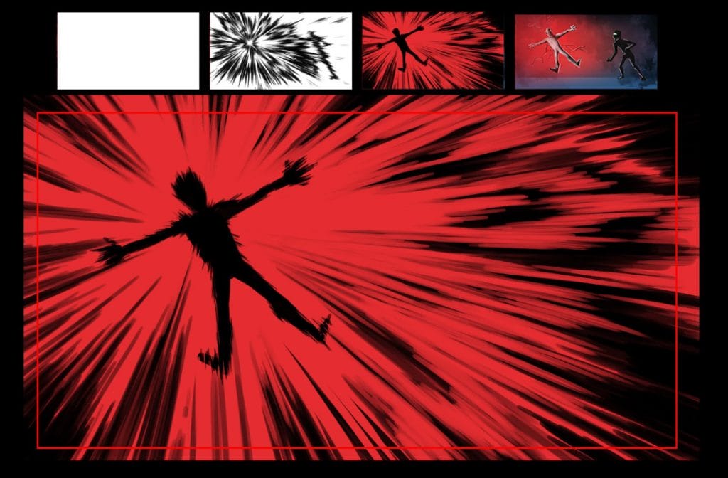
The fight scenes become mostly blue, but the transition from warmer oranges, to greens, than blues, with spikes of red whenever the ninjas were hit, had to be thought through and made intentional. In a tight, ever-evolving production schedule, keeping track of the colours and making sure it didn’t become confusing was the biggest challenge.
We luckily regrouped and started making editing reviews solely for the purpose of colour storytelling, and corrected any tint shifts that were coming out short of the right direction.
Simon: Ultimately it’s a character driven piece. If the audience is engaged with the performance of the characters, then that helps blend the transitions of the backgrounds from warm detailed living room to action colour cards and back.
What challenges did you face in producing this short?
Philip: The biggest challenge was trying to keep the story dynamic and fun and with a good running time. With Instagram, TikTok and other social media platforms, things fly by and people have less attention.
Originally the pitch was to have an action short of about 30 to 60-seconds. My first pass of the animatic was one minute and fifteen seconds. As we developed the story more and more it went to about one minute forty seconds and finally back down to about one minute thirty seconds.
A big change in the story was that the ninjas were stopping Santa from giving a girl a present. Of course, Santa rescues the girl and, in the end, the little girl gives a karate chop to one of the ninjas. The bosses did not like the idea of a child being kidnapped.
The cookies were always there in the background, but now they become the object between Santa and the ninjas. And of course, this just made the story sillier.
Simon: For such a short runtime, there was a lot to pack into it in terms of acting and action, while making sure it’s all readable. There’s a lot condensed into the timeframe. So we had to pick and choose where we had to invest the most frames in for a gag or an action to register with the viewer.
There’s some lovely acting on show. And so we needed to find ways for them to be enjoyed and not lost in too many abrupt cuts. What might work as a storyboard might not work once animated. Certain movements might take longer to act out or need a longer window to settle.
Due to the time constraints, if we were to add frames to one shot, we might have to cut it from another. There was a balancing act required to know where to invest the time in for the good of the piece.
Geneviève: Particle simulation is somewhat of an underused feature in Harmony for us. We wanted to play around with it in production but rarely had the time to go in depth before. If we wanted to use particles, the reflex was to use After Effects.
This made the production process a bit more complex, as we needed to take all the renders from Harmony and finish the shots in another software. This makes the process less streamlined and it complicates the creative retakes process.
We took the opportunity to make the speed lines within Harmony in this short using particle simulation with hand-drawn particles. It wasn’t an easy task but we now are confident using it for future production. The process consisted of taking the different pre-existing particle node system plug-ins available and modifying it to fit our needs.
I’d say, once you understand what makes the systems tick, they are pretty fun to use.
How would you describe the reaction to your film so far?
Philip: The reaction has been very positive. In general, people like it and find it funny.
Geneviève: The main reaction I get is that it’s epic, weird and funny. All adjectives that are very suited for it, in my opinion.
Simon: With the talent that’s gone into it, it’s nice to see it all come together.
- Making a list and checking it twice? For more about Tonic DNA’s holiday short and the studio’s other projects, be sure to check under your tree for a link to their website. You can also find Tonic DNA’s animation on Vimeo or YouTube.
- Interested in making an animated project of your own over the holidays? Artists can unwrap a 21-day trial of Toon Boom Harmony Premium.


