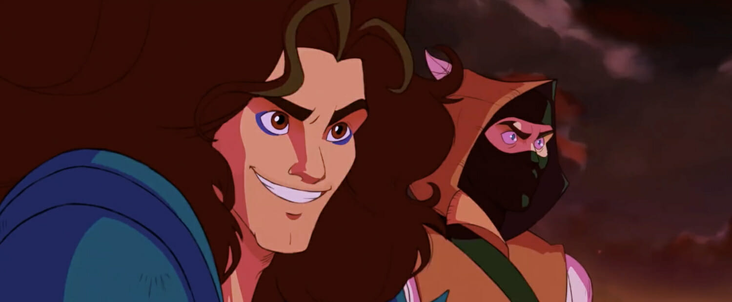
In the music video for The Mystic Crystal by Ninja Sex Party (NSP), vocalist Dan Avidan and keyboardist Brian Wecht are transported to a fantasy kingdom in which a princess has been imprisoned in a crystal. The duo embark on a comedic quest to save her, traveling through the Fields of Annoyance, Dragon Barf Junction, and the Cliffs of Erectile Dysfunction.
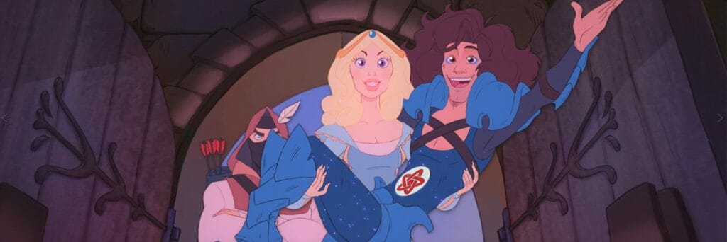
This twelve-minute music video mixes live-action and animated scenes. Produced by Knights of the Light Table, the animated scenes take inspiration from Bronze Age-era Disney productions, Don Bluth films, and Rankin/Bass Productions’ The Last Unicorn. The Mystic Crystal is the most recent of several collaborations between Knights of the Light Table and Dan Avidan.
We caught up with producer Patrick Stannard, director India Swift and post-production artist Michael Doig to discuss comedic projects and digitally recreating animation that evokes Xerography from the 1980s.
How would you describe your role in The Mystic Crystal and what did a typical day in production look like for you?
India: I directed the project. I took on a lot of the creative side as well in terms of doing some rough animation. But mostly it was managing the team, making sure they had what they needed, checking over the files coming in, and just trying to keep things moving in the right direction.
Patrick: I would say that India was a big force in terms of the creative direction of Mystic Crystal. I was mostly doing what I usually do when India is directing a project for Knights [of the Light Table]: I handle client relations, I make sure everybody has licenses, I do scheduling. I sort of take a lot of the administrative things. And every now and then I might hop in, do an effect here or there.
India: Yeah, he did some effects for the intro of Markiplier’s character, the necromancer, as well as generally acting as a producer and handling the client relations side. Pat also steps in sometimes to help us creatively. He’s got such a great sense for design and story. We often end up back-and-forthing on different projects about which way to approach various things.
Patrick: I would say that, no matter what the Knights gig is, myself, Michael, and India kind of act as a brain trust. And I think every one of the gigs is stronger for it.
Michael: On Mystic Crystal, I was the colour designer. We were trying to emulate [Don] Bluth. So I hopped between that and backgrounds, painting, leading the team on that, and the post-production and compositing. But my main interest and passion is in colour. I wear a few hats when it comes to Knights projects.
India: A lot of the background concept art and the final execution was handled by Mike.
Patrick Stannard: And the compositing. Can’t forget that.
India: Of course. Mike finishes almost every project that we work on together. It’s Mike heading up the compositing, so the final look of all the frames is often straight from Mike.
What did the creative brief from NSP look like?
Patrick: It’s been a while since we last looked at the brief. I do remember a discussion about how much was actually going to be animated. Initially, we were going to be animating less than we ended up doing.
They had the costumes and they had the live action stuff. Dan [Avidan] is a huge fan of The Last Unicorn, so we definitely brought elements of that into it. India, Mike and myself put forward that Bluth-y quality. That very much clicked with Dan and everybody.
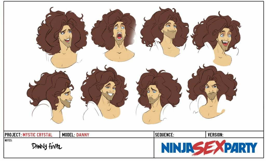
Off of our first designs, from the NSP side, it was decided to push things a little less caricatured. We’re used to caricaturing Dan and Arin [Hansen]. For this one they wanted more of those heroic fantasy elements. So we kind of prettied Dan up a little bit after our first few passes.
The creative brief was pretty simple to my recollection. There weren’t a lot of strict guidelines. They very much came to us with a general idea that they wanted these animated sequence, where they’re going into a storybook, and workshopped it with us. It’s one of the reasons it’s so fun doing projects with them.
What did the character design stage look like for The Mystic Crystal? What was it like designing real-life musicians for animation?
India: As Pat was saying, the Bluth style is fantastic. But he’s not exactly known for making the most beautiful characters. He’s got a very gnarly style, which we love. So it was a matter of taking the feeling and the mood of Don Bluth and trying to bring in more of that Disney influence to try and make the characters look aesthetically pleasing.
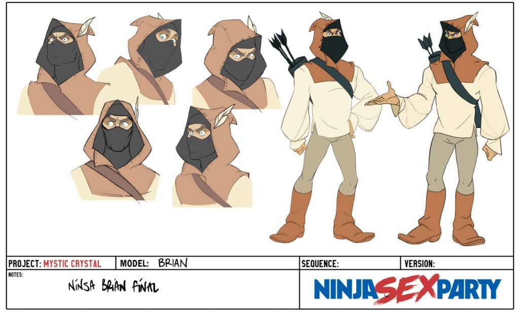
We had an animation character designer working with us. Amanda Bell did some incredible work on the designs. She really nailed that style. There were honestly very few notes that I needed to give when it came to the character designs.
[Character design was] definitely part of the process that we all had a lot of fun with. Pat threw designs in, I threw designs in, Mike might have even thrown some ideas in there. It was a very collaborative process to start off with. And then Amanda got us across the finish line and to a place where hopefully the band is happy with it too.
Patrick: India has a 2D DreamWorks influence into her animation. And that mixed with the Bluth style lends itself to having charismatic, charming designs. Amanda Bell’s work also revealed an interesting new thing that we introduced into Mystic Crystal, which we hadn’t done before. We forewent shadows. We actually went for flat colours and did a ‘scruff up’ pass.
India: What we were essentially trying to do was emulate that early animation style of both Bluth and Xerox-era Disney, where you would often get construction lines or little bits left over in the animation that had not been completely cleaned up. We were trying to get the feeling of that into our cleanup. For us, it was still very important that we had a proper cleanup pass. Both to really nail down the animation and the characters. Our fantastic lead of cleanup, Bryony Evans, really brought it home with that. It makes the colouring process much easier.
We wanted to make sure that we included that ‘scruff-up’ of the lines that would happen back in the Xerox era of animation. And the flat colour is also part of that. When you think about features such as Robin Hood, or The Secret of NIMH, all the tones and the shadows are done by adjusting that flat colour base on the character.
There are a few moments in The Mystic Crystal where we have shadows. But they’re not generally part of the character design, which was very different for us. In the past we’ve always had at least a shadow pass, if not a shadow pass and highlight pass on all of the characters. And I think it really helped to sell the 2D look that we were going for with The Mystic Crystal. It made it feel nice and distinctive from the other projects.
We really relish the opportunity to explore different ways to do things in Knights of the Light Table. Every single project we get, especially with NSP, gives us the opportunity to explore a different style of animation. And try our hands at creating something that looks very visually distinct from anything we’ve done before, which is always a great challenge and a lot of fun.
Patrick: Just replicating that Xerox, we were able to capture some of Amanda Bell’s cross-hatching. So much of the appeal of those designs is that they have this kind of almost woodcut feel to them. So I was very happy that India and her crew were able to capture that.
India: It was a lot of extra work but I’d say it was definitely worth it. Even if it’s something people don’t notice while watching. The animation team as a whole was very happy with the way it came out in the end.
What did the planning stage of The Mystic Crystal look like?
India Swift: It was a lot of fun. We were working with a couple of storyboarders. also stuck my oar in there and did some of the storyboarding myself as well, which is great because I love doing it. It was a lot of looking at the influences, a lot of trying to get little Easter eggs in that we thought Dan would appreciate; a lot of studying Bluth, a lot of studying The Last Unicorn.
It was nice because the projects we had done previously had been quite high-octane and high-action. They’re quite fast-paced. We got to take it a little bit slower with this in terms of the storytelling. Because it’s quite a fast-paced song, the pace is still there, but we got to breathe a bit more in the compositions.
And we got to explore a lot more with the environments. That started from the boards, with trying to figure out some really cool set pieces we could use. Designing the Cliffs of Erectile Dysfunction was hilarious. The dragon pass was really fun. Generally it was me and some freelancers back-and-forthing and working on that for about a month.
What were the challenges in storyboarding for a combined animation-live action project?
Patrick: I think it’s interesting when you’re boarding to music lyrics. India mentioned having moments to breathe; we also have a montage sequence, which is kind of the reverse of that. The lyrics and what Dan is singing is in very quick succession. They’re going from the Fields of Despair to Dragon Barf Junction.
Each one has to be a vignette and you have a quick transition between each one. There was also a fair amount of thought put into the transitions between the live-action and the animation.
India: Absolutely. And that was quite a challenge, because sometimes the footage was still being worked with and edited. It was a process of working with their editor right up until we started animating, to make sure we really had those locked in. A lot of the time we wanted to transition from something in the live action, to either a match cut or something that had meaning to the previous scene in animation to try and make that transition smoother. And to try and tell more story with that.
Habo jokingly exclaimed “I never want to animate horses again” so please enjoy the last horses @Animatoonings will ever make. pic.twitter.com/ulgxiOWP9h
— Knights of the Light Table (@KotLT_Animation) June 29, 2021
What techniques and programs did you use in animating The Mystic Crystal?
India: A lot of Toon Boom software! Storyboard Pro to storyboard it, we used Harmony in animation, and then the compositing was done in After Effects.
Michael: Yeah, we did compositing in After Effects, and for some shots we used the 3D camera in Toon Boom. And then we used Photoshop and Clip Studio for painting the backgrounds.
India: There was a lot of trying to figure out bringing the 3D camera from Toon Boom Harmony straight into After Effects, which is really helpful. We wanted to get the feel harkening back to the animation of the nineties. We wanted to get that kind of parallax look. Animators would lay different layers of the background on top of one another, separated on sheets of glass and then shoot a camera through them to create the illusion of depth. And Toon Boom has a great system for doing that, so often we would get shots exactly the way we wanted them in the Toon Boom scene first. And then Mike could bring those camera keys directly into After Effects and work from them without losing what the animator had originally wanted the scene to look like.
Michael: It was always my goal to preserve what the original intention of the animator was. So that technique worked most of the time. In the shots that were a little bit more complex, and you have that multiplane camera feel, sometimes I would bring the background layers directly into Toon Boom and just render those out as passes. Just so I knew that it was going to be more one-to-one.
I learned a lot about the 3D camera in Toon Boom Harmony on that project. It probably the way that I would go about it now If I were to choose, it would be to set it up on Harmony rather than trying to re-engineer it in After Effects. Just because you know what the results are going to look like. I find that After Effects is a little bit slower to preview, because you have to go through the cumbersome process of setting up a proxy asset. There were so many shots to do, I didn’t end up doing that.
I would say that the multiplane camera was almost a limitation for the project. The boards were very strong and clear, and that carried all the way through the project right into compositing.
India: And sometimes it’s a challenge. The first shot of the animated portion of the music video is this sparkle effect weaving its way through a landscape. And we boarded that not one hundred percent knowing how we were going to make that work with a bunch of parallax.
Trying to figure out how they would have done this back then was a really fun challenge for us. Where would they switch out the backgrounds into full animation? Where would they wipe the screen to hide a transition? That was really fun, and I think it came out really well.
It feels authentic because we really tried to respect and approach animation with the same principles that they had from the time that we were trying to emulate.
We’re closing out this #MysticMonday with @OldSwifty who couldn’t resist nabbing a few of the shots to animate for @ninjasexparty‘s #TheMysticCrystal
— Knights of the Light Table (@KotLT_Animation) July 5, 2021
Their reasons for picking this one were “well… it was a really cool shot”. pic.twitter.com/7fZ8TnZUnL
What were the challenges or benefits of animating to song lyrics?
India: I’m sure everybody here has a different answer to that. For me, it’s that the lyrics can often be very evocative in terms of imagery. It helps a lot in the boarding process. And the most obvious benefit that I can think of is that it really helps you nail down the timing for your sequences and for your scenes. You have very clear beats to hit and very clear moods musically. So it very much helps from a story structure standpoint.
You can hear when potentially the low point might be for a character. You can hear where it needs to feel triumphant. And then you can attach the further story points to those parts and then figure out the in-between, knowing that you have the most important waypoints mapped out for you.
In terms of challenges, because the timing is often mapped out for you, sometimes you might not feel like you maybe have enough time to explore something that you really want to in a section. Finding clever ways to cut around that or convey a message with as little time wasted as possible is really important, to try and make sure things read, but you still manage to convey the most important information.
Patrick: I think India hit the nail on the head. That’s the main challenge of it. Some of the fun areas to explore are asking, “Do you want to represent the lyrics literally? Or do you want to tell a different story? To maybe juxtapose images with the lyrics to tell a more in-depth story?”
When you’re thinking of boarding a scene, and you’re thinking of telling a story, you have a length of time that you’ve allotted for how you’re going to communicate that. And it doesn’t always line up with the music. So the challenges are definitely presented in terms of, “How do I tell this more efficiently in a short amount of time?” or, “How do I lengthen this, and what does that do in terms of building suspense, or setting up a payoff later?”
There’s a lot of moving parts. Having the lyrics and the music simultaneously gives you direction and motivation, but also can be restricting. Though, with these restrictions and that amount of freedom, I find it invigorating from a creative standpoint and a great learning experience. I think they make you a better board artist.
India: It’s a really nice way to dive in, if anyone wants to try their hand at a first project. I think boarding to music is always great because it’s always really nice to have a starting point for a story. Rather than starting with what feels like a blank canvas. Music is great for that.
You can convey so much with music. A lot of the tracks that we end up getting sent by the clients, Dan and his associated bands and musical friends, have almost fully-formed stories when they come to us.
Patrick: I think also for music, another fantastic thing is that it’s not as outwardly literal. When you’re thinking of boarding a dialogue scene between two characters, you’re thinking of a room and a table and chairs. You’re not going to be as creative with your shot choices.
But when you’re listening to poetic lyrics that can be very metaphorical and somewhat abstract, you start thinking metaphorically and abstract. You might try to do a more interesting composition because, being brought up on music videos, you expect it. So it’ll help you branch out and do things that you might not normally do if you were just given a script page.
India: It’s probably why a lot of board artists listen to music while they’re boarding. Getting in that frame of mind and the mood of the piece that you’re making is a huge help.
Patrick: It’s really good for fight scenes. I’ve seen people board a fight scene to a Michael Jackson song, and then you just remove the music because it adds an interesting rhythm to the impacts. And you’d never know it if the artists didn’t tell you.
Michael: From the three main projects that I was more involved with, I definitely felt the contrast between the more abstract, metaphorical project where we’re telling story that was in harmony with the lyrics, rather than adapting what they’re saying.
The Mystic Crystal definitely felt like it was telling you a story. It was our responsibility to interpret what they said they were doing. We were trying to find the most interesting way to succinctly communicate what they’re trying to tell the listener, in the time that they deliver the performance of the song.
I think at times it can be a little bit too quick. So our challenge was, “How do we have things on screen long enough that the audience can see what we want them to see, and understand what they’ve seen?”
I feel like the journey part of the song was probably one of the most difficult [parts to animate], because it covers so many locations. There was a clever thing where, in one scene, we have foreground elements passing. They’re literally going through three locations, but it gives you enough time to feel this sense that they’ve travelled distance. Even though the animation was a little bit more limited.
India: There were so many more locations we wanted to explore that were called out in the lyrics. But part of the job of directing a music video was deciding which ones we were going to keep in, which ones were the most important or the most visually interesting, which ones we would have to leave in the lyrics.
Here’s @k7movingdoodles tie-down animation for Danny’s “immunity” to the Cliffs of Erectile Dysfunction and Brian’s tacit disbelief of such a scenario ever occurring. #TheMysticCrystal pic.twitter.com/eFjeom5WAT
— Knights of the Light Table (@KotLT_Animation) June 29, 2021
Patrick: There’s an interesting wrinkle to all of these locations and trying to tell things visually. There was a particular challenge, and that was the comedic moment when they arrive at the Cliffs of Erectile Dysfunction. The way that the song presents it is that only Brian gets erectile dysfunction from the cliffs. And we had to figure out how to portray that.
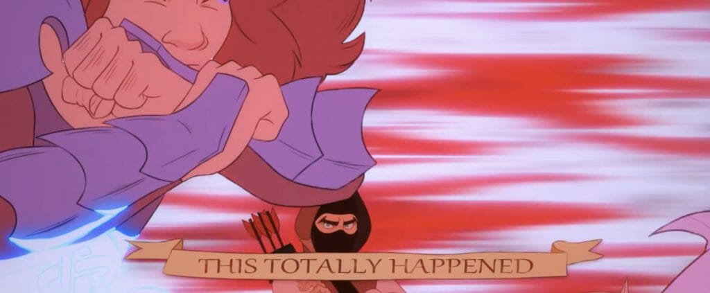
A funny moment that the team came up with was the unraveling of the scroll. So basically these cliffs shoot lasers at Danny and Brian’s crotches. Then Danny’s armour protects him and he shoots the lasers back to blow up the cliffs. And then the scroll unravels and says, “Yes, this totally happened.” And that delivers that this is an unreliable narrator moment.
India: I can’t believe that this is our job. That entire thought was so wild. But yeah, t here was a bit of back-and-forthing on that. Initially, we tried a pass where we just tried to convey the fact that Danny was telling this as an unreliable narrator through his acting. There were concerns from the band that it wasn’t spelling it out enough that the viewers would necessarily get it. So there are a couple of versions where we went back and forth trying to figure out how we were going to represent that visually.
That scene was animated by the amazing Kevin Ryan, who has such a feel for comedic timing. For almost every funny scene I was like, “Just take it, Kevin. You know what to do. You’ve got the timing — make me laugh.” And every single time, he absolutely nailed it.
How did the comedic nature of the song affect the animation style?
India: Generally it meant that we had to really make sure that we were very clear with poses and the expressions of characters. When we’re doing something that’s slightly more stylized and abstract, it’s enough sometimes to get the feeling or the tone that you’re going for.
It can often be beautiful to have something you maybe misinterpret at first glance. And then that evolves into something else. It’s fun to play with that kind of stuff visually. But when you’re doing something where comedy has to land, clarity is absolutely key.
The audience has to be on the beat with you. So really making sure that we were nailing the expressions and the body language of the characters, and the posing and the staging, and making it as clear as possible, was the most important thing.
Then as I mentioned, timing is the other really important component to making something funny in animation. And we happen to have one of the funniest animators around on the team, so that was a huge boon for us – having Kevin Ryan there to hit those shots out of the park.
Patrick: When animating for comedy, similarly with music a lot of it is timing and legibility, making sure it reads, making sure you have a good setup and payoff.
I think the arrow was a particularly challenging comedic moment. Ninja Brian fires an arrow and it has to be legible. The thing is that the arrow shoots off into the distance and then needs to come back and hit Danny. And so that needs to read really clearly. The contrast with the effects and the background are important. How it’s framed and tracking is important on that.
And then later, after Dan says, “Don’t do that,” you just get an immediate closeup of three arrows going into his back.
Michael: When of my favourite shots in the whole thing is Brian responding to Dan. And he doesn’t even move.
India: It’s one frame just held for nearly a second. It’s a fantastic drawing. I think it was Gemma Roberts who did that drawing of Brian just looking down with utter contempt at Danny. It’s one of the funniest parts of the video. He doesn’t move at all. It’s the clarity.
I think when it comes to doing a music video, where you know that comedy is a part of it, that has to be accounted for in the boarding. You’re using flatter shots in general, and you’re trying to make the timing much snappier than you maybe otherwise would. Contrasting Danny flailing madly around with the absolute stillness of Brian was helpful in selling that.

What was compositing on The Mystic Crystal like?
Michael: With a lot of the projects that we do, we’re often emulating a style of animation that is older. So a part of the process is always asking, “How do we take something that is digitally created and make it feel like it’s been shot with a camera?” We put in intentional artifacts or noise. I think we often find that things feel too clean and we always want to have that human touch to it.
When people remember the films that they saw in their childhood, there is this magic or a spark. And part of my job is trying to find what that is. If we can compare what we made to cake, there’s this nostalgic filling in the middle.
For The Mystic Crystal, our reference points were Bluth animation, but for me it was The Black Cauldron and The Secret of NIMH. How are colours presented in those? Where are we using our values? We had a lot of dark foregrounds and silhouettes in the foregrounds, and let light really shine in the midgrounds so that you felt this sort of ideal space that the characters are in with this always surrounding, threatening danger.
For compositing, we added a bunch of noise. We also offset the colour channels so there’s a bit of bleed, so that nothing is quite solid and clean. There’s that little bit of blur. And then we sharpened it up. And with The Mystic Crystal we also applied a film grain.
For the cleanup process, we worked with Bryony before she came aboard, asking: “What is the cleanup process on this production going to be? How is this going to be unique? What are we trying to get?” Because we weren’t dedicating time and resources to the lining, that time and focus shifted onto, “How are we processing the lines?”
There’s a process on The Mystic Crystal where we take the two lines that are output from Toon Boom — there’s the cleanup line and then the rough pass — and we apply a level of procedural noise to the lines themselves. So as the frames progressed through the shots, they’re being almost eaten into and erased in certain parts to get that Xerox feel. We did a process where we split the line art into two, with a sixty percent and a forty percent pass.
India: It’s a lot of trial and error, getting those percentages.
Michael: It was alchemy. I actually ended up writing a script. You just hit a button eventually that did this process, because there were over a hundred shots. And this was combined and sandwiched down into the post-production stack.
India: I love that process — just trying to get the weathering of the lines and the inconsistency of the pen pressure. We were very adamant about wanting to use the vector brushes in Toon Boom because they provide such a wonderful base for colouring. They make the colouring process very easy.
How do we use those vector lines but also have this eaten away line at the same time, where some bits are maybe faded out? Mike’s solution to that was very cool: to have that noise behind the lines and then project that onto the image so that, in alpha terms, the line was sort of eaten away in some places and then stronger in other places.
Patrick: All those little things come together. That’s what nails that cohesive feel to all the animation on The Mystic Crystal. Talking to the smoke and mirrors, it looks like it could be easy to reproduce, but it’s not. There’s a lot of effort and craftsmanship that goes to refining it to that degree.
India: A lot of time before we kicked off the animation was spent researching this stuff and trying a bunch of different tests. Mark Hendry was also very important in that process. He is, like I am, a geek about animation and he specifically loves looking into that era of animation and how to reproduce that look.
He was one of our layout artists, and he helped us to figure out how to get that look with a digital workflow. For example, one of the tricks that we used from his recommendation that Mike put into the comp process was having a very small, subtle shadow underneath the colour on characters. So that if you really looked, they felt slightly suspended above the background. You could almost imagine they were on acetate on top of a matte painting.
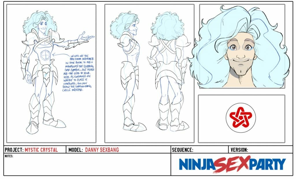
Patrick: We never talked about the little sparkles on Danny’s leotard, as well as the star on his chest. We didn’t want to draw that.
India: It seems like a small thing if you draw it one time. But when you’re doing hundreds of drawings, that’s a lot of line mileage for something that is very finicky to move in subtle ways across frames. We tried our hand at automating that. We essentially drew the circle on Danny’s torso and then a crosshair. And then Mike put that through a process in After Effects where it would map the symbol to the crosshair.
It’s more successful in some shots than other shots. Hopefully people haven’t seen the parts where there’s a couple of frames where it goes a little bit strange. But that really helped shave down some time.
The sparkles were something I was really adamant that we have from day one because, as Pat mentioned, one of the inspirations for the project and one of Dan’s inspirations was Dragon’s Lair, the video game. Princess Daphne in that game has this dress with this sparkle effect, and I’ve been obsessed with it ever since I saw Dragon’s Lair. And Danny’s wearing a sparkly leotard.
We had to use the effect from Dragon’s Lair, or try to get as close as we can to it. So Mike wove his magic to make that happen, because there was no way we could have done that hand-drawn without the animators absolutely getting carpal tunnel syndrome.
Michael: In addition to that, the sparkles in the first shot and the arrow fired by Brian are Harmony Particles. Animator Hardik [Manktala] did those. That was literally magic to me. I don’t know how he did those.
India: As well as being an absolutely incredible animator, Hardik was also the person who taught us the magic of Toon Boom Harmony’s Particles. We were still trying to figure out how to do this stuff and Hardik just dove into the system and came up with some incredible results.
Which part of the project was the most interesting or challenging to animate?
India: For me, one of the most challenging shots that I tackled was the shot where there’s a huge amount of depth and we’re zooming out of the village. Two guards run in from either side and we see the necromancer walk towards the center of the village, and then interact with the crystal which he steals.
There were a couple of reasons that was difficult. Firstly, there was such a huge amount of depth on the shot, and I had to try and keep all of these characters in that depth convincingly. Then secondly, the camera zoom was happening at the same time. I had to figure out a way to make it not look strobe-y while animating the characters not on ones.
I believe my solution was to stagger the camera motion on that scene. So I probably asked Pat, and he probably said to try that. And then the third challenge was that that transition is meant to transition seamlessly into the live action. The animated Markiplier character was meant to transition into the live-action Markiplier character in the same shot.
So lining up things like the cape swing with the way that the cape was swinging on the live-action counterpart, lining up his pose, making sure the proportions were all there, making sure the walk didn’t feel too fast when they were walking away from camera, and then stacking the effects of the other characters on top of that, was a real challenge.
The guards were also a last-minute addition so we had to frame those in after the fact. It was all-in-all a shot that was begun fairly early in the process and was one of the last ones to get finished.
This shot was a challenge – it needed to lead seamlessly into the live action footage of Markiplier and there were a lot of characters to manage during the 3D camera move.
— Knights of the Light Table (@KotLT_Animation) July 5, 2021
It was a shot where we weren’t 100% sure how it was going to look until we took it through compositing. pic.twitter.com/is2rzloj6v
Patrick: And it’s probably one of the ones that audiences don’t notice. All that challenge was to make it seamless.
India: Exactly. If they don’t notice it, then I’ve done my job well. Hopefully people just accept it as part of the rest of the animation, in which case I’ll be very happy. That’s often so much of the job — trying to make something look natural enough that people won’t call it out. So for me, that was one of the biggest challenges.
Michael: That shot that India is describing is probably one of the more involved backgrounds. There is, as India said, so much depth, that I ended up splitting the ground plane as two flat planes that sort of slid over one another with a bit of a soft edge. So please just look at the animation, because this is smoke and mirrors.
There is some sliding of buildings over ground, but it’s hopefully masked by that zoom. That was one of the ones where I tried to do it out with the animation, and then eventually I was like, “Where are these buildings?” India and I sat and worked together to decide where the buildings were going to be placed, where the camera was going to be placed.
India: I loved being in a studio alongside Mike, because being here in-person together makes it so much easier on these projects, when you come to the last ten percent where you’re exporting everything out. To be able to sit together and really go through things in person, and make sure that we’re both happy with them, that’s a huge part of the process whenever we make one of these music videos with Pat.
It makes such a huge difference and saves so much time. So I’m really happy that we were able to continue working together in that way, even throughout the last couple of years of pandemic.
Probably some of the more challenging parts I didn’t expect to be challenging as well were in the final chapter where they’re in the castle together. All of the characters have come back to return the king’s daughter to him and it’s the happy resolution.
There were so many crowd shots in that last little section. If you say ‘crowd shots’ to any animator, you can immediately see the horror. Poor Kevin handled a lot of them. He did an amazing job, usual. We tried to make sure we had all the ground planes working, and depths on all those characters. A lot of those characters were individually exported because they were all moving on different timings.
Assembling those scenes and making sure they were working, and making sure that the transition from one scene to the next scene was working seamlessly, was just lot of very technical back-and-forthing that took a lot of time and was a lot more difficult than we first envisioned it to be.
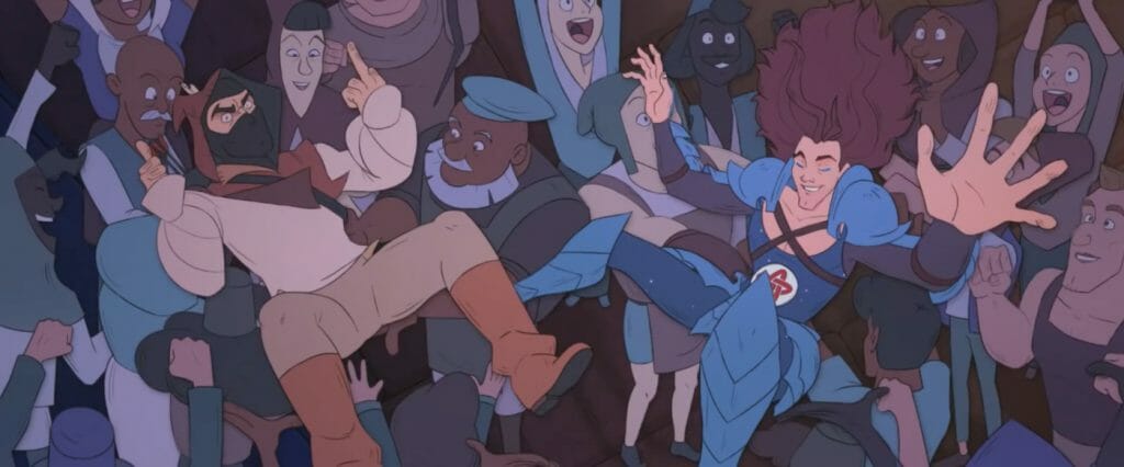
Michael: I think every department cries when a crowd shot’s involved. Often a crowd shot means more of a wide shot. Which means the background department and layout department need to figure out how the characters are going to be in the space.
And sometimes, thankfully, they cover up a lot of painting space. But when it comes to all the layers having to get mixed in, and the colour and the compositing, that was a big challenge. How do make sure that people can see that this is a crowd, and the crowd doesn’t feel too grouped? Make sure that your characters feel like they’re both in the scene with the other crowd characters – but are the focal point of the scene distinct enough that they stand out, without standing out too much?
There was a lot of balancing. I remember the scene where Dan and Brian are being thrown up in the air by the crowd. Dan is above Brian, and then Dan is below the crowd.
India: The layering on that shot was very complex. We had to keyframe the depth to make sure that worked. As long as it visually looks like it works from where the camera’s sitting, then that’s the main thing.
There are some battles where you have to say, “I think no one is going to notice the corners we cut here, and it conveys the effect we want, so I’m going to have to leave it and move on to other things.” That’s always a battle with animating anything.
Animation is like a sponge: it will take whatever time you put into it, and always be able to take more. So there’s always the temptation to just work on something until you feel like it’s perfect. But working with clients, trying to get things in in a timely manner and be professional about it is one of the things you have to balance along with that.
To be able to look at a shot and go, “You know what? I think it works well enough here, and we’ve gotten to a point we’re happy with. We need to move on to other things now,” is a hard decision, but one that needs to be made at some point.
Michael: I have a few other challenging shout-outs. One was another transition shot, in which live-action Dan and Brian dissolve into the scrying bowl. The distortion was hand-animated by Gemma. Trying to get it to go from the live-action liquid and wibbling forms to the solid animation of them walking forwards was really cool. Gemma just took that and was like, “Yeah! Let’s go!”
The other one is the bell.
The Bell of Doom, tolling for @OldSwifty whose soul left her body shortly after completing this shot.
— Knights of the Light Table (@KotLT_Animation) July 5, 2021
Animating the bell was a huge undertaking, and Swifty will be forever grateful the line wiggles could be hidden in the lighting pass. Here are the wiggles in all their glory. pic.twitter.com/wMkFBJMBKh
India: I think I’d actually blocked that out of my memory.
Patrick: That’s not a 3D bell. That’s hand-animated.
India: It’s based on a bell that Mike modelled for me. I started, and then said, “Michael, I need your help please. I’m going to lose my mind.”
Patrick: It’s just a bell swinging. But the lines had to be so solid on that because it’s metal. It’s not flesh. It’s not going to squish and stretch.
India: It’s also mostly in silhouette. So you can’t even see a lot of the surface detail I put into it. You want it to look convincing, but you also don’t want it to look perfect. The last thing you want in our Don Bluth era animation is to have a 3D-looking bell that looks like it’s been rotoscoped.
What we ended up doing was a similar approach to the one we took with the ships in Starlight Brigade. We had a simple model made that got the rough proportions and everything right. And then I used that to draw the key frames of the animation and in-betweened by hand. So you still had those inconsistencies that come with the hand of the artist, but it was hopefully solid enough so pass as being a convincing motion.
Gosh though, that bell took me so long to do. There was so much back-and-forthing and adjusting lines by a pixel or so to make sure it wasn’t wobbling all over the place as the bell was swinging back and forth.
Patrick: Thinking about that, and about Gemma animating that ripple by hand: this is definitely the most expensive Knights project. We did about six minutes of animation. And because it’s sandwiched between live-action, you don’t think about it. The video feels half-animated.
It surpasses every one of our other projects in terms of scope. India and her crew put an insane amount of love and effort into every frame of that. There’s scenes in it that look better than a DreamWorks movie.
India: We have the pleasure to work with some of the most skilled artists in the industry. And some up-and-comers who haven’t yet been discovered and snapped up. And no doubt they will be snapped up, if they haven’t already. It’s mostly thanks to them that the projects come out the way they do. There really is no substitute for the skill that an artist can bring to the table.
We had the absolute pleasure to work with some people we hadn’t worked with before on The Mystic Crystal. And they all brought something new into that mix and helped make the project what it was.
Gemma brought a devilish charm and energy to her shots of @markiplier as the Necromancer, seen here scrying over a bowl of spilled magic juice. #TheMysticCrystal pic.twitter.com/TNvGMPzK22
— Knights of the Light Table (@KotLT_Animation) July 13, 2021
How would you describe the reaction to the series so far?
Michael: Everyone’s asking for a series.
India: It’s always a very flattering response to get, to anything that we do as Knights, to have people want a series or want more from that world. The reaction’s always wonderful to see. What’s always paramount to me in my mind is pleasing and satisfying the clients first. I always want to feel like we fulfilled their vision for what they were hoping for from the project.
But the fans of NSP are some of the best fans in the world. They have such an amazing community. Seeing the fanart that came out of the videos that we’ve done and seeing the conversations happening about people’s favourite parts is always so fun.
It’s hugely heartwarming when the video’s first launched to have all the animators together. We all gather everyone who’s been on the team and we look through the video comments. We chat about the project, and we all watch it together when it first comes out. That’s always a really memorable and precious part of the process for me.
The fan reaction is astonishing and wonderful and humbling. It makes us more determined to make even cooler stuff next time.
Patrick: That’s our goal. We keep getting better with our craft with every music video. When I think about the stuff we were doing back on Heart Boner and Night Runner, we have refined so many processes. We might not even realize it but a lot that, if you look back, was held together with duct tape.
India: It always feels a bit like that, doesn’t it? You always kind of feel like you’re going up against the wire on everything, and everything’s just barely holding together. But then there’s such a sense of pride when it finally comes out and you can all sit together and watch it.
- Curious to see more from the Knights of the Light Table? Visit their website and follow the studio on Twitter. Patrick Stannard can be found at @PatrickStannard and India Swift and Michael Doig share their work at @DoigSwift.
- Interested in using Harmony for your next animated music video? Artists can download a fully-featured 21-day free trial from our website.


