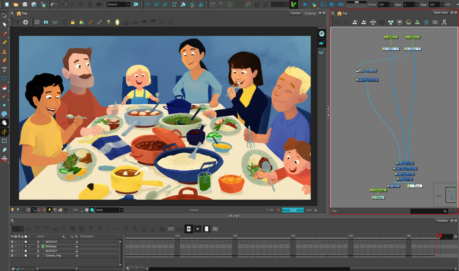
To encourage animators to try out new tools and techniques following the release of Harmony 21, Toon Boom Animation assembled a demo pack titled The Ingredients of Animation, which features work from six artists participating in our Ambassador Program. Each artist hired for the project contributed scenes, made using a variety of cutout and paperless techniques — and were inspired by recipes they have a personal connection to.
Among the featured artists is Lieke Wouters, a freelance illustrator and animator who is based in The Netherlands. She’s worked on a variety of projects, from TV series to animated shorts and YouTube series. Lieke says that regardless of the size of a project, she’ll always look for (and find!) the magic in it. Currently, Lieke is working on a film for Marlyn Spaaij called Trouble in Mind. We caught up with her to hear about the inspiration behind the scene, and how she went about creating it.
In 10 seconds, your scene tells a story of multiple generations of family sitting down for a shared meal. What inspired this scene?
It’s actually my childhood that inspired this scene! My grandmother was from Indonesia, and we used to go to her house to have these big family meals. My grandad always had pigeons in the garden, and he would feed them together with me, my sister and my cousins. He had this little tin can with food and when he shook it, all the birds would come flying. And at the end of the day, we would get called inside to sit down with the family to eat. That memory is what inspired the opening of the scene!
You titled your scene Rijsttafel. How would you translate that to English?
Rijsttafel literally translates to ‘rice table.’ It’s the meal that I drew in the last shot of the scene. A rijsttafel is a traditional Indonesian meal that includes lots of different dishes that are shared. My grandmother brought this tradition to us in The Netherlands, from her Indonesian culture.
Traditionally, families will pass down their rijsttafel recipes from generation to generation. So when I was 18, I received my own booklet of family recipes from my aunt. And when I later moved out, my mom gave me a rice cooker. It is super handy for when you need at least 6 stovetops to make all the different rijsttafel dishes! Grandma and Grandad sadly passed away, but we honor them by continuing to cook and eat rijsttafel together as a family.
You animated this scene using Harmony. What Harmony features did you most rely on to create this animation? Were there any new features that stood out to you in particular?
I heavily relied on the node view. In fact, I do almost everything within the node view. I love how intuitive it is, enabling you to connect your different nodes. I also find it’s great for keeping your project neat and organized. Since this is a cutout scene with pegs and drawing nodes, this was definitely the feature I used the most for this project.
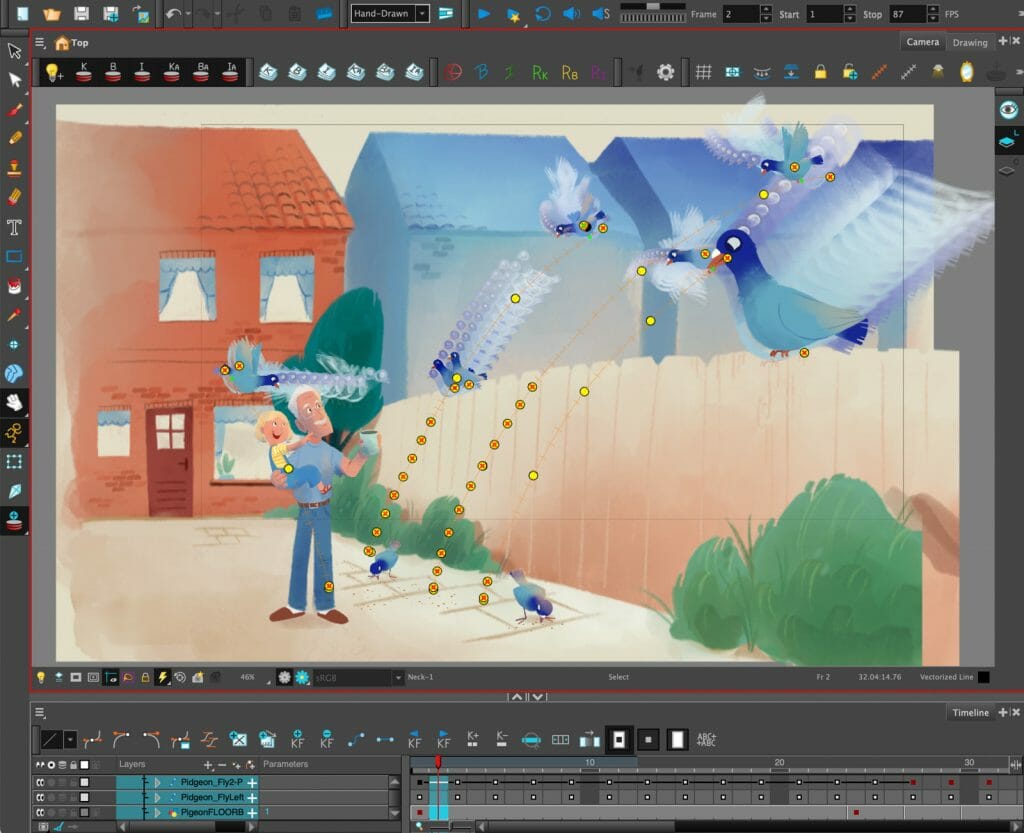
The scene opens with a swooping camera motion that follows several cut-out pigeons as they fly down into a yard. How did you approach using pegs to animate these flying pigeons?
I used pegs to differentiate the types of motion of the pigeons. The pigeons move from up to down, and that motion is one peg. I created a separate peg for the rotating motion of the pigeons. This helped me to have the most control over the movement of the birds as they swoop into the yard.
What was your process for rigging the cut out animation characters in this scene?
I used a very basic cut-out rig, but that’s because it does the job! First I made a sketch of the characters, and then I made drawing nodes for every element that I wanted to have separated. I drew them out, and then connected them all with pegs to make the hierarchy.
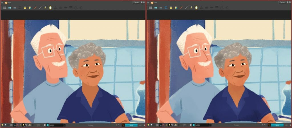
The characters in the scene have such subtle lighting and textures. What tools did you use to achieve this look, and how did you go about using them?
I wanted to create the textures after animating, and I wanted to take advantage of the drawings I had already made within my rig. So I used the art-layers within a drawing node. Each element has 2 drawing nodes: Number 1, which just shows the base element which is drawn on the first three art layers; and number 2, which only shows the underlay-art.
I masked the 2nd node with the 1st one, and started drawing textures on the underlay-art. Because the textures are connected to the elements I previously created, they follow the movement of the animation. But their output composite is separated from the rest of the rig, which makes it possible to put them through a blending-node, or a colour-override node. This way you can easily give your characters that little bit extra. To make this little system super easy, I created a base rig where it was all already built in so I don’t have to create the node structure over and over again!
What was your technique for making layered backgrounds, and then creating motion transitions between them?
I started by making a storyboard for the scene. Using the export layout function of Storyboard Pro, I was able to get the sizing of the backgrounds that I wanted. I created the backgrounds with their own foregrounds and backgrounds.
The motion transition between the 2nd and 3rd shot was something I decided on last minute. I made the two shots, and then merged them. To go in between them, I made an extra background with a motion blur that I painted. This helped to breach the gap between the two shots. I then finished it up by adding some extra effects over the transition using Toon Boom Harmony nodes. This blended the transition together even better.
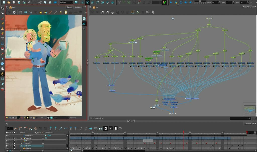
How did you use inverse kinematics to your advantage in animating this scene?
I love inverse kinematics because they are basically already built into the rig. It’s just a matter of turning some things off and on. I used it in this scene mostly with grandpa in the first shot, to help make him sway back and forth. Inverse kinematics are perfect for those subtle animations where the feet can stay grounded.
What did you use free-form deformers for in animating this scene?
I used the free-form deformers for the faces, just to get very subtle turns in the heads without having to draw tons of eye shapes and expressions. For a simple scene like this one, free-form deformers are perfect for making tiny tweaks like that.
What feature of Harmony was your favourite to use in animating this particular scene?
I loved working with the blending nodes for this scene. You can do such cool things with them. For example, you can use an overlay layer to add a little more depth. Having the option to make these extra tweaks is super convenient.
Want a taste of the newest features in Harmony 21? Be sure to discover the new features here and download a 21-day trial. Curious about the other Ingredients of Animation? You can find more articles about the participating artists here.


