Great horror storytelling shares key elements: fear, revulsion, surprise and terror — the latter of which combines the former three through the lens of imagination, where a scene can truly become haunting. Mercury Filmworks senior animator Shane Plante has a taste for these ingredients of fright; having a lifelong appreciation for the genre. He brought this sensibility for scares to his latest short, The Gate.
Produced as part of the Mercury Shorts program, Plante created the entirety of The Gate using Toon Boom Harmony. (Including the backgrounds!) He has been an animator at the Ottawa-based studio for the last 14 years; a self-described ‘jack-of-all-trades but master of none’ who has worked largely on Mickey Mouse shorts, alongside other projects.
With The Gate, he was able to combine his professional experience animating shorts with his personal love for horror, creating something that is rarely seen in mainstream animation: terror. We caught up with Plante to discover how he used Toon Boom Harmony to bring his vision to life — or death, as the case may be. Here’s hoping for a sequel.
Hi Shane! How do you feel looking back at The Gate now that it’s out in the world?
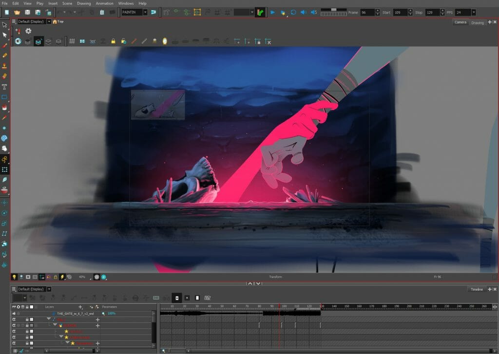
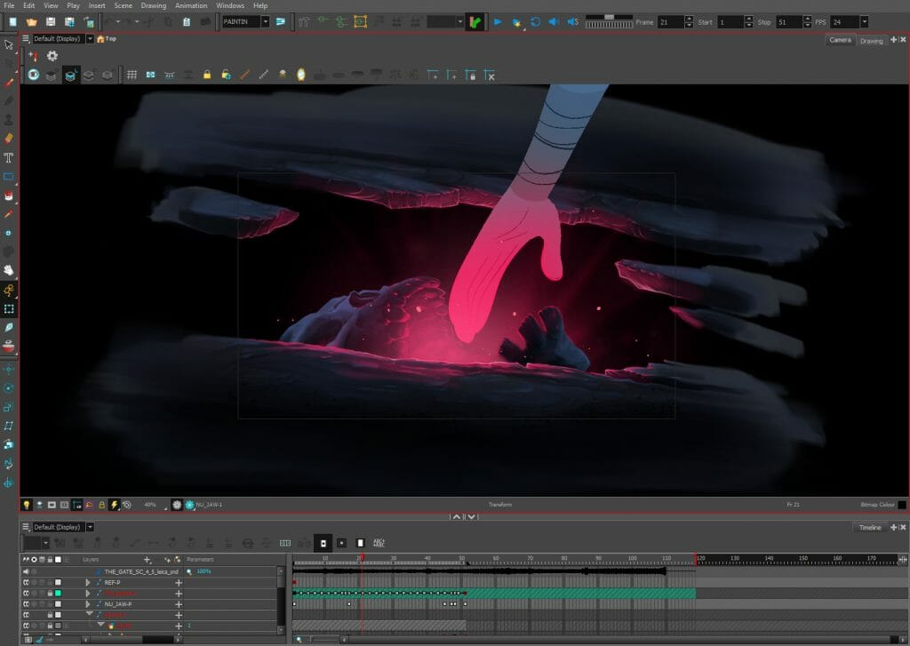
Shane: Horror can be very unforgiving, and I didn’t know if it hit home until it was done. I knew I put my all into it, but you never really know if it’s going to work or have the punch you want it to. Everything you saw in The Gate was done in Toon Boom, there was no outside software. I wanted to test the boundaries and see if I could paint something with depth and tie everything together in Harmony. Mission accomplished; it was so fun.
Painting in Harmony is actually a new hobby for me now. There’s something about painting in this software that I can’t get over. We have a couple licenses for Harmony 21 and [Mercury Filmworks] really want me to play around with it because word on the street is the painting tools and brushes have been revamped. That’s made for me; I can’t wait!
Can’t wait to see what you do with Harmony 21! Other than classic horror films, what references did you pull from as you concepted and created The Gate?
Shane: I wanted to try something I’d never seen before and to take a risk. I was actually going to do something that was underwater as my first idea. But then I got really into watching a clip of Christopher Walken in The Prophecy.
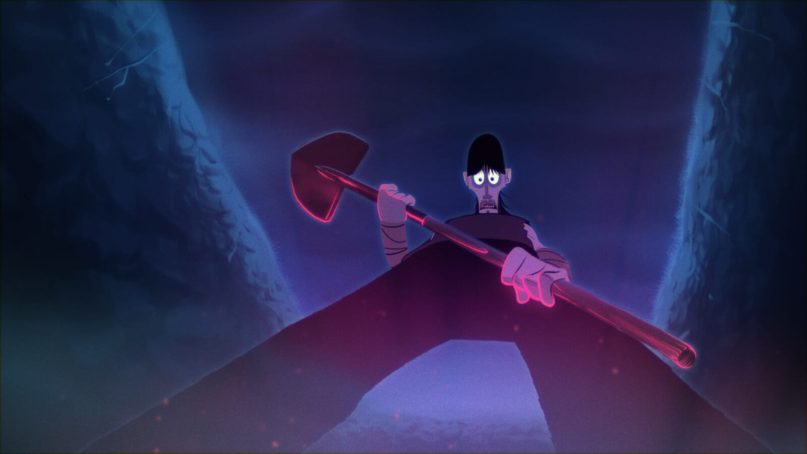
The idea for The Gate came from that camera angle, one shot, and has nothing to do with dialogue in the scene. Christopher Walken was sitting on a gravestone and the camera was going up, and I was like, ‘Wow, that would be really cool to animate.’ Boom!
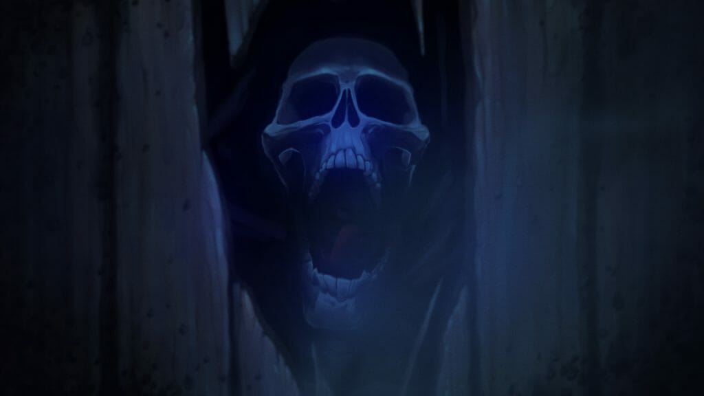
Right away, I realized I had never seen anyone animate anything about a grave robber. Also, I wanted to try showing suffering in animation. I’m not a psycho, but you never see it. I was going from the perspective of what you don’t see in animation. There’s no deeper meaning, I just really wanted to take a risk and try horror.
And you did absolutely everything in Harmony?
Shane: Yes, the whole thing. People on my Instagram say that they’ve always wanted to see horror animated, which is great, but also that they can’t believe I painted The Gate in Toon Boom. I think they’re used to seeing the vector side and they don’t know that you can switch every element to a BMP.
The compression technology in Toon Boom on those BMPs is amazing. Sometimes, we have these backgrounds on the shows we’re working on, and they can slow down the scene because they’re so big. Everything that I did in The Gate had an alpha channel that was so light, and I could manipulate it so easily, that I couldn’t believe it. It was a huge learning experience on my end and something I never would have foreseen.
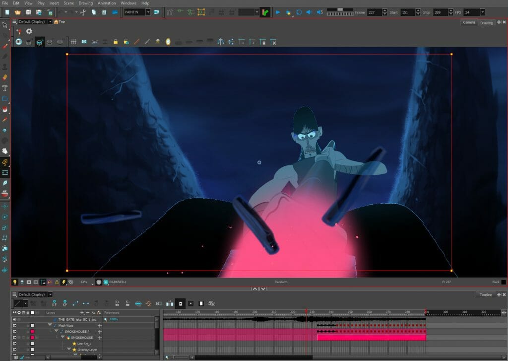
It was a happy little accident realizing how easily you can manipulate stuff. Especially the last shot when the camera follows him into the grave. I cheated that big time; there’s three different switches of the BT in there and I just put a mesh warp on it. I could tweak it on the fly easily because the BMPs were so light; which helped me get this short done on time. That last shot was more in a 3D space anyways. There’s also some parallaxing with the BG as the camera comes in.
With painting in Harmony and using mesh warps, there was no render loss. I could fully render each scene in The Gate, including the last one, in no more than three to four minutes. I’m blown away by how light it all was. Each painting was a layer, because I was trying to find my rhythm painting in Harmony. I had never done it before!
How long did production take you, end to end?
Shane: Condensed, this whole short took over four weeks of 10-hour workdays. I do a lot of my own scenes and builds in animation, so I had a lot ready going into this. And I also do mixing and mastering audio work outside of the studio, and compositing I do my own way.
I think if we had a comp guy look at the scenes, he’d be like, ‘Why did you do it like this?’ Usually, it’s just my shorter way of getting from point A to point B. I find if I keep everything light on the front end, the animation and comp will go way smoother — and I can tweak things on the fly with no rendering time lost.
A lot in The Gate is hand-drawn and all the lighting was painted in Harmony too. Everything in Harmony is essentially four layers: overlay, line, colour, underlayer. Since I was usually painting stuff on one layer, I put the lighting on the overlay and I would mask it out or make a transparency when it started glowing. That’s the trick for how I did that, and it’s really easy. Easiest and laziest! [laughs]
What was the most fun scene to animate?
Shane: I’m a big fan of limited animation, like this short, when you can stage it. That’s what I get from Robert Valley stuff; the guy makes lighting a cigarette amazing. It’s just negative space around the character, but in that limited animation the whole scene comes in higher.
I wondered if I could do that with The Gate, so I tried to approach it like a really weird song. It’s got your ear first with a pre-chorus and then the chorus at the end that ramps it up. The idea was: I’m going to try and make as much at the start subdued. There’s that shot that is literally his eyebrows going up and his pupils getting bigger, but there’s not much else going on there.
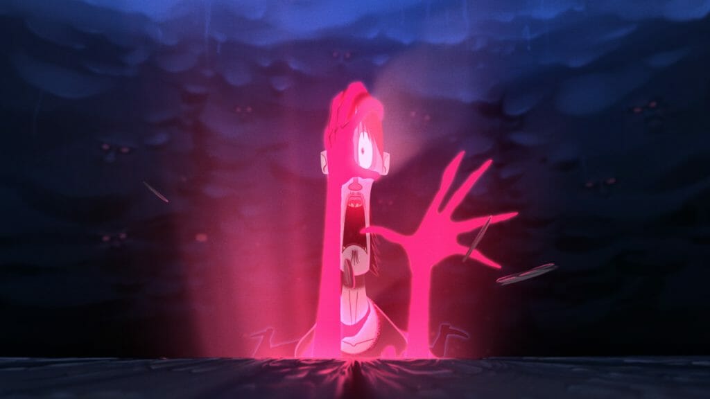
The real animation happens during the last shot. It’s all for the chorus when the hands start coming out and the camera’s coming in. And that was the hardest thing to animate, because I knew I had to cheat the camera going in there too.
The first hand coming out to the boards going over and the credits coming up — that’s one scene. I think it was about 900-and-something frames; 300 frames of him and then the rest is boards and the amulet coming towards the screen, which was all hand drawn.
I had a lot of trouble posing out the first shot, where everything’s so pushed. We don’t get a lot of chances to animate stuff like that, or at least I can’t remember the last time I have in the studio. So that was a tester.
The glow effects and vortex were stand-out animation — especially the depth that you gave it…
Shane: I should have done it on multi-levels and offset the spinning up, but we were running out of time. I should have drawn three, four or maybe even five layers of swirls going in. What I ended up doing was I threw them in a spiral and rotated the whole thing. In the middle, I had a mesh warp that made it look like it was rotating even quicker than the top. It really gives it that depth, plus I pushed it back in the Z depth just a little bit and turned it around.
The whole of the entrance of the coffin is a vignette of white and I had that slowly rotating too. It’s one of those magic eye things where it feels like there’s a lot more depth. The mesh warp was my best friend.
Were there any other key Harmony features that really helped out?
Shane: I used the blur a lot — way too much. I don’t watch a lot of cartoons outside the studio; And I watch a lot of 70s movies. They wrap focus so much with the film and the cameras they use, it’s so beautiful with the film grain that I’ve always tried to tailor a style around abusing those mini wrap focuses.
I replicated that in Harmony for The Gate, where previously I would have used a lot of After Effects. So, radial blur. Gaussian looks so good, but it chews a lot of memory up and it was just slowing down the last scene a little more than I wanted it to. I used glow, but mainly on the character outlines to give him a touch of moonlight around him because he’s a lineless design. I’m a simple man, I stick to the basics!
What’s next for you and The Gate, and what advice would you give to young animators who also want to produce a short like this?
Shane: When you’ve been working on one thing for so long and you’re reaching the finish line, you can’t wait for it to be over. Then it’s over and you’re fine and you take a breather for a month or two — and then you start to miss it. That’s what’s happening with me and The Gate. I would love to see where it could go next and finish the story, especially with Harmony 21.
I think maybe I used Toon Boom a little differently than other people around the studio. Not saying better, just different. I like to try and find a different path in software and people often say it looks good or doesn’t look like Toon Boom.
What people don’t see is the years of trial runs and unfinished files. Like I have a terabyte of unfinished Toon Boom experiments trying to get this style at home. So, my advice if you want to do something that’s different and a little darker than this is to start with little, tiny experiments to work your way up.
Start small and make mistakes — that’s the only way to get here and that’s the only way The Gate got done. You see the final product, but what you don’t see is the endless field of unfinished bad scenes. Don’t be afraid to make mistakes. A lot of them.
- Do you want to see more scenes of animated horror? Be sure to follow Shane on Instagram at @time.scum, and let him know that you appreciated his short.
- Curious about working with Mercury Filmworks? You can find a list of current openings at their studio in Ottawa, and watch more Mercury Shorts on their YouTube Channel.


