Pat Keegan is an artist, animator and storyteller who has won awards for eye-catching work across TV, film and animation. With more than a decade in the industry working on cult series like Rick & Morty, Pat is an artist who pushes the craft and reaches new heights using tools like Storyboard Pro. These two experimental clips showcase some of Pat’s visual world-building and technical wizardry.
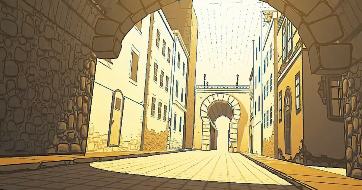
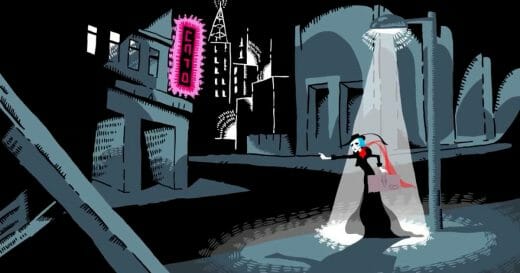
These scenes provide a wide range of movements through intricate city architecture — drawn brick-by-brick by Pat. One scene features a adrenaline pumping hover scooter ride through a sharply detailed Cyberpunk cityscape; which evokes the near-miss rush of classic scenes in George Lucas’ Star Wars: A New Hope or Ridley Scott’s Bladerunner. The other clip is a slow and dream-like scroll through the lower regions of an ancient city.
We caught up with Pat, hoping to quiz him about how he put these impressive scenes together. He was helpful enough to share a bit behind his process, including how he uses Storyboard Pro‘s 3D stage to create and control depth. He also had advice on building patience to achieve these technically-advanced scenes! Learn more in our interview below.
Hi Pat! Please give our readers a synopsis of who you are and the work you do.
My name is Pat Keegan and I am an Emmy-winning story artist and 2D animator working in film and television. I’ve been in the animation industry for over a decade now and worked on projects such as Anomalisa, American Dad, Big Mouth, Rick and Morty and some great upcoming projects at Netflix.
What attracted you to working as a storyboard artist?
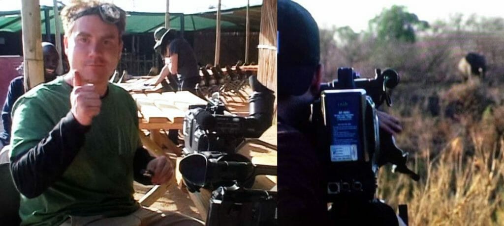
My journey to being a story artist was a little unconventional. And I think, ultimately, was born out of frustration for the chaotic and spontaneous, although amazing, nature of my career path prior to animation: wildlife filmmaking. I’d spend hours sitting behind a camera in the African bush collecting footage of animal behaviors. And you are at the mercy of nature at that point to whether or not the animals hit their marks or know their lines. They almost certainly never do; wild animals are horrible, horrible actors.
Until they are not. But dammit, Pat, you weren’t pointing the camera the right way.
In response, I think I course-corrected to the other extreme end of the spectrum where you meticulously pre-plan your ideas visually. And what captures that practice better than being a story artist? And now, as I write this and think back of my incredible experience in the bush, I miss it and I think I made a horrible mistake.

What can we see happening in the clips? Can you talk us through them?
These clips are essentially just large environments that I built within Storyboard Pro, that have dimensions that you can move your characters or camera through, in either longer one-take shots like in the examples, or you can move your character(s) and camera and compose shots within this stage without redrawing new backgrounds.
You call these clips 2.5D. Can you explain that concept in more detail?
Well, these aren’t 3D models and they aren’t just flat 2D planes with detail drawn on. It’s somewhat of a marriage between those two approaches. The environments have more than one side to them based on whichever side is ‘to camera.’ For instance, a building will have the facade, but also will have a side that perhaps runs down an alley that will move in perspective with the camera.
What can you share about the process behind these two clips?
TEDIOUSNESS. PATIENCE. The technical part is, essentially, almost like digital carpentry. Each piece of a doorway, for instance, is it’s own layer with its own piece of geometry: a rectangle, a square, whatever. Now you move that piece to where you want it on the stage, and maybe that piece is the side of the doorframe, so now we need another layer and piece of geometry to run along the other side, so that the door-frame keeps its form in dimension for whichever axis you are moving your camera through.
You keep building more and more pieces of these stage elements until you have your doorway, your table, your building, your whatever. Tedious, I told you. But the end result was always better for my projects than simply importing a 3D asset. In this approach, you can create a dimensional environment in the proper style that looks drawn and not just a giant gray box. Explaining an artistic process… it kind of loses its magic a bit, huh?
The 3D scene navigated by the hover scooter is breathtaking. What inspired this scene?
This is for a personal project that I am currently developing. It is a chase through a futuristic cityscape. I am going to write ‘cyberpunk’ here, and you have to know how much I struggled with whether or not I wanted to write that word. I am not sure if that word is too hacky or corny these days, but either way, it has that cyberpunk aesthetic.
Oh god. I’ve said it twice now.
What is your approach to textures in your environments?
Textures are tricky. I wouldn’t recommend them for these types of shots. Both are these long, sweeping shots that flow through larger environments, which is going to ask a lot of Storyboard Pro and your computer. So in these, there are little to no textures. For instance: one example has some brick and cobblestone, which I felt didn’t need dimension. So to sell that texture, all I did was draw flat stone detail or brick and mortar lines. The idea comes across without needless spinning beach balls or program crashes that seriously sabotage your mental health.
What features of Storyboard Pro help you execute these techniques?
I think a huge part of Storyboard Pro that is underutilized, at least in all of the productions I have been lucky enough to help with, is the Stage View. This is an area where something like this shines. You have the 3D stage to freely move your assets back and forth to instantaneously create depth.
In Stage View, you can grab the screen and move around to get a preview of your shot before placing your camera. It’s almost like when you see a live-action director looking through a viewfinder to discover the best angle or composition. Stage View lets you see your entire setting as a whole and work out your camera work, and inspire blocking ideas before moving forward.
What is it like working as a storyboard artist on major animated productions like at Netflix?
Netflix has been amazing. At least, for the two projects I have been fortunate enough to work on. I have worked on many productions with various types of pipelines and these last two projects at Netflix were what I was always looking for in regard to collaboration on a project. It seemed like a small team just trying to make something great. Ideas were welcomed, pitches were an event where the story artist could shine or horrifically bomb; I’ve been through both, but either way, each is memorable.
Having said all that, my time at Netflix coincided with working from home during the pandemic. Dealing exclusively with virtual meetings and pitches can be difficult. But given how much I enjoyed it, it just speaks to the amazing crews that I had the chance to work with. I look forward to working with them in person at some point… I just need to relearn how to act like a human being in public again.
Do you have a final word of advice for aspiring storyboard artists?
Create your own stories. I feel there are multiple benefits of boarding your own stories: Let’s say you are on a project that maybe isn’t doing it for you, but you need the money or are just gaining experience. Animation is a demanding business and it’s easy to get burnt out or fall out of love with it — so work on your story after you punch out. It will help keep you inspired or motivated, if you are not scratching that itch on your day-to-day projects. It keeps your passion burning.
Secondly, the best way I learned was to have my own story, cinematography and composition ideas. Experiment with the programs, push the programs, get out of your comfort zone. We are artists, I know how frustrating and scary it is to be new and not great at something. Be okay with being new to stuff. Work at it and then tomorrow, you’re better. The day after that: “Wow! I’m kind of not bad at this anymore.” And before you know it, you are this whole new artist with this new awesome skill-set. And, frankly, you’ll be embarrassed by the skittish, boring artist you were beforehand. Also: it helps to have a partner or spouse who has a career with a consistent paycheck.
- Interested in seeing from Pat Keegan? You can find storyboards, animation and drawings on his website.
- Ready to plan your next project? Artists can download a 21-day trial of Storyboard Pro.


