In Mylène Thisdale’s thesis film Graffitude, a young graffiti artist paints on a bakery’s outer wall at night. With a chuckle he sprays over the bakery’s security camera. The baker, after cleaning off the security camera lens, she finds a completed mural depicting herself serving the community. After struggling to crack a smile, she gives the sheepish artist a thumbs-up.
Graffitude won both the Triple Boris Bursary and the Toon Boom Animation Bursary at Cégep du Vieux Montréal’s animation gala. The short makes effective use of compositing and colour design in Toon Boom Harmony to leave a lasting impression on the viewer. We had the chance to catch up with Mylène Thisdale to discuss the process of creating an eye-catching thesis film.
I had the chance to watch Graffitude, and it’s delightful. There’s a nice little twist at the end when the baker tries to smile.
Mylène: A lot of people seemed to like the finale. I’m very happy about that. I really like subverting expectations, so when I came up with that idea I was hoping that people would like it.
What inspired you to make graffiti the subject of your student project?
Mylène: The whole idea for my film came from a shot I wanted to try in the storyboard of having the camera be covered up by something, someone wiping it away and showing the viewer the next scene. And with that I thought, “What could cover the screen? It could be sand, it could be dirt… Oh, paint!”
So I went with the graffiti theme and used a character that would cover the camera using spray paint. And then I built the story of my film around that.
How would you describe your role in this project? Were there other contributors?
Mylène: This is a solo project. We have the help of our teachers and the staff at school, but we do everything on our own. And that is quite the challenge, because you’re still refining your idea but you have to make your designs as soon as possible, because you’re still in a time constraint.
Fortunately, you have input from your peers, you have input from the teachers and other staff members, to help you. It does help a lot to have people who have experience or just a different eye creatively to tell you, “I think you should try this and that,” when you’re in the early stages.
In the later stages, once everything is set, things move super quickly in production, and you don’t really see the time go. Everything happens super-fast but it’s smooth because you already have all the preproduction work behind you.
Was there a particular part of production that you enjoyed the most?
Mylène: I really enjoyed compositing. I found that seeing a scene come together, and seeing how much detail and polish I can add to my film, and really pushing the final images, really interesting. And seeing everything come together when you’ve worked on something for a year and a half is always super rewarding.
Then there’s the painting sequence that happens in the middle of the film, with the close-ups of the can and paint effects. It’s definitely another highlight of the project for me! I was a little worried when working on the animatic that the cuts would be too jarring after adding colours. Fortunately, that wasn’t the case! This was a sequence I wanted to try when I decided on the graffiti theme. It was a lot of work with many effects involved and a lot of fine-tuning; I’m quite proud of how well it flows!
What did the planning stage of this project look like?
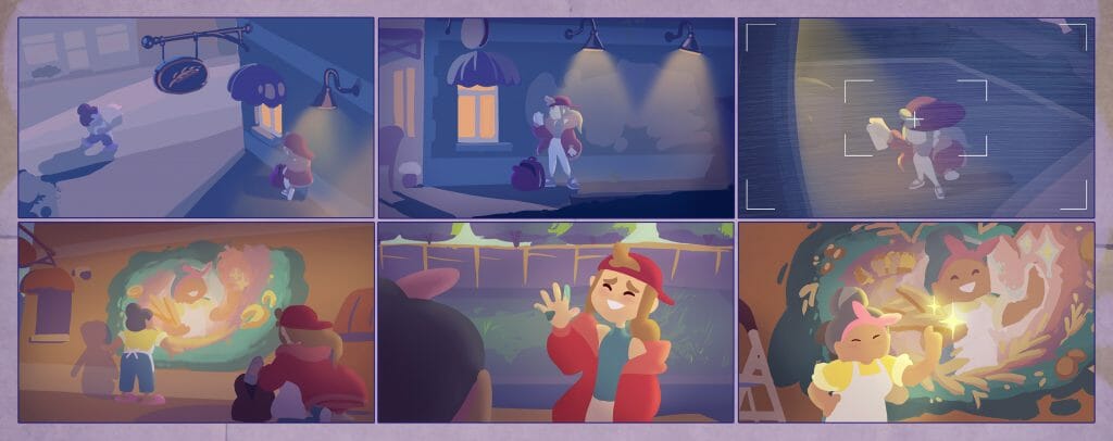
Mylène: We come up with our idea, and then we present it to our peers. We have a thirty-second time constraint for our film, because we have to make sure that we can do all the production work on time. And then we discuss the idea, we see what we can add or we can cut to make sure that it fits.
Once the idea is pretty much set, we start working on the storyboard. We do many retakes to make sure that everything fits and functions. While we’re working on storyboards, we’re working on the character designs, the background designs, colours. Once we move on to the animatic, then we really have to make sure that our film isn’t too long, to make sure that we can actually produce it. And then once all those stages are done, then we move on to production.
What techniques and programs did you use to make Graffitude?
Mylène: I used pretty much only Toon Boom Harmony software. There was Photoshop for the backgrounds, but all the animation and compositing was made in Toon Boom Harmony, and the storyboard was made in Storyboard Pro.
I especially enjoyed the compositing of my scenes directly in Harmony because it’s so much simpler when you have all the tools at your disposal in the program that you use to animate. So if you have to make modifications to the animation, you can do it directly in the software.
I had a really good time using different tools as well. The can of paint that my character is using to paint the wall is actually a 2D rig. So it’s a 360 rig that I could put in my animation to save myself time. It’s not perfect, but I made it for what I needed, and I managed to implant it in my film.
For the signboard at the beginning, some people asked me if it was a 3D object. My answer is “yesn’t”. It’s made of two flat drawings put in Harmony’s 3D space and animated it with a peg. The thickness was then hand-animated, with a creative use of Harmony’s layers to save time. Then all that was left was to add some compositing magic to make it pretty.
How did you go about designing the setting? Was it challenging to make a back alley look appealing?
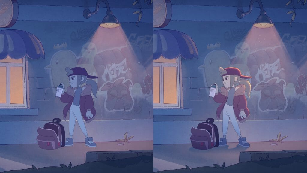
Mylène: I bounced between a few ideas, specifically in terms of the colour. I opted for a lot of colour, and to go for a painterly style, kind of watercolour-y in my case. So I went with a lot of hue contrast.
I have a night setting and a day setting. For the night, I wanted there to be a lot of blues, a lot of purples, with a yellow light to contrast. And for the day, I wanted to have all these oranges and yellows. So I went with a lot of hue contrast.
How did you approach designing the characters?
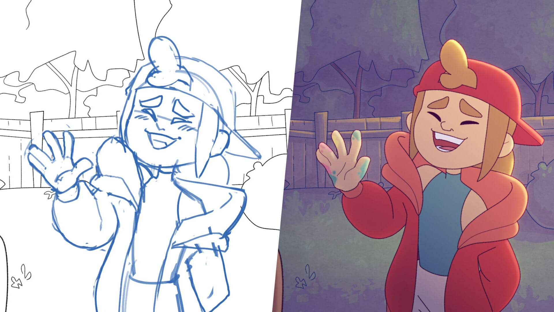
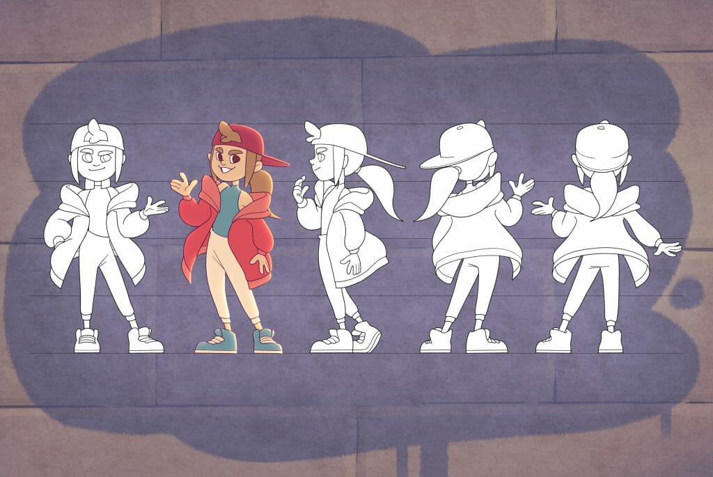
Mylène: For Fred, the young troublemaker, I wanted to go for the baggy-style clothes, but I wanted to keep a dynamic silhouette that I could work with for poses. I wanted to make sure that I could have clear silhouettes. So I ended up only picking an oversized sweater and making everything else a little more form-fitted so I could have dynamic poses that are clear to read.
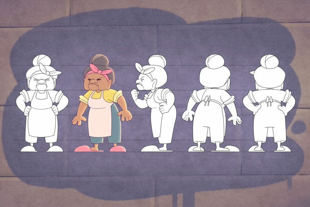
For the old lady, Michelle, I was very inspired by the little old ladies that I meet in public transport everyday that have super-cute style but for some reason really stern expressions. I found that contrast really cute. So I designed her around that.
The highlights and shadows in this film really stand out. What techniques did you use?
Mylène: I ended up doing two layers of highlights. I have one layer of highlights with a harder edge, and another layer underneath that’s really blurred. And I also added a little turbulence to it, a little noise, to add some texture.
I had the opportunity to add a texture on top of my characters, but I found that that flattened them out a lot. So I only ended up putting the texture on the highlights, and I quite like how it came out.
For the shadows, I used mainly gradients to make sure that my characters would fit in their environment.
What challenges did you face in producing Graffitude?
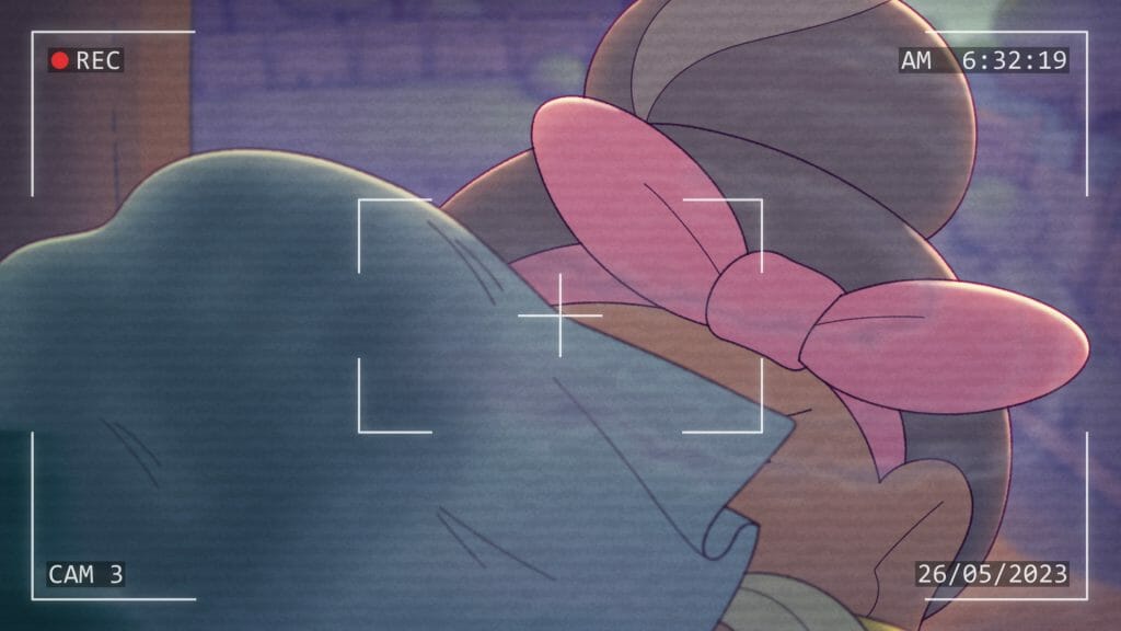
Mylène: There were quite a few! On the subject of compositing, in the scene where Michelle wipes the camera with a piece of cloth, I actually did very few hand-drawn effects on that scene.
The little humidity trail that the cloth leaves behind was all procedural, in a sense. I drew a pencil line where the path would be and I added some blur and turbulence to make the water effect. Unfortunately, that meant the scene was very heavy. But I had a lot of fun experimenting.
In terms of animation challenges, there’s a lot of acting in my film. There’s a lot of subtle movements. So that was definitely a challenge. But the biggest one I can think of is definitely the walk cycle at the very start of the animation, when the old lady is walking with the sacks of flour and a box in her hands in that top-down view. That was very challenging to animate and I had to do quite a few retakes.
I see you’ve won multiple bursaries for Graffitude. How would you describe the reaction to your film so far?
Mylène: It’s very overwhelmingly positive. I’m so happy. People are complimenting me on the technical aspects of my film, people are noticing the detail that I put into it. I’m very, very happy about that, because I had fun making it.
People are also positively reacting to the story as well, saying that it’s very heartwarming. That was something I was hoping to achieve – that heartwarming feeling at the end with the little twist. So I’m glad people caught on to it.
Do you have any advice for students planning their thesis films?
Mylène: Two words: organization and consistency! It’s so important, when you’re working on a project on your own, to use every tool at your disposal to make sure that you are organized, in a way that makes the road ahead look less daunting.
If you’re able to break down the big tasks ahead into little bite-sized pieces, that will make it so much easier. It makes these goals seem so much more achievable. If you get organized from the beginning, it makes it a lot less stressful.
Also, get other people’s opinions. That’s always super valuable, because you see your work every day. And sometimes you feel stuck. You’re not sure. You’re messing with a hue slider, +2, -1. Sometimes getting someone else’s opinion, saying, “Actually, you’re using just straight-up the wrong value,” can change your perspective. Maybe you’re not focusing on the correct problem because you’ve been staring at your work for so long. It’s really helpful to ask other people’s advice.
What do you hope to work on in future projects?
Mylène: I’m not quite sure yet. I’m hoping that I can find a workplace that will allow me to use my full skillset. I’d really like to touch on a lot of things and put my attention to detail everywhere. Overall, I just want to contribute to making cool projects happen.
- Interested in hearing more about Graffitude’s festival run? Follow Mylène Thisdale on LinkedIn and see more of her work on ArtStation.
- Ready to use Harmony or Storyboard Pro for your thesis film? Toon Boom Animation offers student licenses.


