For the launch of Toon Boom Harmony 20, we hired seven artists and teams around the world to participate in a demo video highlighting the features and capabilities of our new animation software. These artists were drawn from both the Toon Boom Ambassador Program and our international community of artists, who were given total creative freedom to construct their scenes.
We previously highlighted Mark Borgions on the Toon Boom blog, along with his work animating illustrations with Master Controllers using Harmony Premium. Mark runs his design studio, HandMade Monsters, in Antwerp, Belgium. His illustrations have been published in advertising, editorial, reference books and galleries around the world. We interviewed Mark about his scene from the Harmony 20 demo pack and his professional practice.
Final render of In Our World, Mark Borgions’ scene from the Harmony 20 demo video.
What was the prompt that you were given, and how did you interpret it for this project?
We had a Skype call with everybody involved. The only thing on the table at that moment was the voiceover text. During the call everybody got to pick a few sentences they felt comfortable working with and we discussed the technical focus of each piece of animation. As it turned out, I had the opening, something about a world full of possibility.
So to me, those were the two elements: 1) It being the beginning, 2) it being about wonder.
Was there anything about this project that surprised you?
To just say, “go do what you think works best,” was a bold move from you guys. Everybody on the project had a certain technical aspect they had to focus on, but that was it. To have that kind of freedom also allowed me to dig a little deeper in little details. Maybe they are things that nobody will pick up, but I know there’s little things here and there I could try because of that freedom.
{% video_player “embed_player” overrideable=False, type=’scriptV4′, hide_playlist=True, viral_sharing=False, embed_button=False, autoplay=False, hidden_controls=False, loop=False, muted=False, width=’800′, height=’800′, player_id=’31442722554′, style=” %}
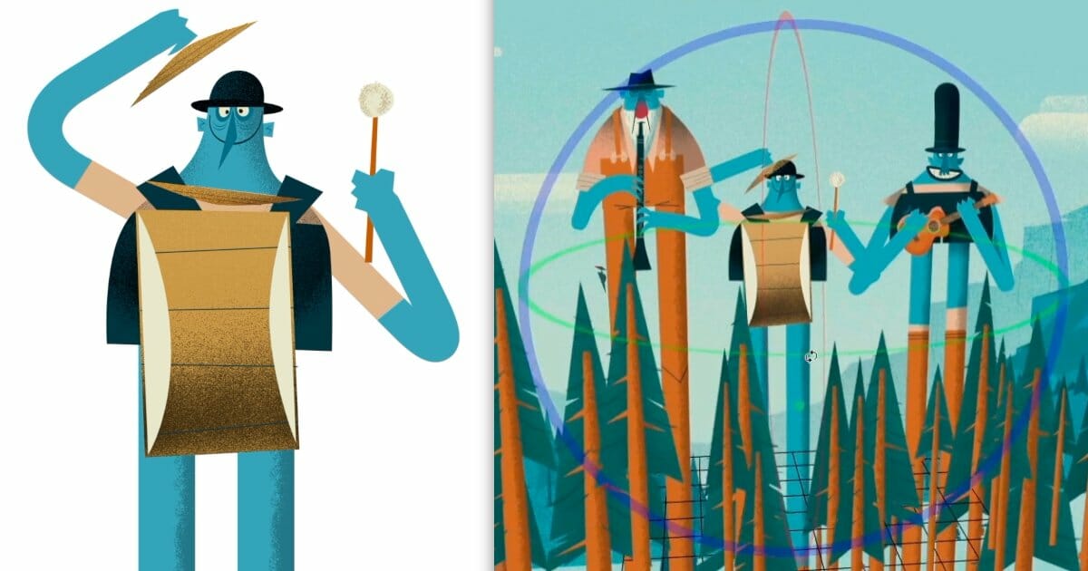
The drum-playing giant featured in Mark Borgions’ scene from the Harmony 20 demo video.
Your scene escalates quickly, from a squirrel climbing a tree to giants towering over the forest. How did you plan out this transition?
Because this is the opening of the movie, I felt it needed a bit of an ease-in. Yet, as it’s only a couple of seconds, I needed to find a way to get to some sort of action fast.
I liked the idea of ‘tree people’. It’s something I once stumbled upon while doing an illustration, and I’ve always felt an urge to explore more. So you have these trees, and a pedestal camera movement reveals that some of them are actually giants. Moving the camera up in the trees gave me a way to switch from one way of looking at the scene to another in very little time. From there, I looked for a way to bring some action to the giants.
What was the most technically or artistically challenging element of your scene?
The idea of scale was the tricky part. How fast would the giants move, again keeping in mind the very limited time I had to tell the story. The way the drummer giant approaches took quite some tweaking because of that. One thing I had never used before now is the Focus Node, yet that turned out to be a very important thing that helped me sell the concept.
{% video_player “embed_player” overrideable=False, type=’scriptV4′, hide_playlist=True, viral_sharing=False, embed_button=False, autoplay=False, hidden_controls=False, loop=False, muted=False, width=’1280′, height=’720′, player_id=’31442984310′, style=” %}
The OpenGL render of the 3D multiplane camera layout used in Mark Borgions’ scene.
You’ve mentioned before that you enjoy the imperfection and restrictions that came with print media, and it has a significant influence on your style in digital animation. How did you bring those elements into this scene?
A lot of the elements in the scene are imported bitmap assets. Those have the grain incorporated. For other parts, like arm or facial detail, I wanted more flexibility in Harmony. I used a lot of texture brushes, sometimes on separate layers, so as to be able to move the grain around as needed.
I also put a colour correction node before the write node, so I could bring some wash and glue to the colour scheme, very much like I would do with a still image.
Which of the characters did you enjoy designing the most? How do you approach abstraction in character design?
Looking back at it now, I think the guitar giant is my favourite. He has a bit of a comical way how he wears his shorts high up.
Abstraction is indeed something that I think is extremely important in character design, but it’s a double sided sword. Because in restricting detail, there’s always the danger of becoming too generic, too ‘smiley’ in design. That is something I really try to avoid. It’s always a balance between a push to geometry and elements that break the perfectness of that geometry.
So even as a lot of the things in my work have symmetry, it’s never truly symmetrical. Very much like a real person never has two identical eyes.
{% video_player “embed_player” overrideable=False, type=’scriptV4′, hide_playlist=True, viral_sharing=False, embed_button=False, autoplay=False, hidden_controls=False, loop=False, muted=False, width=’766′, height=’646′, player_id=’31442722871′, style=” %}
Mark Borgions controlling the face rotation of his guitar-laying giant using an interpolation grid.
Which features in Toon Boom Harmony were most useful on this project? Did you use tools on this project that you wouldn’t have otherwise explored?
I am such a huge fan of deformers. I use them. All. The. Time. So for the characters, I’d say those are the most important.
Secondly, I’ve become addicted to Master Controllers, even if it is for characters that I barely need to move. They are so easy to set up, and have such instant gratification.
Maybe the biggest change for me was in the output. Normally, I tend to render my different layers as different sequences, and post-process them as needed. But this time I wanted to stay in Harmony for the complete process. As said, I used the focus node for the first time. It’s easy to use and so effective, I already altered my method of rendering for other projects.
How did this sequence compare in scope with other projects that you have worked on in the past?
It’s very short, and it takes place in one — be it a very wide — location, so that narrowed it down a bit. But all in all, it is comparable.
I work alone. I don’t have a well-planned production pipeline. I tend to do stuff, look at it a couple of times, try to define what I like and dislike, and go back a few steps to tackle what I just learned. If that is redoing a character I had just completely rigged, so be it. I think I wouldn’t last an hour in a normal production environment. I think it comes from the way I work on my illustrations, where I work quite similarly.
I know sort of what I’m aiming for, and then I work until I have something that does what I want it to do, regardless of the time it takes me. Or the effort it takes. The only thing of concern to me is how the result looks.
{% video_player “embed_player” overrideable=False, type=’scriptV4′, hide_playlist=True, viral_sharing=False, embed_button=False, autoplay=False, hidden_controls=False, loop=False, muted=False, width=’1080′, height=’1080′, player_id=’31442728009′, style=” %}
Isolated animation of Mark Borgions’ guitar-playing giant.
Did you have the opportunity to try new features in Harmony 20 that you would be interested in using in your work? If so, what impact would it have on your process?
I said before: I really love deformers. So learning that they received a major boost in Harmony 20 interested me. The Weighted Deform Node is really cool, and the way you can now stack deformers and envelopes seems like a real game-changer for me. I know I only just scratched the surface, but it already shows enormous potential for the way I work.
Something simple like a head turn, for instance, where the scaling of the left eye is different from the scaling of the right eye, is now a lot easier to do. It’s going to eliminate a lot of layers, because I can now do all this with these envelopes.
I also welcome the new Point Kinematic Output Node options. I can think back of a couple of projects where I could have really used those.
Do you have advice for artists who want to experiment with different styles in Harmony?
Harmony is such a versatile tool, it can work for everybody. So I would turn it around: if you have a certain style, and you want to do a moving version of that style, test what’s in Harmony’s toolbox. See what can help you to make it work in motion. Each style or look demands a certain way to go about it. But since it’s all in the same package, it’s never exclusive. I’m very much a vector person, but if I need a brush smear, I can add it without a problem.
I like that with each version, there’s new nodes that can help eliminate the need for post processing. Like the new color curve node, is something I know I’ll use a lot. And to have it at this stage of a production, allows me to use it more as an animation option than as a post option. Simply attach the node where I need it, no need to render alpha channels or separate elements any more.
Want to see more from Mark Borgions? You can find a curated portfolio on his website and his latest illustrations on Instagram. We also hosted a live Q&A session with Mark on Twitch, which you can watch in its entirety.


