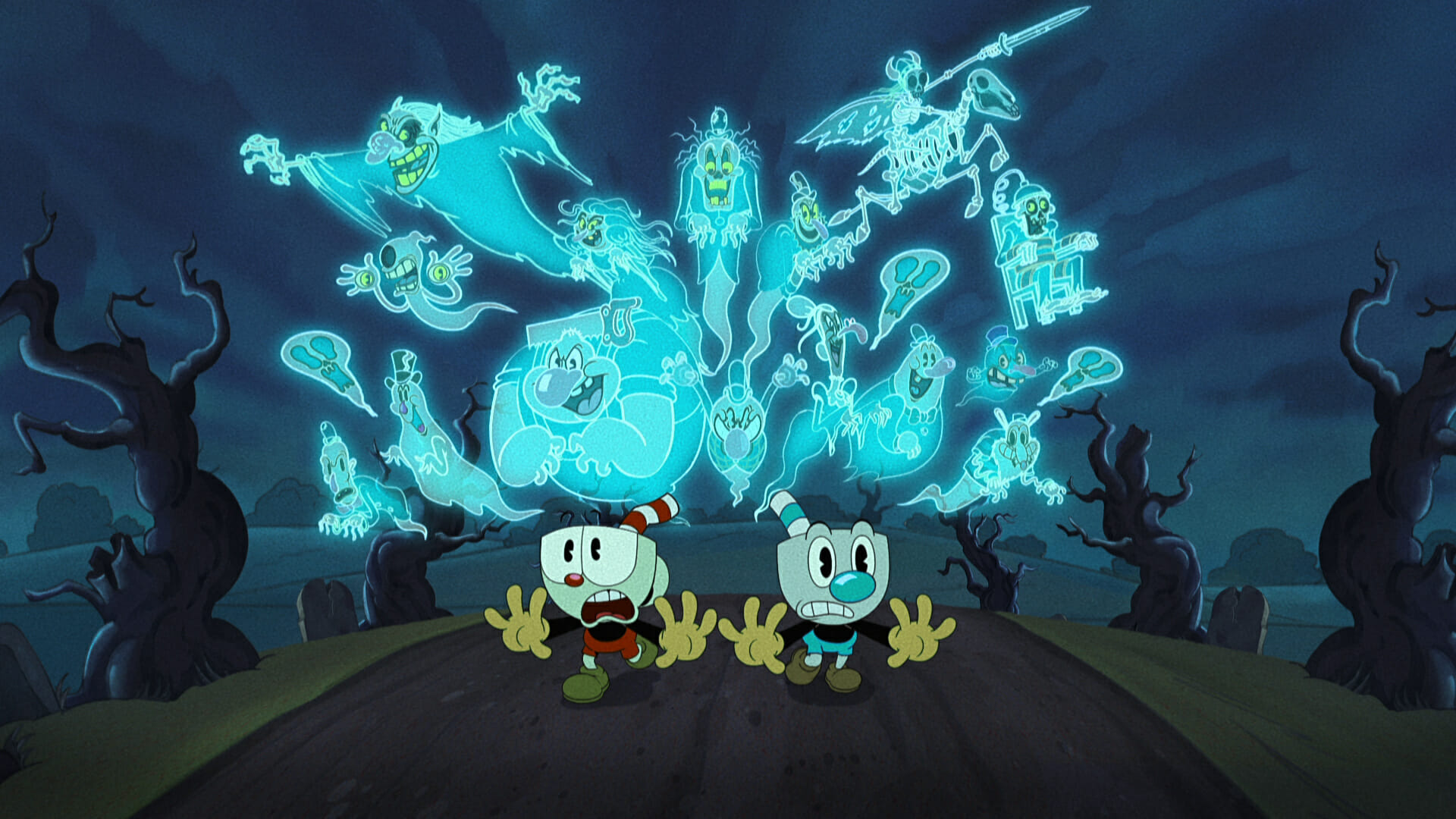
The Cuphead Show! is a new series from Netflix based on the wildly popular video game by Studio MDHR. The original Cuphead game captivated fans by paying homage to 1930s cartoonists, such as Max Fleischer and Grim Natwick. The game also features a big band jazz soundtrack alongside charming, handcrafted animation.
Released in February 2022, The Cuphead Show! is also a tribute to the Fleischer Era of animation, with ambition, a modern eye, and a genuine appreciation of the source material. This hybrid digital animation series, animated by Lighthouse Studios, follows the misadventures of the loveable, impulsive scamp Cuphead, and his cautious but easily swayed brother Mugman. Lighthouse Studios was responsible for production, from layout to locked picture.
We caught up with the Lighthouse Studios team to learn about how they achieved its classic aesthetic through rigging, lighting, and effects. Read on to learn insights from Paul Madden (Assistant Director), Andy Stevens (Animation Supervisor), Marty Broski (Lead Animator) and Nathalie Sandstad (Deputy FX Supervisor).
To start, can you tell us about The Cuphead Show!?
Paul: The show is about two brothers, Cuphead and Mugman, who go on all these adventures that revolve around the chief antagonist, The Devil. The series is based on a video game called Cuphead, which is a run-and-gun game made by Studio MDHR in the style of 1930s animation.
Cuphead is the more boisterous of the two characters and Mugman is more hesitant; always worried about getting into trouble. Throughout the series the two brothers encounter different characters while The Devil reappears several times.
Could you share some background on Lighthouse Studios, and how your studio got onto the project?
Paul: Lighthouse Studios has been around since 2017, it was formed by Mercury Filmworks and Cartoon Saloon. The studio is based in Kilkenny, Ireland, but we have artists and crew from all over the world. We work with production partners like Amazon, Apple, Netflix, and Warner Brothers. Before getting started on The Cuphead Show!, we did a test for Netflix, and they were really happy with what they saw.
Most of us at Lighthouse were aware of Cuphead the game. So it wasn’t hard at all to find crew interested in working on it. There’s a fanbase within Lighthouse of artists who’ve played the game; as well as artists who love the style of old cartoons, like Fleischer, and old Disney. The appeal of Cuphead the game is that it’s a love letter to animation. It’s not just an old style of video game; it uses an old style of animation, too. Being able to combine the enthusiasm of our studio for the game with our love of classic animation made The Cuphead Show! a great project for us to get into.
Andy: Doing the test for the series was exciting! It was the first time that the whole studio across all the different departments came together to really sell itself on a project. Everyone at Lighthouse was passionate about Cuphead, some of us were fans of the game already. Doing the test was fun because it gave us the chance to bring in a lot of our own ideas and inspiration. The test followed what Netflix was looking for. But because it hadn’t been through pre-production yet, we got to be quite imaginative with what we put together.
How big is the team behind the show?
Paul: We have a big team working on The Cuphead Show! because along with animation, Lighthouse also handles layout, backgrounds, rigging, scene prep, lighting and effects. Throughout production, we had a lot of interaction with Netflix; particularly with their creative leadership. Although Lighthouse looked after the production from start to finish, it was creatively led by Netflix every step of the way.
Nathalie: All of the departments working on The Cuphead Show! also have sub departments. And our teams have grown as production has gone along. For example: The FX department started out as a fairly standard sized team; with two sub departments: special effects and lighting. As production developed, those sub departments grew into separate ones. This helped us better accommodate all the designs and animation that Netflix wanted to see in the show.
What was your process for adapting the original Cuphead game into an animated series?
Paul: We had really great character designs, model sheets and environments to work with when we got started; given to us by the Netflix team. Things were nicely set up for us to adapt those materials for the pipeline at Lighthouse. But it was up to us to figure out how we could achieve the rubber hose 1930s animation look, from a technical perspective.
Netflix had given us references for that older, hand drawn style of animation. We had to come up with the processes on our side for how we would get that look by leveraging the teams and the software available. We wanted to incorporate hand drawn animation with rigged, digital animation; and then the traditional 2D effects and lighting as well. Overall, a lot of proprietary work went into the project before we actually got started on animating it.
Andy: A general approach at Lighthouse is to always treat the project as if it was traditional, even when we’re doing digital animation. We always encourage our animators to frame the animation as drawings. Whether they are posing or deforming elements, they should always think of it as a drawing first. It’s so important to use drawing principles — so that we achieve a good line of action, good volume, and a good silhouette.
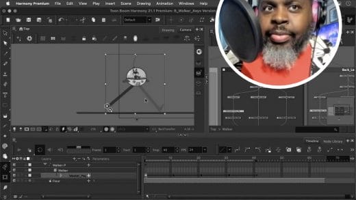
Using a 2D digital system allows the animator to be part of every step. And they can see what the actual final product will look like in real time. This allows them to adapt and make adjustments to get the animation looking as good as it can. Toon Boom does have automations, like tweening, but we encourage our animators to use those as starting points to help achieve that authentic hand drawn look.
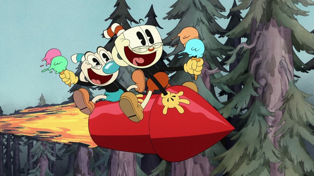
Can you share more about the process behind how you achieved The Cuphead Show!’s 1930s look?
Paul: Aside from referencing the hand drawn style, effects and lighting were a big part of achieving the show’s aesthetic. Andrea Fernandez is the art director on the show and she worked with Dave and Cosmo to influence the look of the series; from the backgrounds and layouts to the effects and lighting and the final grade.
It was great having so many references beforehand, that Andrea was able to work off of, to build up the designs and model sheets. She also directed us toward some classic styles for the effects and lighting, which helped add to the overall classic look of the show.
In the stages of development — of working from final animation and adding the effects, lighting, comp, and the grade on top of it — it really starts to come together. Adding those elements is what really brings out the 1930s cartoon look.
Nathalie: For effects, we would usually be provided either a series of designs or breakdowns of how the particular effects should look. This could sometimes include a direct reference; which was always very helpful for us, because in effects you often come from different projects with different styles. Having references helps us envision the desired look much better.
For effects, we always have to look at how we can incorporate and utilize the software to the fullest of its ability to help us achieve the look. But also maintain the schedule we’re on. One important strategy for us was to incorporate some of the lesser-known tools for effects, which includes rigging tools. For example: deformers, constraints, or even comping tools, helped us bring together the whole look.
Lighting was challenging for me initially. Because it was new to me to collaborate between rigging, animation, and comp to get that final aesthetic together. Our strategy was to look at the rigs and at the animation’s approach, and then break it down to see how we could apply the traditional look. We always referenced the designs that we’d received from Netflix. Because they had such a particular style, we had to follow them closely to replicate them with the lighting. The lighting was a fun challenge!
Marty: For the animation team, the most important goal was to pay as much homage to the 1930s; in balance with some more modern elements. Despite the classic look, we were referencing the 12 animation principles. Back in the 1930s, those principles were in the making. To create truly 1930s animation you do have to overlook some of those principles, which we didn’t want to do. I’d say our biggest challenge was to balance the rubber hose animation look with something that would translate well in modern times for the modern viewer. Things such as smears and drags helped us to make the show feel less rigged and more hand drawn.
You might notice in the show that there is a lot of dancing. This is something we did on purpose to align with references. Every dancing shot had its own reference; Mostly references from the Nicholas Brothers, of Cab Calloway dancing. Aside from looking at live action footage of dancing from back in the day, we’d look at clips of shows like Popeye and Betty Boop. We built off of our massive library of references to create dancing scenes that mimicked the style but appealed to today’s audience.
Roll the Dice!
— Marty Broski (@ismartsy) February 19, 2022
This scene is my pride and joy of season 1. I absolutely loved animating it. It is by far the most complex shot I’ve done in my career, and I couldn’t be happier working on it and how it came out. (1/3)#thecupheadshow pic.twitter.com/LwbuFFNZJg
The Cuphead Show! used another technique pioneered by classic animation: stop motion animated backgrounds. Can you tell us about how you applied this technique, and the result it created?
Paul: Every so often in Fleischer cartoons you would see a stop motion background or backdrop that a character would walk through. To reference that aesthetic element in the show, the stop motion animated backgrounds were done by Screen Novelties in LA.
Screen Novelties provided the stop motion, and then our animation teams here worked with the boards and animatic to extract that timing. Then we were sent early rushes of the stop motion to get a better sense of the timing. And then animation would be added on top of those scenes. It was a bit of back and forth between ourselves, and Netflix, and Screen Novelties.
Combining different types of animation, like 2D, 3D, and stop motion can be tricky. The key is to composite it all well together to ensure that the characters look natural; like they belong in the different animation environments.
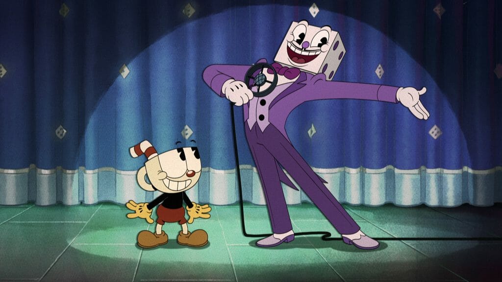
Marty: There was one particular tricky shot that we got from stop motion. It was a shot where there was a camera rotation with characters involved: King Dice and The Devil. First we received the footage that would be important for a shot from Screen Novelties and Netflix. Then we would adapt to what was given to us, but try to keep it true to the animatic. We would rough the entire scene; making sure we were able to track the foot position, which is important since the entire camera was moving. After that was reviewed, we’d put in the keys followed by animation. The trickiest part of that shot was tracking the stop motion with the background. One thing we did was put X markings on the ground to track where the characters would be planted.
Back in the times when they made stop motion cartoons they followed a really similar process. So there was no cheating in how we approached it!
Do you have any tips for artists who would like to do animation that has a classic look to it?
Andy: I think the best place to start is by watching and studying old Fleischer cartoons as well as the Silly Symphonies from Disney. In watching a lot of the classics, you’ll pick up what makes them unique. Like, you’ll notice that animation then was much more performative than it tends to be now. The stories were a little less narrative and it was driven by gag-based, performative characters. You’ll also notice that classic animation tends to be shot from one angle, like stage theatre.
It’s helpful to watch a lot of old animation and then study how it’s evolved since then. For example: learning about how the 12 principles of animation have changed the look and style of animation over the years can be helpful for understanding how to achieve the old, classic look. There are a couple good books that are worth reading. Shadow of a Mouse by Donald Crafton is a good one.
Marty: I agree! Looking at references is super important. And then studying and knowing the 12 principles of animation will help you figure out how to create the classic look using modern animation practices. When it comes to rigging, don’t be afraid to deconstruct the rig and experiment with it. Sticking to the rig itself won’t achieve the classic animation look; we also draw all the time. We have gotten to the point where we draw all the hands, feet, mouths, and follow through movements.
Don’t be afraid to experiment with hybrid techniques like this!
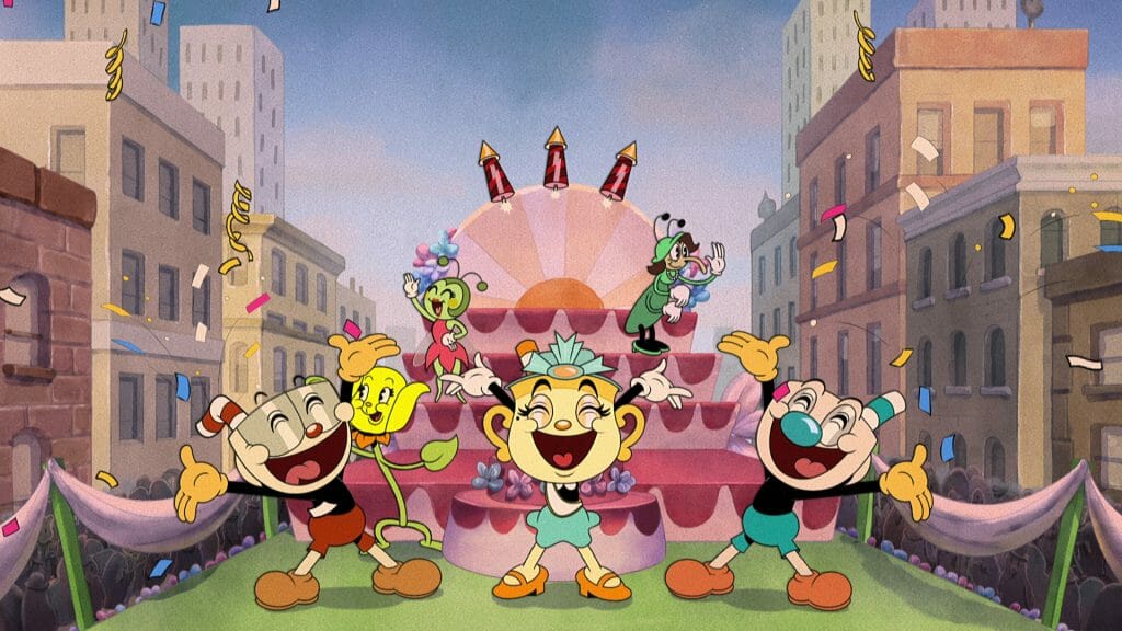
In Animation Magazine, your colleague Dave Wasson mentioned how the studio drew special poses by hand in Toon Boom Harmony. Would you like to elaborate on the work that went into that process?
Andy: Generally, the real key to making rigged animation look hand drawn is to have more unique looking drawings between poses and the breakdowns. Most rigged shows that look rigged typically stay very close to the “default” model of a character. So you really need to push the poses to hit an emotion or feeling better. But more importantly, see that contrast between poses and even in-betweens.
The boards capture the emotion well, so Netflix would provide special poses based off panels that work as a strong starting point; to show how far to push a character in a scene, or just to hit a particular bit of acting correctly. These were also great because as time went on, they determined how far you can push a character. We also had a do’s and don’ts pack that was mostly, if not entirely, constructed by Adam Paloian. Adam was one of the episode directors, and also drew up a lot of the special poses. Combined, it also allowed the animators to explore scenes better that didn’t have special poses.
The do’s and don’ts themselves are over a thousand pages long; including special poses we’re probably talking over tenfold in terms of total drawings. In summary they were really the blueprints of the show that we at Lighthouse had to put together.
SO many amazing CUPHEAD posts out there already! I’m biased, still, I’m BLOWN away by their work! Here’s some of my work for Roll The Dice. Let’s start w/ Dice entrance: I tried to capture Cab Calloway w/out takin the rotoscoping route, but still paying homage to those BBoops?1/ pic.twitter.com/pYZ7ztNZ8w
— Benjamin Arcand (@crazybaloney) February 22, 2022
Were there cartoons of the 1930s era that the team watched or referenced while working on the production?
Paul: The crew were able to watch a lot ’30s and ’40s Fleischer, Ubi Werks and Silly Symphonies as part of research into the rhythm and style of those cartoons. Classic Popeye, Betty Boop (including Bimbo’s Initiation), Mickey Mouse and more were good references. Lighthouse got to see how Fleischer made use of the multiplaning stop-motion backgrounds with 2D cell characters; and also iconic cartoon moments like Skeleton Dance and Cab Calloway dancing/rotoscope that influenced sequences in the Cuphead Show.
Andy: Ghosts Ain’t Real is reminiscent of Skeleton Dance and Swing You Sinners, while anyone familiar with Mickey Thru the Mirror may see some similarities in the unfortunate telephone who loses his soul. We watched a lot of Popeye, particularly Popeye the Sailor Man Meets Sinbad the Sailor for various episodes. There is some cool stop motion background work in that one too; like how Screen Novelties handled it for the show.
Generally, we would watch a lot of Silly Symphonies or Fleischer work where we could. Or just for fun! I regularly go back to Betty Boop M.D. It’s a good short because you have Betty, Bimbo and Koko on the stage performing. But then you also have all these customers having their own performances or just reacting to things; so it’s just a good source of ideas for keeping things alive. Also, the ending of that one is crazy.
- Ready to pour over The Cuphead Show!? The first season is currently available to stream on Netflix.
- Think you have what it takes to work at Lighthouse Studios? Roll the dice and visit their careers page.
- Interested in starting your next animated project? Download a free 21 day trial of Harmony Premium.


