Spiritfarer, from game developers Thunder Lotus, finds a beautiful way to confront life’s most serious question. It is, essentially, a game about death. You play as Stella; your role is to ferry lost spirits through purgatory to an after-life called The Everdore. On this journey, characters find peace in themselves, come to terms with passing, and ultimately say their goodbyes to the living. For its solemn subject matter, Spiritfarer is a warm and comforting game that is likely to pull at players’ heart-strings. This fantastic animated trailer from Knights of the Light Table shows us why.
The Texas-based studio knew that to do Spiritfarer justice, they would have to present faithfully the endearing characters, serene settings and delicate moments of subtlety that make the game what it is. The result is a poignant and polished 90 second trailer that handles the business of death with delicateness.
Now firmly back in the land of the living, Knights’ David Liu and Patrick Stannard were kind enough to share some of their process. They explain how they faithfully rendered the Spiritfarer world while channeling the emotional charge of its storyline. Read our interview below.
Your animated trailer for Spiritfarer is a beautiful, emotional snapshot of the game. What was the trailer meant to convey?
Thank you! The trailer was intended to give a more intimate look into the player’s journey within Spiritfarer. In their gameplay trailer which debuted prior, they essentially showcased what this gameplay loop would look like – the characters that you meet, the things you learn, the relationships you build along the way, and the sadness of saying goodbye to your friends.
What was the most challenging aspect of the project?
Working in an animated production is always a challenge! Every production, big or small, has its own quirks and challenges along the way. It’s one of those situations that no matter how much you prepare for, you will always be surprised with unforeseen circumstances.
Being able to successfully capture the beauty and essence of the themes of Spiritfarer was probably the most daunting task. I’ve been keeping a keen eye on the game since it was announced because I fell in love with the art style and animation. It was rare to see a new game that featured hand drawn 2D animation at the forefront. So while working on the boards and rough pencils of the animated trailer, it was always on the back of my mind that, ‘we need to make it beautiful because the game is already so beautiful!’ I hope we achieved this goal in the end!
What was it like working with Thunder Lotus Games? How did the project come about?
Thunder Lotus was amazing to work with. They gave us plenty of references for their characters and lots of creative freedom on how we were going to approach our interpretation of Stella and her friends.
I believe it was the previous work from Knights which caught their attention. Specifically, the animated music video for TWRP, Starlight Brigade, directed by India Swift and art direction by Michael Doig. The amazing quality of animation and storytelling featured in just 4 minutes was astounding. I had the pleasure of being able to help out with clean up, lighting, and VFX for Starlight and it was an amazing experience. I’d say without a doubt, Starlight is what got Knights the greenlight for working on Spiritfarer.
What was the approach to storyboarding the trailer?
I approached the boards with very rough thumbs to start. Once we felt the layouts were good, we imported them into Storyboard Pro and started adding in some movement. We were given a temp audio track to sync our animation. We had to keep phrasing and musical timing in mind while working because the trailer would be scored later on by their studio composer.
Regarding boards, I definitely went with a simpler approach and elected to do most of the keys when we started putting together rough animation. I know some choose to knock out key animation while doing the boards, but in our case I chose to save it for when we got into Toon Boom Harmony.
Can you tell us about the animation process? What tools were used to bring it to life?
We did all of our animation in Toon Boom Harmony. Our animation process was pretty standard in its progression. We started off with clean rough keys (and some inbetweens) then moved on to clean up and lighting.
Our animation process was similar to what was done for Starlight Brigade, in that we were pushing for a classic anime approach to linework and toning. We actually used the same ink brush tool for the linework. It was a brush that India Swift had created, which had just the right amount of tooth in it to mimic hand drawn lines on paper or cels.
Being able to use that brush tool and have the benefits of vector lines was a game changer. A process that Michael Doig put together for coloring and toning derived from the strong tools that were available to us in Toon Boom. We would do our linework in line mode and then transfer the line data down to color mode. We approached toning in the same fashion.
I know this is probably a well known approach but it still amazes me how efficient it is in the workflow.
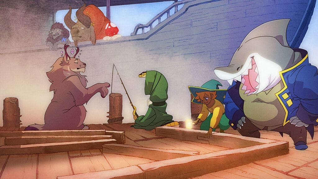
There is an emotional quality in the sensitivity of each character’s facial expressions. How was this achieved?
Oh man… that was definitely lots of sad animation reference! We spent a good amount of time researching old anime and Ghibli which we felt were successful in conveying emotion. I feel there isn’t a lot of anime that really try and push to capture human emotion like that, unless it’s for humor or as a reaction to something.
A lot of that emotion was captured, I believe, through subtlety. It was through the body language and subtle changes in the face. The color choices, the lighting, music and timing of everything also really lends a huge helping hand in conveying emotion. Our animation team did an incredible job with the emotional beats of the trailer.
There is an ethereal, dream-like quality to light in the trailer. How was this created?
That’s a solid question! Most definitely attributed to two important parts of the production — color scripts and post production. I developed the color scripts with Michael Doig to create our roadmap for the trailer. It then became a reference for our background artist and then finally, gave us the benchmark to hit in post.
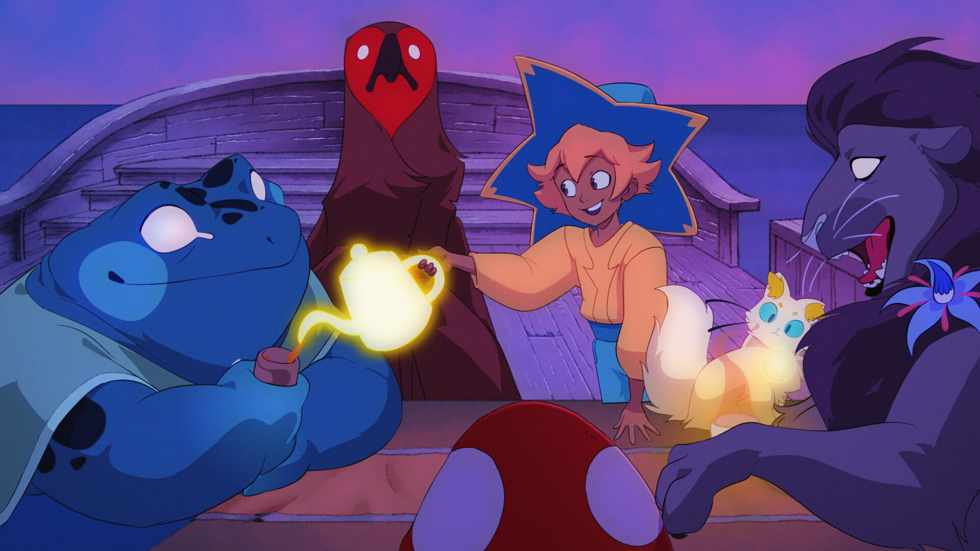
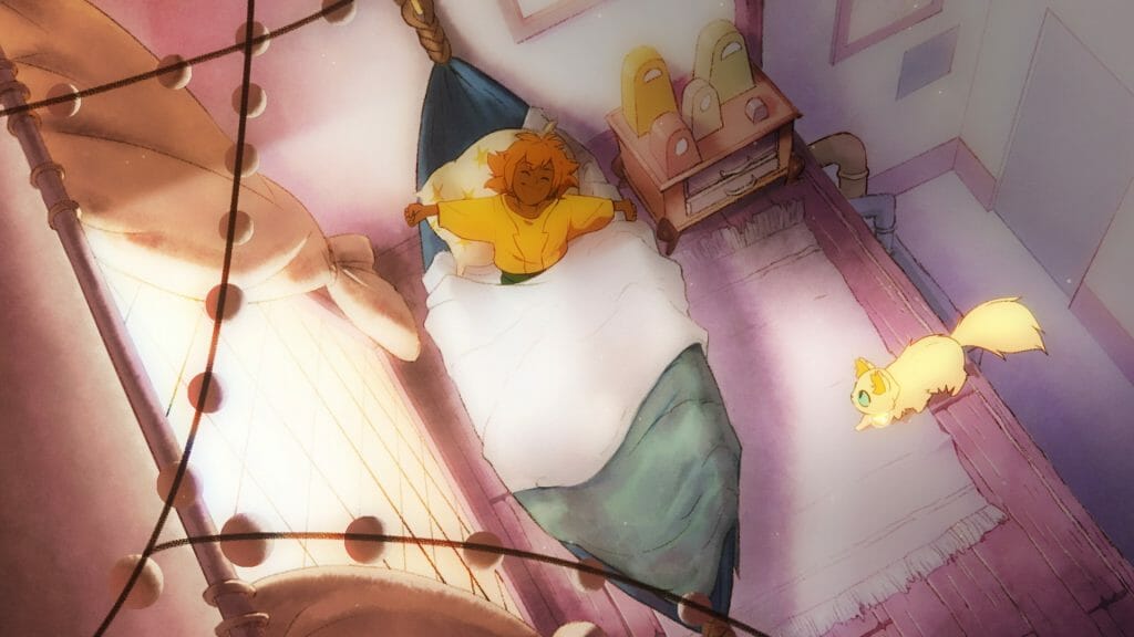
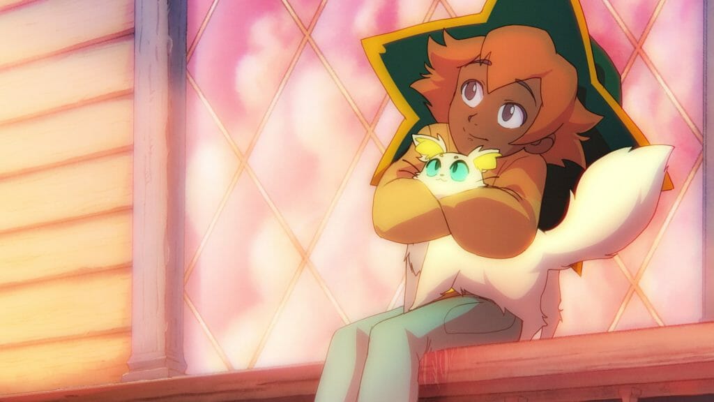
The colors we chose for the trailer were with the intention of achieving that dream-like quality of the lighting throughout the progression of the trailer. The morning started off cool, with soft purples and yellows. We warmed up a bit more for breakfast with warm oranges and yellows bleeding in through the window. Midday was treated with a stark contrast in the lighting coming from above, with subtle blues from the light bouncing off of the water. We then took the blues into dusk, as the sun was setting, while introducing purples and pinks. Finally, we brought it home with cool blues and purples in the evening, as Stella and her friends share tea together, one last time. We then contrast the cool colors with the following send off scene, pouring in bright whites and yellow as we say goodbye to a good friend.
Now, I’d like to say it was because of this one filter and one plug in… but the nuances and layers that go into post are usually never a one-size-fits-all solution.
Tell us about your studio, Knights of the Light Table. How would you define your style as a team?
The art style of the Knights comes from all over the world. It’s definitely a mixed bag of talents, which span different genres of animation. On one hand, we have a strong comedic group of artists who nail that Western style of animation; capturing humor and emotion in every frame. We have artists in Europe who bring a masterclass level of European-style animation. Then you also have artists who dabble with different styles of Japanese animation (like myself).
I think this mixed bag of different animators is what makes Knights very diverse and strong. We all want to grow stronger and we all constantly push ourselves to do better work. We bring our talents to the table in every project. My dream was always trying to find a way to blend Western animation sensibilities with Japanese character models, so working with Knights and our team has been legendary.
I swear, most of our conversations when we work on a call are just “ooooo’s” and “ahhhhh’s” at each other’s work. Being able to do a rough animation and have a clean up artist just elevate it beyond your own expectations is an incredible feeling. I mean, it’s a huge blessing just being able to do clean up animation on some of the roughs I’ve worked on.
Any parting advice for newcomers to the industry?
Keep at it and find friends! I am so incredibly jealous of all the available knowledge and tools out in the open. I wish I had it when I was younger!
That being said, find fellow artists and animators to collaborate with. There are tons of fun collaboration projects online, which are great places to meet other talented and hungry animators. I’ve always learned best when given a challenge, so don’t be afraid to push yourself. Coming out at the end of a challenge is always a learning experience. Even if you don’t feel you’re victorious, you have a critical roadmap to reflect and learn from your shortcomings.
Go and make friends, and meet more artists. I hate to admit it, but a lot of this industry is who you know so it’s always good to make friends and build your network. Art is created at your own pace and on your own timeline; not anyone else’s. So don’t get discouraged if your growth feels slow in comparison to artists you follow.
Interested in seeing more work from Knights of the Light Table? You can find details about more of their projects on their official website.


