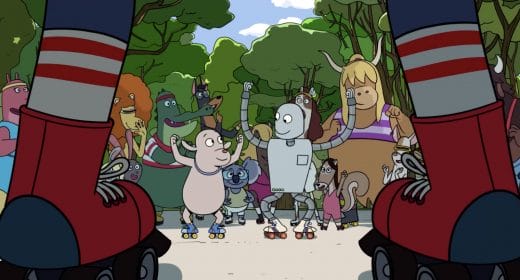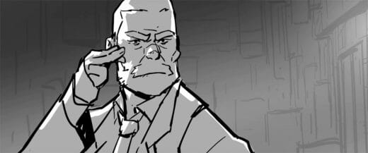
Marty Walker is a busy guy, serving as an animation director at the Atlanta outpost of Bento Box Entertainment — the renowned 2D studio behind hits like Bob’s Burgers, Brickleberry and Paradise PD, among a slate of others. In his spare time, he also creates a webcomic called Ghost Kid.
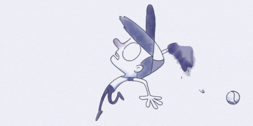
Walker specializes in traditional and digital character animation, both of which serve him well in the Ghost Kid GIFS. The humorous webcomics are windows into the day-to-day afterlife of what appears to be an average, music- and sports-playing lad who just happens to be dead.

Source: Marty Walker
Created using Toon Boom Harmony, the GIFs achieve a spectral, spectacular watercolour style and effect. Walker publishes his Ghost Kid webcomics on his blog, where he also shares tips, tricks and tutorials for other animators.
We spoke with Marty Walker to learn more about how he brings Ghost Kid to death in Toon Boom Harmony, plus his tips for other animators on how to have a side hustle and still have a life.

INTERVIEW: Animator Marty Walker on Ghost Kid
Where did Ghost Kid come from?
MW: A friend of mine and I were tossing around ideas for short films. One of the premises he suggested was: “A ghost who’s frustrated because he can’t touch anything.” I latched onto that and fleshed out an outline for a short about Ghost Kid playing baseball with some friends and being terrible in outfield.
Eventually I realized that I don’t need a whole three-minute short to tell this joke, I could say everything I wanted to in this eight to 12-second clip. I got really interested in the idea of condensing animated shorts down to just their core and letting them live as that. It was really freeing because it allowed me to focus on just telling jokes rather than having to tell a big story and making it mean something.
We really enjoy Ghost Kid’s watercolour effects. How did you achieve them using Harmony?
MW: The watercolour effects were based specifically on the style of my sketchbook drawings where I’d do a quick loose inking with Microns, then a couple layers of colour/tone with watercolour paints. I’d start with a light layer just to establish some local colour then, once that was dry, I’d do successive layers to beef up the contrast as needed. It’s all loose and done wet on dry to get something lively and sort of ‘finished enough’.

Source: Marty Walker
After closely examining my sketchbook drawings, there were five main effects I needed to reproduce:
- Line quality — Capturing the loose feeling of the linework
- Granulation — A kind of ‘dirty’ effect that certain watercolour pigments have, like there’s sand in the paint
- Variegation — A subtle variation in the colour caused by the pigment pooling in different areas or by ‘charging in’ extra paint in certain areas while it’s still wet
- Edges — capturing the hard edge that watercolour leaves when working wet on dry
- Paper texture — The texture that cold pressed watercolour paper has
To achieve the line quality, I used the default Felt_Rough texture that comes with Harmony. I made sure to purposely leave gaps in the linework the way I would when inking on paper. To get quick line boil, I made four custom variations of that pencil texture then, if there was a hold, I’d duplicate the drawing and switch the pencil texture. I was kind of amazed at how convincing that method was; there are points where it genuinely looked like I took the time to retrace the drawing. I’ve found that I can do the same thing even quicker with a Colour-Override and an Image-Switch, but that process is more technical than I can get into right now.

Source: Marty Walker
For the granulation, variegation and varying edges —more simply, the watercolour texture— I took a couple passes with different brushes. First, I went through and flat coloured everything in vector to give me a base. Then on a bitmap layer I’d hit each drawing with a transparent layer of colour using the default Watercolour brush with a couple adjustments to the hardness and spacing. This achieved the warbly variegated wash effect.
I’d then ‘scuff up’ that wash using the eraser and the default ‘Scraper rough paper’ preset, which added that granulated effect. Lastly, I’d hit the edges of the shadows with the ‘Wet Splotches’ brush to add a harder edge and some random splatters around. It sounds like a lot, but it was pretty quick and mindless once I got into the groove.
Then for the paper texture I just added an image of cold-pressed watercolour paper on top and used the Blending node to integrate it in. Easy peasy.
Thanks for explaining! We also love how your Tumblr goes into the weeds of your animation process. Could you briefly walk us through the planning that goes into a Ghost Kid GIF?
MW: Each strip starts off with a sketch done on paper — a single drawing with the caption. The more I can boil the whole thing down to one drawing, the better. I ink and paint it quickly to give myself a guide on how I want the final thing to look.

I then take them into Harmony and do a thumbnail pass — a quick pass at all the major storytelling poses using simple shapes. I try to keep this really loose and gestural. I’m not trying to prove to anyone how well I can draw, I’m just thinking through the pace of the shot.
From there I go into the rough keys phase where I turn those thumbnails into actual rough drawings of the characters. Then I add breakdowns in the rough phase.
Once I’m done with the breakdowns, I clean everything up. I find it helpful to do inbetweens with the cleanest drawings possible. Rough drawings don’t always have everything worked out, and there might be some mistakes in them that aren’t obvious — so if I inbetween at that stage, there’s a higher likelihood that I’ll have to redo all the inbetweens in the cleanup phase anyway. Then it’s just a matter of doing flats colours and a texture pass.

Phew! How long does a GIF like that take you from start to finish?
MW: Each Ghost Kid GIF took 16 to 20 hours from start to finish. I would chip away at them a couple hours a week over the course of a month. Breaking the hours into smaller chunks over more weeks helped make sure I was rested and always had the freshest eye on the project.
What led you to make Ghost Kid with Harmony Premium?
MW: It’s the software I’m the most comfortable using. I know exactly what tools are at my disposal and can achieve any visual effect I need. Whenever I have a project, animation or not, it’s the first thing I think to use.
Where do you want to see your projects like Ghost Kid go and grow?
MW: I’m happy if Ghost Kid is something I do for fun in my down time. I’ve thought about trying to develop a following and make it something big, but honestly I love that it can just be a hobby. With no fans and following, I don’t owe anyone anything and I can just make it for myself.
I do have 10 more strips planned out and fully thumbnailed. I’m hoping those will be released in the next couple years. I find myself a little short on spare time at the moment. [laughs]

You’ve worked as an animator, a technical director and an animation director. What parts of the production process interest you the most?
MW: I love analyzing things — picking things apart, finding out what makes them work and what makes them beautiful. I also love being able to teach and share what I’ve learned with other people.
The best part of my job as a technical director was figuring out how to achieve unique visual styles in Harmony. The goal was always to find a way to make the final animation look as much like the concept art as possible no matter what medium it was done in.
Do you have any advice for artists who are interested in incorporating side projects into their schedules?
MW: It’s really helpful to set aside a specific time each week to work on projects. I used to do every Monday and Thursday from 7:00 to 10:00pm. I’d limit myself to two to three-hour work periods. This helped me stay productive without sinking my entire life into it. The idea was that if I got to the end of the two hours but still wanted to keep working, then by forcing myself to stop I’d be able to carry that excitement into the next day. Otherwise, I’d run the risk of working for as long as I could as often as I could and burning myself out.
Want to bring your next animation project to (after)life in Toon Boom Harmony? Download your 21-day free trial now!
Banner image source: Marty Walker


