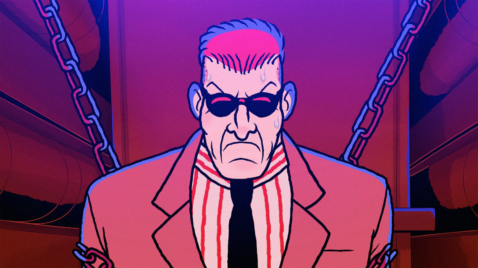
Red Ketchup started as a cult comic book series published in Quebec. Originally appearing in 1982 as a side character in Michel Risque, written by Pierre Fournier and illustrated by Réal Godbout, Red is an albino FBI super soldier with a propensity for drugs and violence. He became an instant fan favourite, and Fournier and Godbout got to work creating his own series.
A new animated series inspired by the Red Ketchup comics, produced by Sphere Animation and directed by Martin Villeneuve, premiered on Teletoon in April. We sat down with Logan Schinbeckler (animation supervisor), Diego Serra (animation director) and Judith Beauchemin (producer) to discuss the process of adapting a detailed, action-packed comic for animation.
How would you describe your role in this project and what did a typical day in production look like for you?
Diego: I’m the episodic director for the show. I’m responsible for the visual interpretation of the scripts, I provide direction to the storyboard team, and work with the editor in the creation of the animatics that would later be passed to the other departments.
I helped supervise the creation made by our design techs and comp, and I discuss things with the animation supervisor, Logan. We discuss things, problem-solve. I help solve technical problems that we encounter during the production of the episodes. That’s pretty much what I do for this show.
Logan: I’m the animation supervisor. My job is probably a little simpler than Diego’s, I think. I spend about half my time checking animation — checking scenes, making sure things are done correctly, looking for revisions, looking for problems, stuff like that.
The other half of my time is spent problem-solving, coordinating with other departments, coordinating with other supervisors, with production, getting ready for the next episode, that sort of thing. It’s roughly fifty-fifty between whatever episode we’re doing and everything else.
What did the creative brief for this project look like?
Diego: This is a question that’s probably better answered by Martin Villeneuve, who’s the series director, but I’ve seen the creative brief. It was about four pages of just discussing the material, which is the original Red Ketchup comic book from the 1980s. In that brief, we were also told who the characters of the series were going to be and the locations where the stories were going to happen.
We also discussed the style. Obviously we based it in the comic book, but there are also some other visual references — Tintin, Dick Tracy, we had some Sin City, Terminator, Rambo. Everything that was in the 1980s that was very influential, we tried to take as much as we could from and put it in our work. So visually, this show is quite rich. You can appreciate some of the influences.
I know for sure that Réal Godbout, one of the creators of the comic, really based a lot of Red Ketchup on Mary Shelley’s Frankenstein. To tell the story, Red Ketchup is a super soldier. He’s created by a serum provided by Dr. K. We made sure that we see that in the flashback that we created for the show.
There’s also parts where Dr. K is obsessed with recreating what he did with Red Ketchup. And he tries to come up with clones. He creates the clones but doesn’t succeed in creating the same type of super soldier. In some later episodes we see clones that got destroyed by Red Ketchup, and a different character puts them together. So you can see the Frankenstein influences in there.
Logan: And visually, there’s some stuff as well. Red’s very stoic and stiff and he’s very tall, and very rectangular. So there’s little hints of it visually as well.
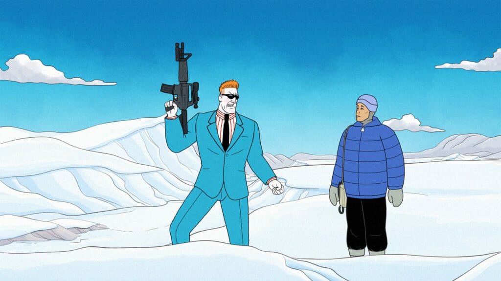
Red Ketchup is heavy on action. What did the process of storyboarding episodes look like?
Diego: It’s definitely been a challenge. It was something that most of us were not really familiar with. We had to learn things the hard way. We’re not talking about a film here. We had to adjust all of our action scenes into a 2D pipeline, which doesn’t have the budgets that we have in film.
So we had to assess how we could make it entertaining, and still manage the resources that we have for the production, and keep it a consistent process for the twenty episodes that we have.
We definitely came up with a set of rules. There’s multiple ways that we created to make this very appealing to the audience. We cut a lot to action. We simplify the acting of the characters. So we introduced the element of the colour cards, which are used in the comic books, to show reveals, to show emotions, even to censor.
Sometimes we have very dark moments in the series, and we want to be inclusive to all audiences. We don’t want to disturb different groups of audiences. So there are some gory scenes that we tried to tone down by using silhouette with colour cards. We came up with a long list of storyboard tricks or techniques. And we’re very proud of the result.
What were the challenges in adapting a comic book into an animated series? What changes had to be made?
Diego: There’s a lot. In the comic books, there are a lot more characters. If you read the comic books, they are so rich in characters, so rich in locations and props. But like I said before, it’s a 2D pipeline — we need to make sure that our assets are limited. So there are unfortunately some characters that we won’t be seeing in Season One.
It’s trying to reduce and be concise about the amount of stories that were told in the comic books. I believe we based our episodes on just three comic books out of nine that Réal and Pierre came up with.
So the story is not necessarily what’s in the comics. It’s an adaptation for TV and that’s something that the audience should know. If you’re a hardcore fan of Red Ketchup, you might not see the same story. You might see that it’s Red in a new situation, facing new challenges.
The comic was written in the 1980s. We’re trying to include the culture that we have now. We try to be respectful of the audience. And maybe we try to tone down some of the language, or violence that was used in the comics.
But the essence of the character, the essence show, is still there.
Judith: One other difference is that the show is serialized. That’s different from the comic books, so we had to really take some of the stories from the comic books and make them into an arc that spans twenty episodes.
Red looks very similar to his comic counterpart. What did the character design stage look like? What did you include from the comics, and what did you leave out?
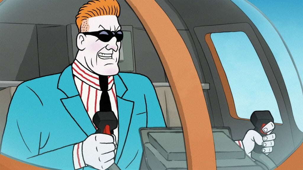
Diego: There was a lot of detail. The linework in Réal’s work is very detailed. You have folds in the clothes stripes in the shirts. It’s very rich, beautiful work. But for a 2D pipeline we have to always simplify. So you might see that the character looks very close to the comics, but they are actually slightly different.
We had to create the volumes and make it animatable. We had to simplify a lot of the lines. A clear example is Red’s shirt — I don’t know how many lines his shirt had. We had about six lines. We had to reduce it to three. Also if he moves and rotates, those lines then create a pattern that might be distracting to the audience.
Sally’s hair was also pretty crazy. There’s a lot of wave, there’s a lot of curls. We really had to simplify it and make it animation-friendly.
Logan: It was just simplify, simplify, simplify. As fantastic as some of those illustrations are, there’s a little more latitude for changing a character’s proportions slightly between panels, let’s say, because there’s so much more detail and there’s a lot of linework.
As soon as you make something into an animatable design, certainly into a Harmony rig, there’s less room for difference between the views in a show like this, where there’s lots of depth, and there’s lots of design.
Also, everybody’s wearing clothes, and the original art has lots of drapery. Lots of clothes, lots of suits, lots of hanging fabric, lots of folds in the cloth. There was a whole pass that I did at one point during an R&D phase where I just basically went through and put X’s through lines. It was too much to animate. It’s too many thing to track and too many things to keep moving.
There were very careful, conscious choices to make sure that it still looks very much like the comic book, even though the details are actually quite different.
Diego: Yeah, we kept the essence of the characters. And luckily for us, the software that we work with has this precise line, a texturized line, that also mimics the ink in the comic books. That’s a really good tool that we used in terms of design.
We also worked really closely with Réal Godbout. He was consulting for at least the main characters of the show. So we took the references, we spoke to him. There was always a back-and-forth on what Red should look like.
The shirt was a big issue I have to say. It was one of those things. Réal really wanted to keep the essence of the character and to stay as close as possible to what he did in the comics. But I think we did a good job with it.
What techniques and programs did you use in animating the series?
Logan: It’s pretty much Harmony and Storyboard Pro. And Photoshop for some of the design. The colour people were using Photoshop. I used Photoshop every once and a while for this, that, or the other thing. Various people might pop into Photoshop to do a draw-over or fix something.
But it’s pretty much Harmony from front to back. Even some design — we’re starting to do more and more design in Harmony as well. So we’re going all the way through comp in Harmony.
What were the challenges and benefits of depicting action and violence in an animated series?
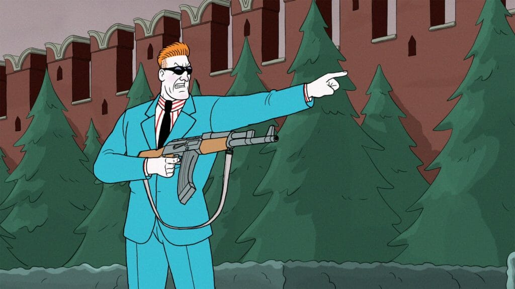
Diego: Violence in animation is always a challenge. Fighting is always difficult because there’s interaction with characters. In this show we have a lot of kissing as well, so it’s not just the violence. Anything to do with interactions between the characters is always going to be interesting. It’s always going to represent some kind of challenge.
Needless to say, this is a violent show. There’s always going to be moments of impact. Posing the characters moving, punching, impacting each other was new to a lot of people that worked on the show. I’d say 90% of the artists on the show have come from a preschool background. So that represents a whole change of mentality.
We have to adjust, to make sure that we see and think like Red Ketchup. It’s completely different. It took a couple of episodes to really nail the style, but now we’re in cruise control and everybody knows what’s expected of the show.
Logan: Every animator’s different, and part of my job is getting to know them and getting to know their strengths and weaknesses. Diego mentioned that fighting, drunkeness and dancing are sort of the hardest things for animators. But a lot of animators also really enjoy those things because they’re difficult and because they’re interesting.
Thankfully we’ve got a couple of animators who are really excited about doing the violence and also very good at it. So we have a small group that are sort of our fight team, essentially. There’s also issues of continuity, making sure that if you’re punching through an edit, that the two scenes make sense together.
You want one artist that can do this fight scene because there’s a lot of cuts. Maybe there’s one artist who’s doing this little bit of a fight, and then there’s another animator doing this little bit of the fight, to make sure that there’s a continuity throughout. And they’re good at it, and they’re passionate about it. Animators are always going to do better and faster when they like what they’re doing.
A lot of it is at the board stage. It’s about those edits that Diego was talking about — sort of doing action between the cuts, so you’re seeing the start and the end of the movement but maybe not the middle of it.
Judith: On the first episode, there’s a lot of blood involved. I remember the back and forth we had first, and this was something where we were like, “We need more blood.” Because that’s part of the story. So that was challenging at first. But we got that level right for the first episode, so we knew how to keep on going afterwards.
Red Ketchup features adult content, like sexuality and drug use. What was it like creating an animated show with adult themes?
Logan: Genuinely, the thing that continues to stand out to me and that I laugh about, and that I will continue to laugh about with my friends, is having conversations about genitals. Having to sit there and have a serious meeting between department heads, being like: “Okay, so, how are we going to rig that particular penis?”
Judith: And to get a serious creator to sign off on Red naked.
Diego: That was a long process. It was interesting. Or even addressing the use of drugs. Red is an addict. So we exaggerated in one of the scenes, and we have a pile of cocaine, and Red has to snort that whole thing. It’s a bit of a highlight. It’s an opportunity that most of us probably won’t do again in our careers. So it’s something very different.
What I’ll take from the show is the fact that we’re trying to tell really big stories with less. The scripts are complex, and we just try to problem-solve and come up with the simplest, most attractive visual.
Apart from the subject matter, how does animating for adults differ from animating for children?
Logan: It’s actually more the style. There’s different kinds of “adult.” There’s adult humour, and this has some of that certainly. But “adult” has become more of a broad stroke. It’s a little more generalized. We’re a subset of “adult” as well, because of the style and because it’s based on a comic book and because of the content.
There are adult themes, humour, language, but there are a lot of shows that are classed as adults, but most of them aren’t animated any differently than a kid’s show. If you look at a Nickelodeon show for six-year-olds and a favourite adult comedy show, the actual animation isn’t very different.
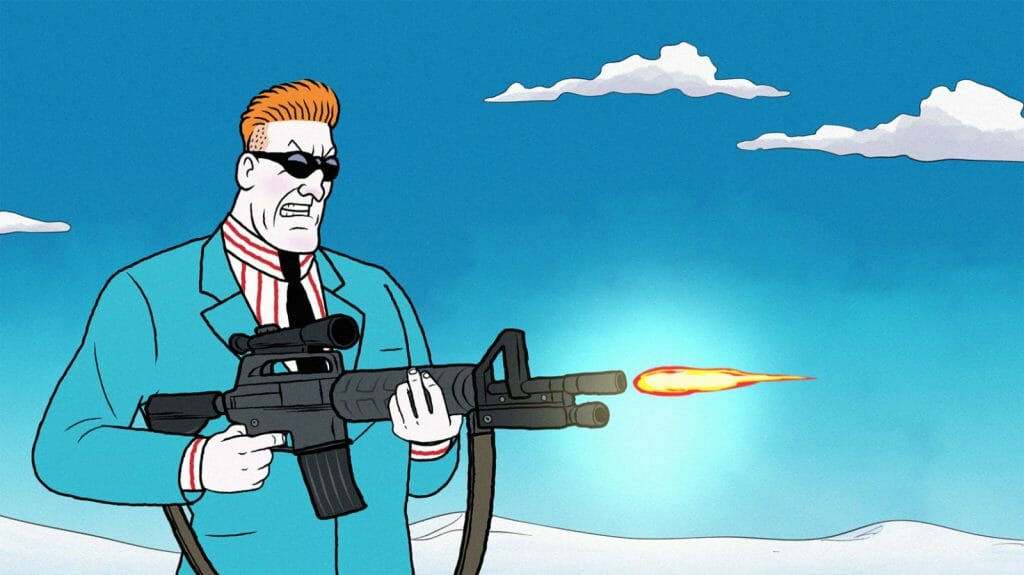
Whereas with this show, the actual design style is so much more realistic. Because we’re trying to be faithful to the comic books, the design style is very unusual in the modern industry. You might have seen it more in the 80s or 90s, when the book is from. But in the modern animation industry it’s very unusual to see this style of design. So the animation is very different because it has to be.
We got these experienced animators who’ve never animated in this style, or have never dealt with designs with this level of realism and this level of detail. So it pushed everyone at every stage out of their comfort zone, even with interesting practical stuff like nudity.
Then there’s VFX and comp. Traditional hand-drawn effects are extremely heavy in this show. There are explosions that took an artist three days. The compositing and the effect in this show are really heavy. There are a lot of scenes that are just effects. Or like Judith mentioned with the blood, there are a lot of scenes where there’s blood splattering and flying, and then there’s a pool of blood and we have to track that.
Having to plan for the level of detail and realism in the rig, in the characters, the anatomy; They have anatomy covered in clothing. It’s not just a noodle arm.
How did the comedic nature of the series affect the animation style?
Diego Serra: The comedy that we have on the show, we based it on the scripts and on the voice acting that we were provided. We’re lucky to have a really good team of board artists and animators that add a bit more to the lines. You can have a line, you can have a voiceover, but it’s how they push the scene that makes the scene maybe even funnier.
Or there’s moments of awkwardness, or silence, where it’s unscripted but we can still try to fit in a bit of a reaction or something to push the moment a bit more. There’s always room for us to add a bit more. But we strictly worked with the script and with voice actors.
Logan: So much hangs on the voice acting. The voice actor will make a massive difference in terms of how we can plan and imagine and actually execute on the storyboard.
We have some situations where comedy timing is different from animation timing. Understanding comedy timing is not something everybody can do. So there are occasions where I do have to give a little revision, where I go back and be like, “You just need to delay this by six frames,” just to help a joke land. But even that’s not terribly common. It’s mostly in the boards and the scripts.
Which part of the project was the most interesting or challenging to animate?
Logan: It’s the same answer to both questions, and that is the design style. It’s so realistic and detailed and very complex. It’s very different than any show I’ve ever worked on in my career. And it’s very different than any show I’ve seen on the air recently.
There’s very few shows in the modern industry that’s doing this style of design with this level of detail. So that is both challenging and fun. It’s really interesting when it takes effort to make someone raise their arm because there’s a shoulder, and you have to think about where the seam on his jacket is going to go. Most character designs on most shows these days, they don’t really have shoulders.
Even though we’ve gone through and simplified, there’s still a lot. Then you add on the fight scenes, then you add on all the effects and so on. Trying to meet the original comic book has been a massive challenge. But it’s also probably what is most interesting and most fun for the people working on it.


