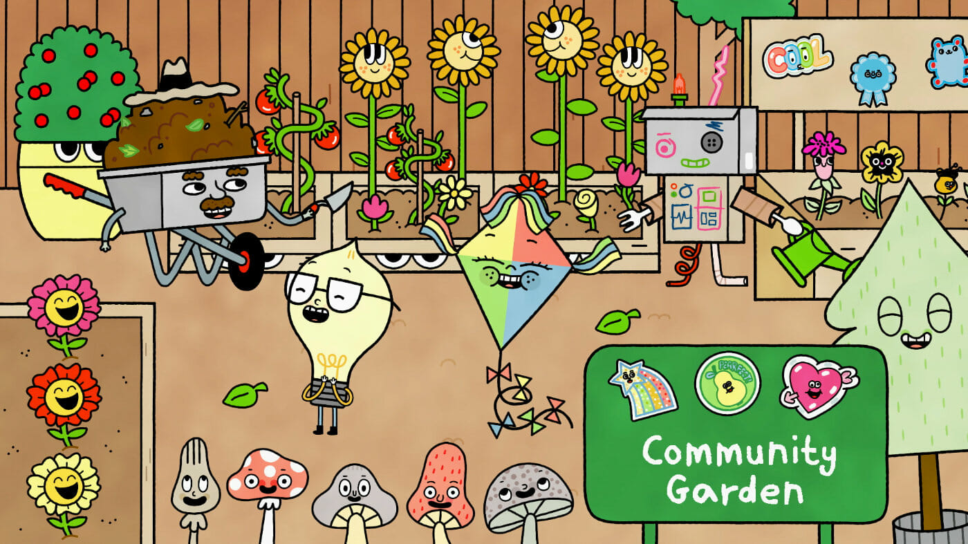
Produced for PBS Kids by Augenblick Studios, City Island is a series of shorts aimed at teaching children and their families about civics. The series follows Watt, a precocious light bulb, as he explores and learns about the inner workings of his city. City Island has been a popular addition to PBS Kids’s content on YouTube and on the PBS Kids app.
For us, the charming character design on this series is the star of the show. With art direction from Gemma Correll, City Island itself is alive, inhabited by sentient objects, clouds, and just about everything else. Streets and buildings are able to interact with the characters and tell their stories for themselves. The line between background design and character design on a project like this is blurred in a way not often seen in contemporary animation series.
We sat down with Aaron Augenblick (showrunner and founder of Augenblick Studios), Katie Wendt (animation director), and Josh Pilch (character designer and storyboard artist) to discuss creating curriculum-driven content for children, as well as the philosophy behind the design of City Island.
City Island is such a creative project! What did a typical day in production look like for each of you?
Katie: A typical day is so crazy and different day-to-day. A typical day is atypical.
Aaron: We could talk a little bit about the way our company is structured. We’re here in Brooklyn and our company has been here for over two decades. We mostly have done all productions in-house, where we like to have all the staff working together. During the pandemic, we got a smaller studio, to where we have just the core team members that all work here.
Here in Brooklyn, we have those in managerial leadership roles, and our larger team is all over the world. We have an infrastructure for virtual staff that is very efficient. So we have people working around the country, we have people working around the world. And we have a large studio called Demente, and they’re a notable Harmony production studio. And they do a lot of the animation production on the show. So we have a lot of people working around the country and in other countries.
So I would say that a typical day is a lot of us having creative meetings, talking with each other about the episode we were working on. Anything from writing to directing the actors to reviewing animation, designing: these were all things that happened on a daily basis here.
What did the creative brief from PBS Kids look like? Or did Future Brain Media pitch this project to PBS?
Aaron: This was a project that I developed and pitched them. About five years ago, myself and my partner at Future Brain, Dan Powell, decided we wanted to start a kids’ company together. There’s just so many exciting things happening in the kids’ space. I think that some of the most daring work in animation is actually happening in the kids’ space.
Katie: Especially visually.
Aaron: Visually, for sure, and design-wise, what’s happening is very exciting. So we decided we wanted to start a kids’ company, we got together a bunch of our favourite artists and creative people, and we sat in a room and talked about ideas for shows.
That was the meeting where I pitched an idea about a show about a city where there’s no people, but the city is what’s alive. And that all the characters could be objects in the city. That’s where it all started. Katie was there, and we all sort of bounced off each other and talked about it, shaped the show. By the time I pitched it to PBS it was called City Island, and it starred Watt, a little lightbulb, and his best friend Windy, who’s a kite.
When I pitched it to PBS, we didn’t have a specific curriculum in place, which is rare for PBS. I knew I wanted it to be a show about community, and about people collaborating to get things done and problem-solving. But it was during the development process with them that they suggested the idea of it being a civics show, because it’s in a city and that was something they were interested in exploring with their network.
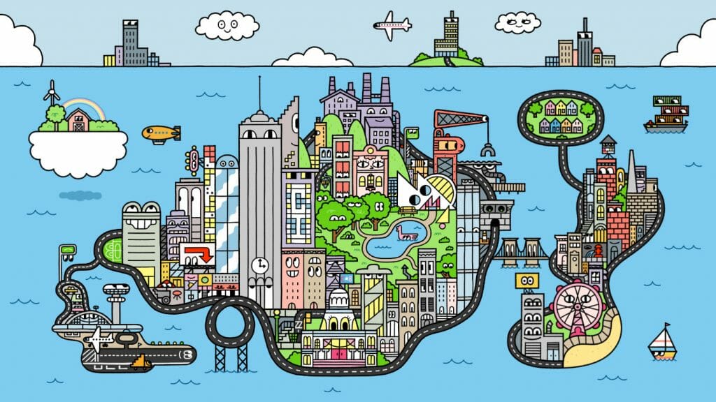
It does make sense to incorporate the civics theme in a story about a living city.
Aaron: What’s great is that on City Island, all the different infrastructure of the city can tell its own story. We talk to subway cars, ferris wheels, buildings. They can all talk to us. So it’s interesting because the city can speak for itself.
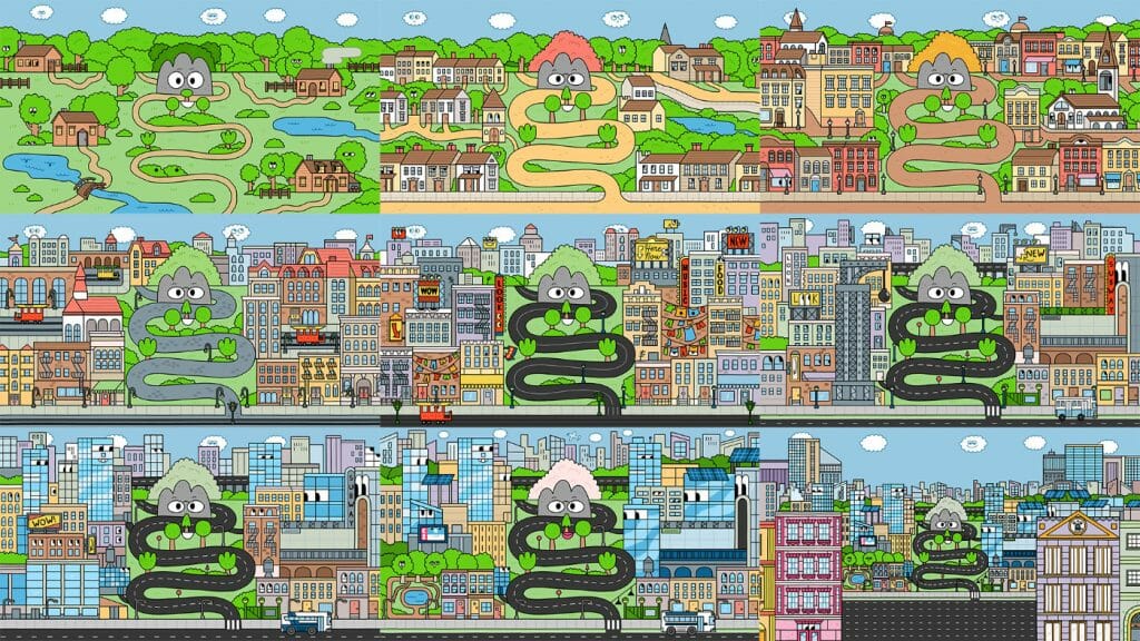
That reminds of the episode about a street named Laney who recounts the development of the city around her. You don’t see that level of creativity in shows very often.
Aaron: That was one of the episodes that we were the most proud of. We’re here in New York City, and the history of New York is interesting and important to all of us. So we had this idea in the writer’s room that we could tell the story of the formation of a city, going from an empty field to a bustling metropolis.
And then we could do it in one shot, where you could see all the different development that happens in a city over the years. Things get built, things get torn down, things get replaced. To do it in one shot was really exciting. That was a very tricky episode for us to do. And it helped for us to do it in Harmony, but I think there were some challenges.
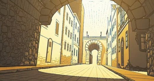
Katie: Demente, the animation studio that we work with in Guadalajara, said, “Oh, this is a really unusual show. The backgrounds are all characters as well.” All of the art for the show was created in Harmony. We didn’t use Photoshop backgrounds. Everything is Toon Boom Harmony.
The buildings have eyes, and all of the eyes need to look around. And there are cars, and the cars are alive, and they need to be able to look around and interact with characters. So right from the get-go Demente was like, “This is an atypical production.”
For the episode ‘History’ in particular, that was crazy because that long shot where the city’s being built up, and pieces of it are coming in and going away, and interacting with each other as they appear and disappear. I think it almost broke Keith [Stack], our animator. It was a testament to how robust a program Harmony is.
Aaron: One of the things I like about Harmony is that, of the software that we use, it feels the most like a community, and they tend to be available to talk to. In talking to Toon Boom, they were very impressed that we were rigging our backgrounds the same way we were rigging our characters. They thought that was pretty unique.
Like Katie said, in ‘History,’ the idea of having these rigged backgrounds changing and forming, and characters going in and out of these locations, is pretty unique to Harmony. We should be happy about the fact that they supported this kind of crazy endeavour.
Josh: That shot has a camera move also, at the very end. On top of everything else, we were able to pull that out and do a legitimate multiplane with more elements coming in.
Aaron: How many elements, do you think, were in that final shot?
Katie: Hundreds, easily. There were ten eras or something, and each one has at least a dozen buildings. There was a lot of stuff going on.
What did the planning stage of this project look like?
Aaron: We had this core idea of this show where the city’s alive, and had a few of the characters mapped out. And then we developed with PBS for a couple of years. We pitched and were purchased right before the pandemic, and a lot of the development happened during the pandemic. So it took a few years of development.
PBS Kids is so great at understanding how to integrate curriculum in a show that is still entertaining and fun to watch. I think they’re the best out there at doing that. With City Island it was very important to them that we could make the social studies civics curriculum completely integrated in the storytelling. And a lot of it came during the development process.
Also, characters are very important to them, and character relationships. So a lot of the development was figuring out who these characters are, why they’re doing what they’re doing. Who is Watt? What is his motivation in wanting to find out about his city? Is he just a precocious kid? What is his personality? And also, how does his personality compliment Windy, and how does Windy compliment Watt? So it feels like a real friendship and it just doesn’t feel like some tacked-on, cartoony archetype.
By the time we wrote the episodes for the scripts, we felt like we understood how the show worked. That was around when it became shorts. We initially developed it to be a full half-hour show. It was around the pilot time that they became increasingly interested in shorts, largely because of the success of their app and YouTube channel.
So we became shorts for the pilot. We really figured out visually how the show worked during the pilot. I contacted [art director] Gemma Correll when I was first developing the show, before we talked to PBS. She’s one of my favourite artists. I asked her to help me out with it and she did some amazing sketches. The show is basically a love letter to her style.
Another facet that happened during the development was the addition of Tunde Adebimpe, our composer. He’s someone that I knew from my start at MTV. And he went on to become a world-famous rock star in a band called TV on the Radio. So with Gemma’s style, Tunde’s music, and then Katie’s animation direction, it all came together.
By the time the show got green-lit and we started the full series, we were ready to go. We understood how the show worked, and what it looked like, and what it felt like, and what it sounded like. That was helpful, because it’s a really ambitious show.
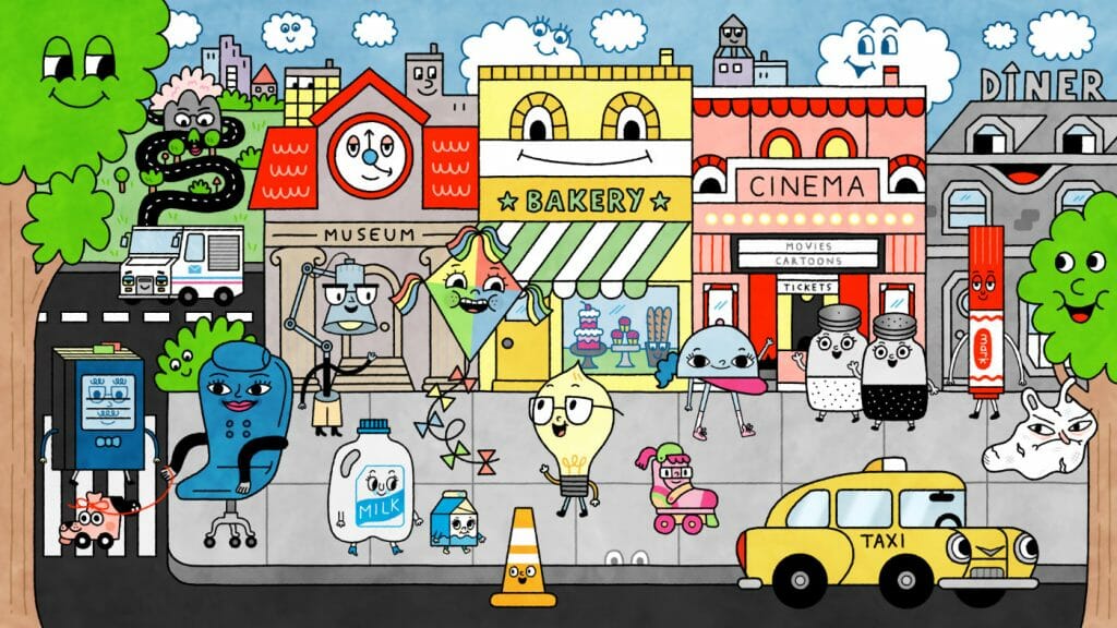
The character design really stands out on City Island — Gemma Correll’s style is so appealing. What did the process of designing the characters look like?
Katie: I was less involved with the pilot design, where the main characters got nailed down. But that was a lot of Gemma’s sketches. Gemma is luckily so incredibly prolific. She did sheets of character sketches for us and we honed in on what gave the characters their personalities.
When it came to series, we would have a kickoff meeting with Gemma where we would read through the script, and we would tell her what we were thinking; for all of these new characters that were being designed. And Gemma would come back to us within the day with dozens of sketches for every character.
Gemma is also incredibly sweet to work with and seemed to take no notes personally. And then we had a great design team who would polish everything in Harmony, because Gemma tends to sketch and do her outline work on paper.
Aaron: Because our design team was cleaning up in Harmony, they were doing very basic layering for rigging.
Katie: Yeah. The rigging was occurring at Demente. So we would create this unrigged art that we would then send to them for rigging.
Aaron: A lot of shows in Harmony will send the animation company Photoshop drawings that they have to retrace. We just wanted to save them having to retrace. We literally were cleaning up with the pencil tool.
Katie: And that’s another aspect of the design that was very Harmony-centric. Demente actually helped us create a custom pencil line that matched Gemma’s style. Because her style is so inky. You can see the bleed on the paper. So we worked with Demente to create a pencil line that would emulate that. Getting the line right for the show was a major focal point for the early part of production.
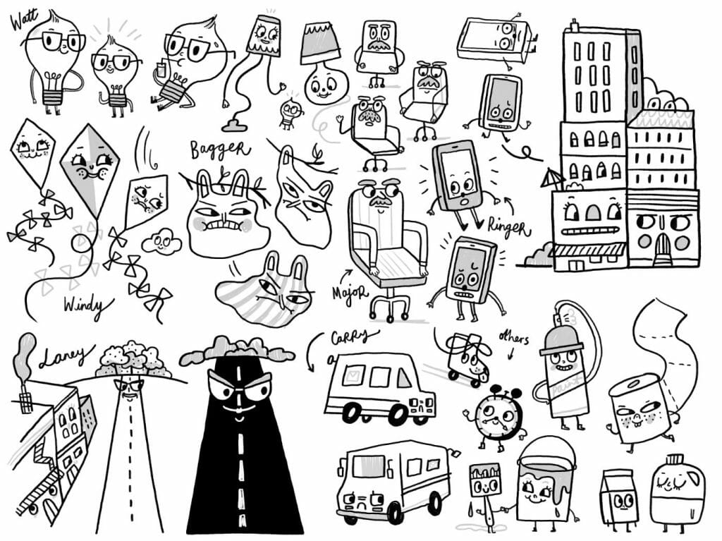
On City Island, there are no humans, and every element is potentially a character. How did that inform production?
Katie: We have a background design team and a character design team. So we were constantly, while making our design lists from the script breakdown, asking, “Is this a character or a background element?” It kind of fell down to, “Does it talk?” It generated some existential crises sometimes.
And then there are characters that are made of multiple objects. But then there are objects made of multiple characters, because they’ve got two sets of faces.
Aaron: Here at the studio, we all like philosophy, and it shows up in the show. There’s a concept called panpsychism, which is the idea that all objects, down to molecules, are conscious, which is somewhat similar to City Island. It’s an interesting philosophy that was fun to think about as we were building City Island.
Katie: There’s an episode where you see the entire Earth from space and the Earth is alive, which raises a lot of questions. Are the mountains on the Earth alive? A satellite is taking pictures of the Earth and keeps zooming out. But I really wanted to do a joke where we zoom in too far and you see all of the water molecules in the ocean talking to each other. I still really want to do an in-microscope episode.
Aaron: The concept in panpsychism that causes us a lot of problems is the combination problem. An example of that would be in ‘Retirement Home.’ Watt says, “Word on the street is, retirement homes are boring.” And then we pan down and the street itself says, “I hear all they do is eat soup and take naps!”
And for the street, a manhole is the mouth, and cones are the eyes. So the street is the combination of these objects on the street. The accumulation of these objects then becomes alive and sentient.
Katie: In another episode, there’s a superhero called Super Bulb who’s a comic book. So the big question was, “If you open him up, are there drawings of a comic book, or a superhero lightbulb character?” I think on that one we landed on he’s a superhero lightbulb character in there.
Aaron: We had fun philosophical debates in both the writer’s room the animation room.
Were there any added challenges in rigging such visually diverse characters? I’m picturing the mayor, who’s an office chair, but who still has movement and arms. And no other characters are shaped the way she is.
Josh: It is an added challenge. Demente would have to take each character, look at it, and say, “How does this one work?” For the mayor, her arms are the arms of the chair, so they’re naturally in an armchair position. But they have to be able to come up and gesture and then go back to that position. We had to make sure there were enough points for it to bend up in a pleasing way and look like an arm.
Demente has a really nice envelope on her body, so she can rotate in a way that a rotating chair does. The seat is sticking out when we look at her from the side, and then it can seamlessly turn into a front view where it foreshortens. That’s a very specific problem to solve with just that one character.
Aaron: It’s tricky since they’re all objects that rarely have heads.
Katie: When you’re rigging a human character, there’s a fairly standard height hierarchy that you use. But with all these characters, it takes some real deconstruction. What needs to move with what? There’s a lot of, “My head is my body.” Which in some ways is easier.
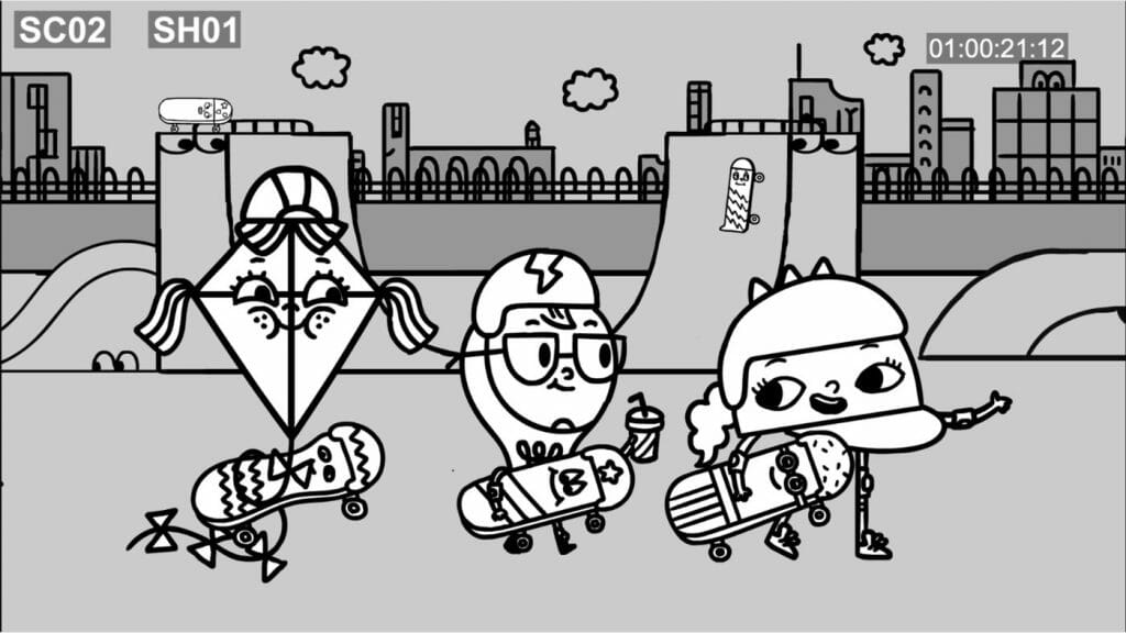
Aaron: It’s a question we had to ask constantly. Seriously, what is Watt’s head? It’s probably the top of his bulb. And Windy’s head is her body.
Katie: Doing a profile view of a kite character that didn’t look completely bonkers was a challenge. We have a cell phone character whose profile view is just a flat screen.
Aaron: With Windy, she has tassels coming out of the top of her head, and a tassel on the left and right. And we had to explain to Demente that the tassels need to operate differently.
Katie: Because some are her hair and some are her arms. Her tail can also grab stuff.
Aaron: The whole show is one big thought experiment.
How does animating educational content for children differ from animating other series?
Aaron: In talking about the curriculum and talking about PBS, I definitely have to mention our producer, Gavin Lankford, who has been incredible at watching all of our crazy ideas, but always making sure that it works well for kids. So Gavin was the one that we sent every script to, every design to, every animation cut to. And he was showing it to his whole team at PBS.
He was very good at guiding us in making sure that the show could be ambitious and in some ways daring for PBS, and also very funny, but also had a very sound curriculum, and had a voice that worked with PBS.
I also have to mention Anne Lund, who’s the head of curriculum at PBS. She does these amazing frameworks with her team for all the curriculums that are on their channel. Every time we were in doubt about the curriculum, we would look to the framework.
And Sara DeWitt, who’s the head of the network, was always very encouraging to us and very supportive of the show being what it was, which is a very ambitious show that had something new to say on the network. And luckily her kids love the show. So that helped.
So definitely having a strong team at PBS that was very supportive of the show was really our secret weapon in being able to do a show like this.
Katie: And those curriculum frameworks are so comprehensively written that it makes it pretty easy to get inspired. For City Island, it was a social studies framework. And we picked out the pieces that were more civics-driven. But it’s broken down into the best ways that kids connect to these lessons, and examples of how kids can connect to these lessons.
And then we also worked with an educator, Liz Hinde, who was incredible in saying, “Well, if you’re looking to do an episode about economics, kids understand economics in terms of things like Pokemon cards – one card’s more valuable than the other.” She was great at giving examples that are actually useful to kids, as opposed to dry, abstract concepts, which was incredibly helpful too.
Aaron: She worked on the civics curriculum with Anne Lund for PBS. So when we decided to go down the route of civics, she was instrumental in choosing what topics were right for the show.
Which part of the project has been the most interesting or challenging to animate?
Katie: ‘Celebration’ was tough. And the shot in ‘History’ that we talked about. As a single shot, it was probably the biggest challenge.
Aaron: We get these super ambitious ideas. We never wanted the show to feel like a sitcom. I’m usually less interested in seeing shows that have one location for almost all of the stories. I tend to get a little bored by that. With New York City as the inspiration for the show, I always wanted the world of the city to be the location. Usually in the writer’s room when we said, “We already went there,” we would usually avoid it.
Katie: We also tried to avoid the feeling of, “This is the assignment for the day. Figure out how voting works!”
Aaron: Yeah. When you’re doing a curriculum-driven show, the easiest route is when a teacher has an assignment for the kids. We can do that, and we’ve done it, but it’s always more fun when the curriculum is embedded in the world itself.
Katie: ‘Celebration’ was probably the most ambitious episode because the concept was to show an entire city working together toward one ultimate goal.
Aaron: That was an interesting challenge, because we wanted the last episode to be a wordless episode, very inspired by Fantasia. Because we had Tunde, it was such a dream to be able to let his music be the story itself.
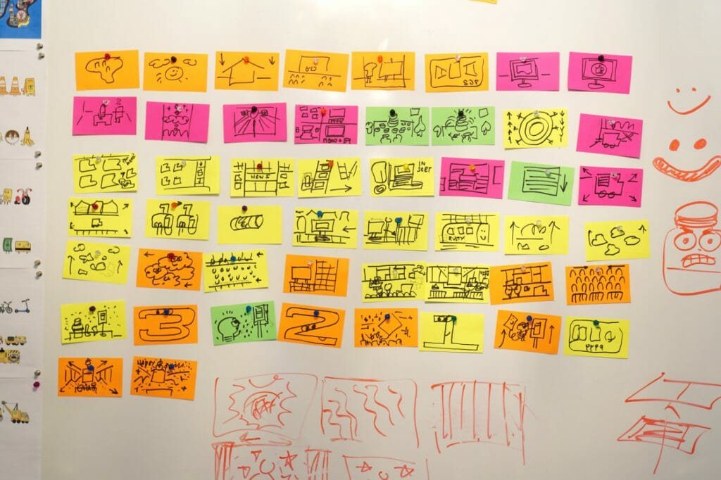
It was challenging, because we needed to have a curriculum on a story that has no words. Sowe tried to visually represent city planning. We wrote the script with index cards. Me, Katie and [head writer] Billy [Lopez] sat in this room together sketching out ideas.
Another big influence on that episode was Rube Goldberg. We’re big fans of Rube Goldberg, how one thing can lead to another in interesting ways. It was interesting to us that we could create a visual thread to the episode.
What I find is, on a production, if it’s challenging at the top, it’s challenging all the way through. It was hard to write, it was hard to design, it was hard to storyboard, it was hard to animate, it was even hard to sound design. It was difficult for everyone all the way through but hopefully it was worth it. I think it came out pretty amazing.
- Interested in watching the City Island shorts? Check out the series’ Linktree. For more City Island content, check out the official City Island Instagram account.
- Think you have what it takes to join the team at Augenblick Studios? Visit the team’s career page. For more children’s media spearheaded by Aaron Augenblick, check out Future Brain Media’s website.


